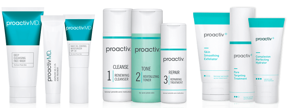
Let’s build the right Proactiv for you.
Continuity companies such as Dollar Shave Club, the Honest Company, and Sephora have created insider membership packages that allow members to have monthly dropship delivery as well as personalized experiences and product curation.
Proactiv members needed a similar system of benefits that related direct marketing companies have. The benefits included: convenient delivery right to their doorstep, exclusive discounts, special promotions and insider access to Proactiv’s latest product launches.
To comply with my non-disclosure agreement, I have omitted and obfuscated confidential information in this case study. The information in this case study is my own and does not necessarily reflect the views of The Proactiv Company.
Project Team
Mark Kusek — Creative Director
Mike Faivre — Design Director
James Ferrell II — Web Designer
Brett Johnson – Business Intelligence
Erik Bjarnason — UI/UX Designer
James Scariati — Front-end Developer
Daniel Yunas – Project Manager
I lead the UX design team and my individual responsibilities includes: the research, UI/UX design, and prototype execution for this project. The experience is an adaptive web-based experience that allowed users to understand their individual acne needs and it gave The Proactiv Company the ability to distill their userbase into more refined segments based upon their purchasing and acne treatment needs over time.
The Challenge
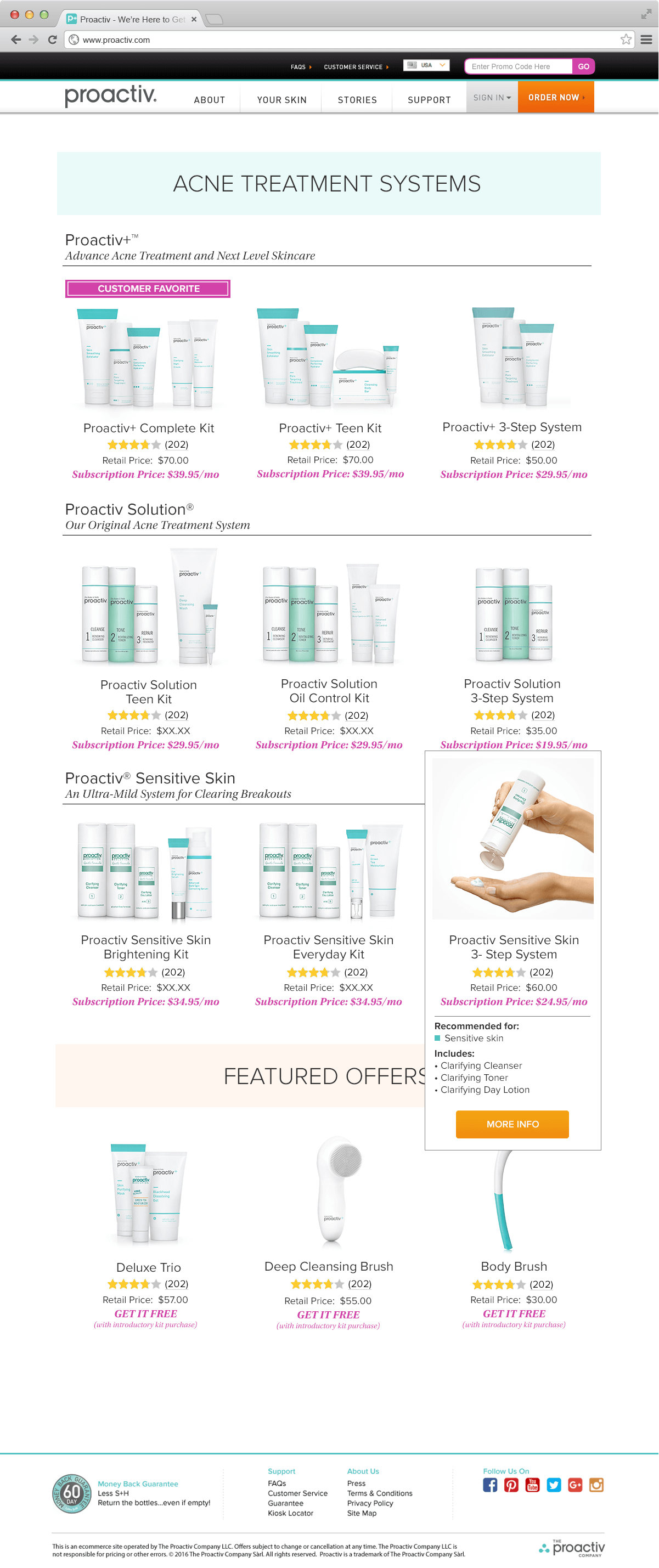
The goal was to create an immersive experience for our site’s users that allows them to customize their box of products and treat their acne over it’s live cycle. The front facing site had to be redesigned to cater to the new design aesthetic as well as work as a funnel for users to sign up for the continuity program.
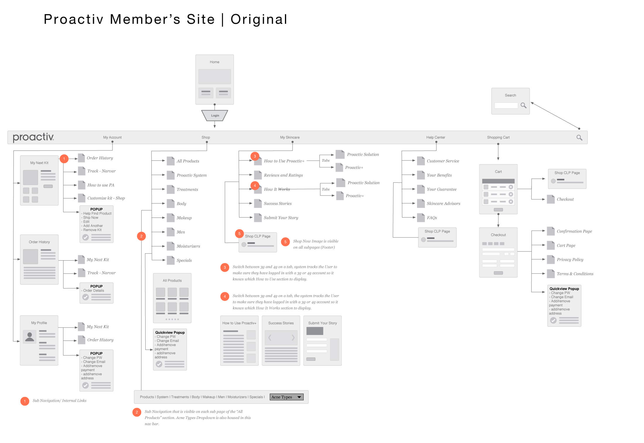
The Original Member’s Site
Proactiv’s first member’s site was convoluted, unresponsive, and didn’t inform the user with kit alterations, product limitations, and terms of customization.
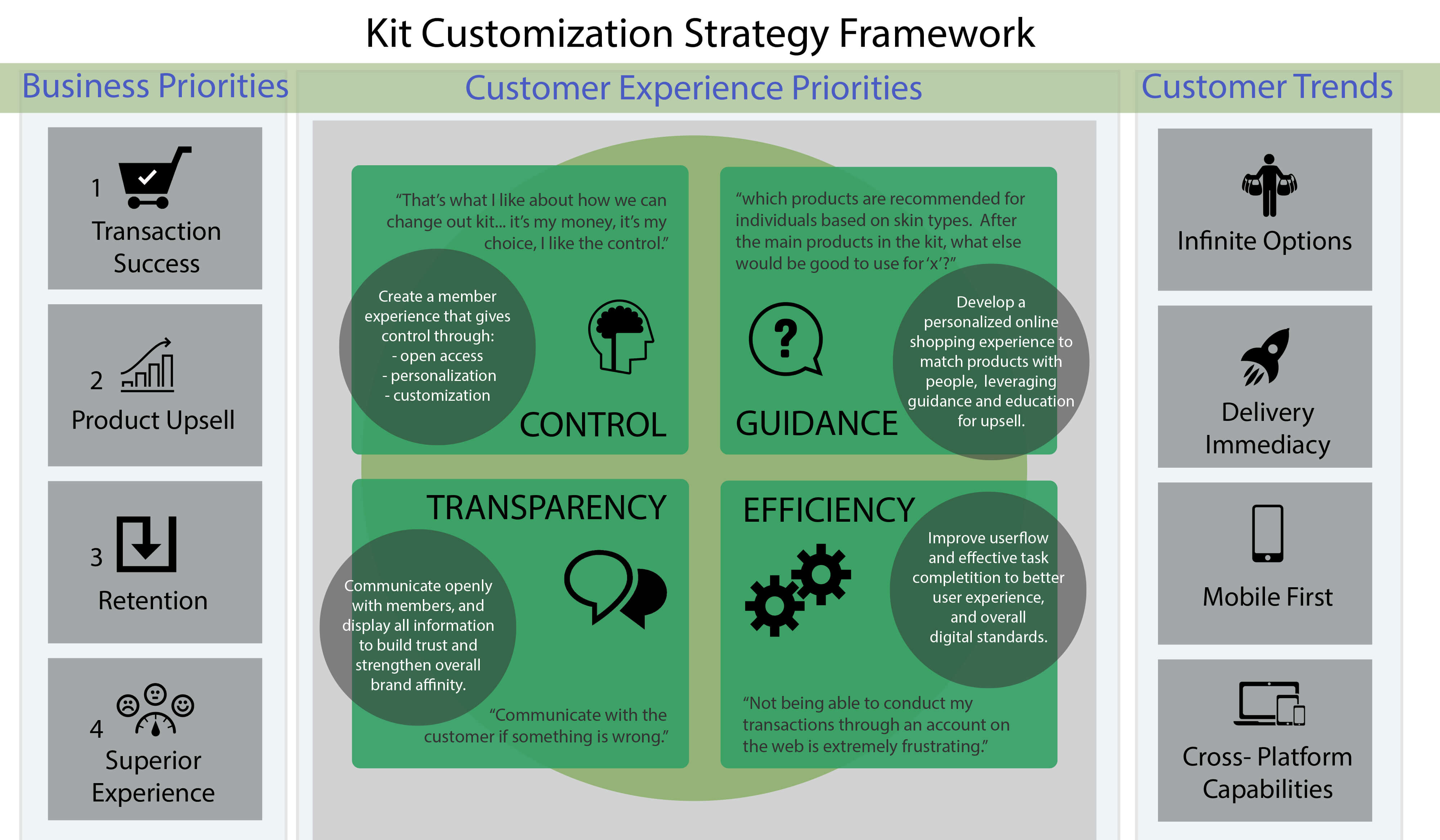
I worked with a two designers, brand stakeholders, business intelligence, and a front-end engineer. The design team worked to translate the business goals into a user experience that would allow the distillation of consumer behavior and motivations.
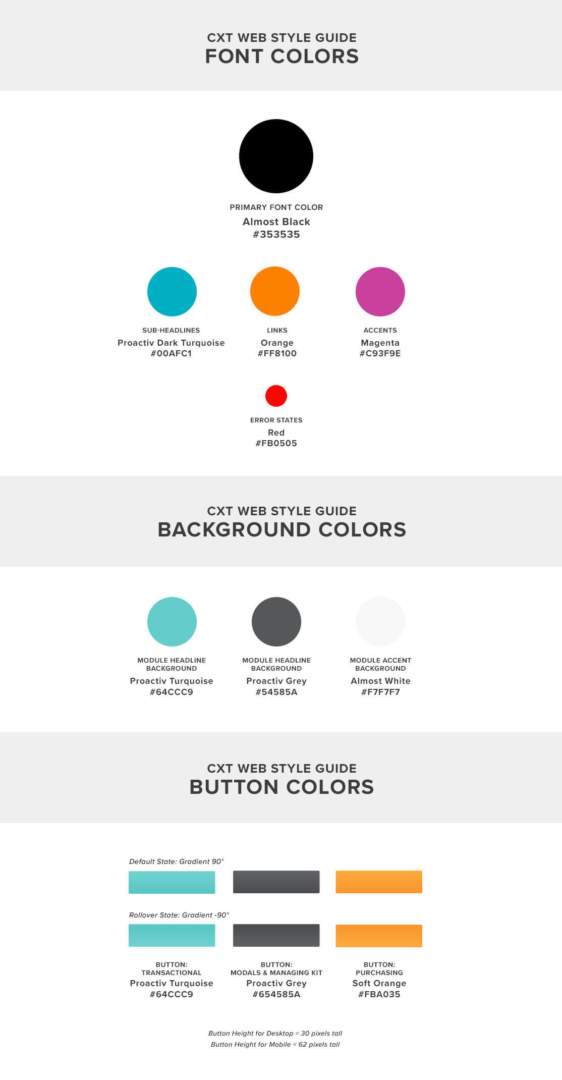
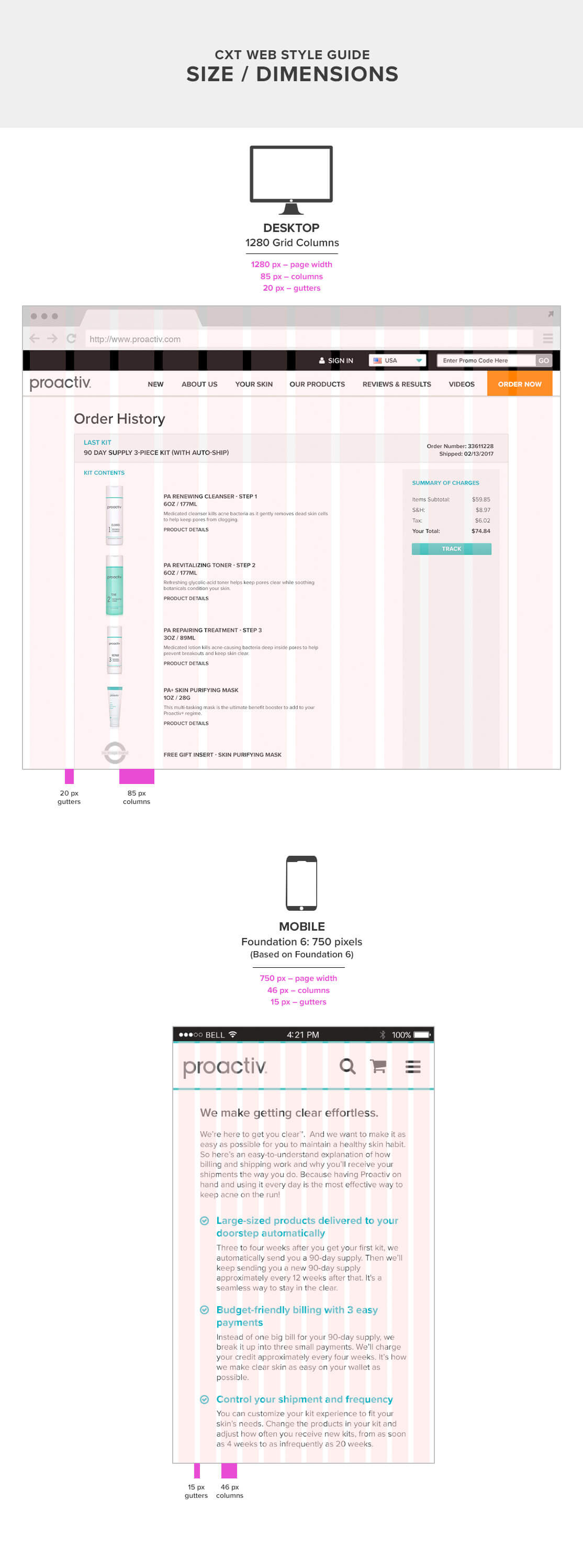
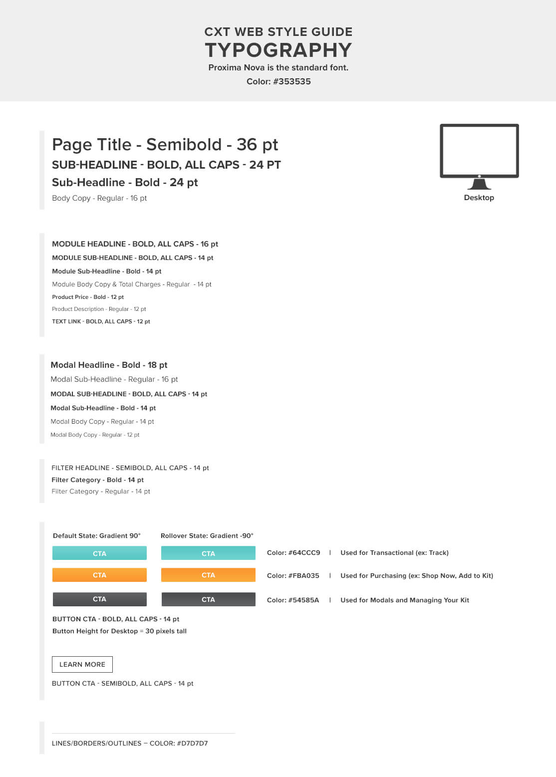
The design team and I built out templated style guides, sizing frameworks, and prototypes to explain the overall vision and end goals to the stakeholders.
The project manager acted as our initial stakeholder which allowed the team to have a fulcrum to evangelize customer goals and their relation to the overarching business goals.
The project manager built out the stakeholders needs into epics using JIRA. Each task was then vetted by the entire team so the workload was shared, understood, and communication remained transparent.
The team worked to collaborate on white boarding sessions, rapid sketching, and data gathering – based upon our then current knowledge of our users and their purchasing decisions. I executed user journeys, wireframes, prototypes and assisted with design specification creation.
The internal review process allowed the design team to work at an iterative pace with the business stakeholders to get sign off during the initial concept stages. Once the design team was at the prototype stage the stakeholders only had to sign off on the brand aesthetics because functionality, high-level design guidelines, and marketing had already been agreed upon.
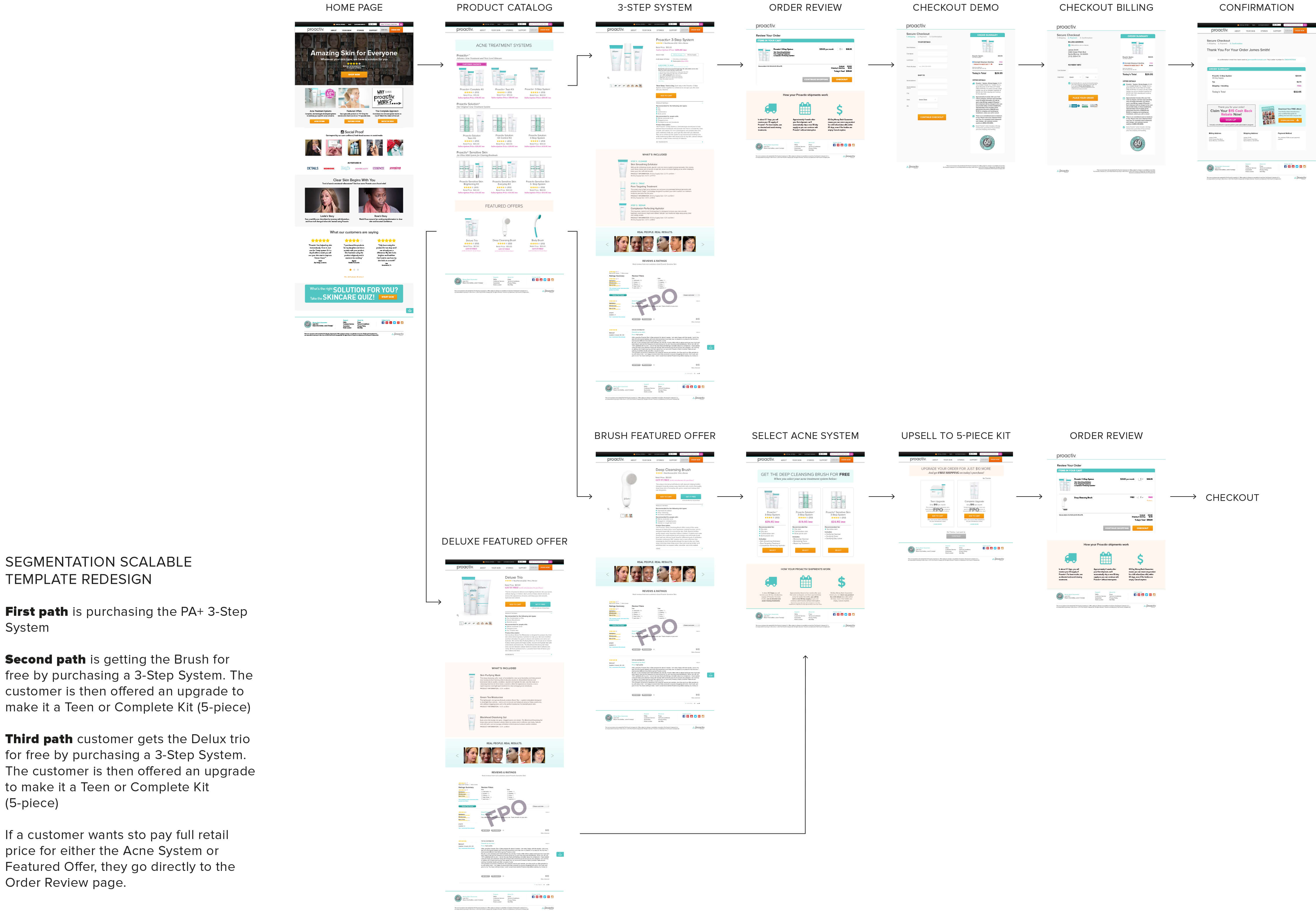
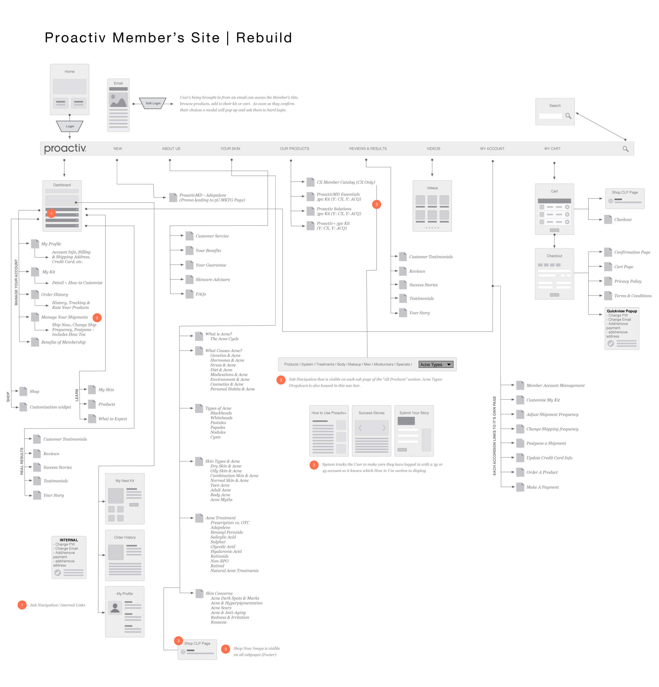
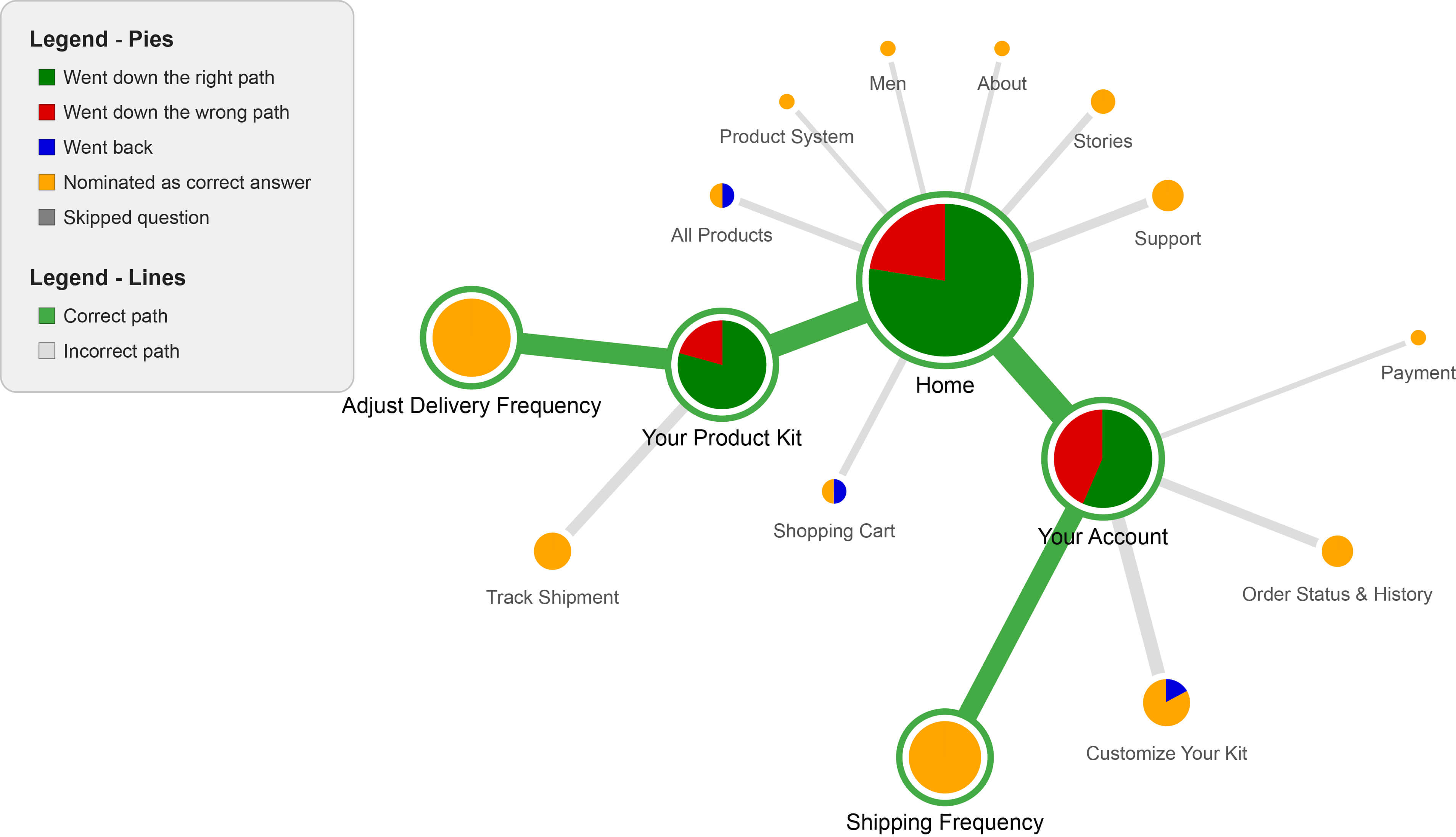
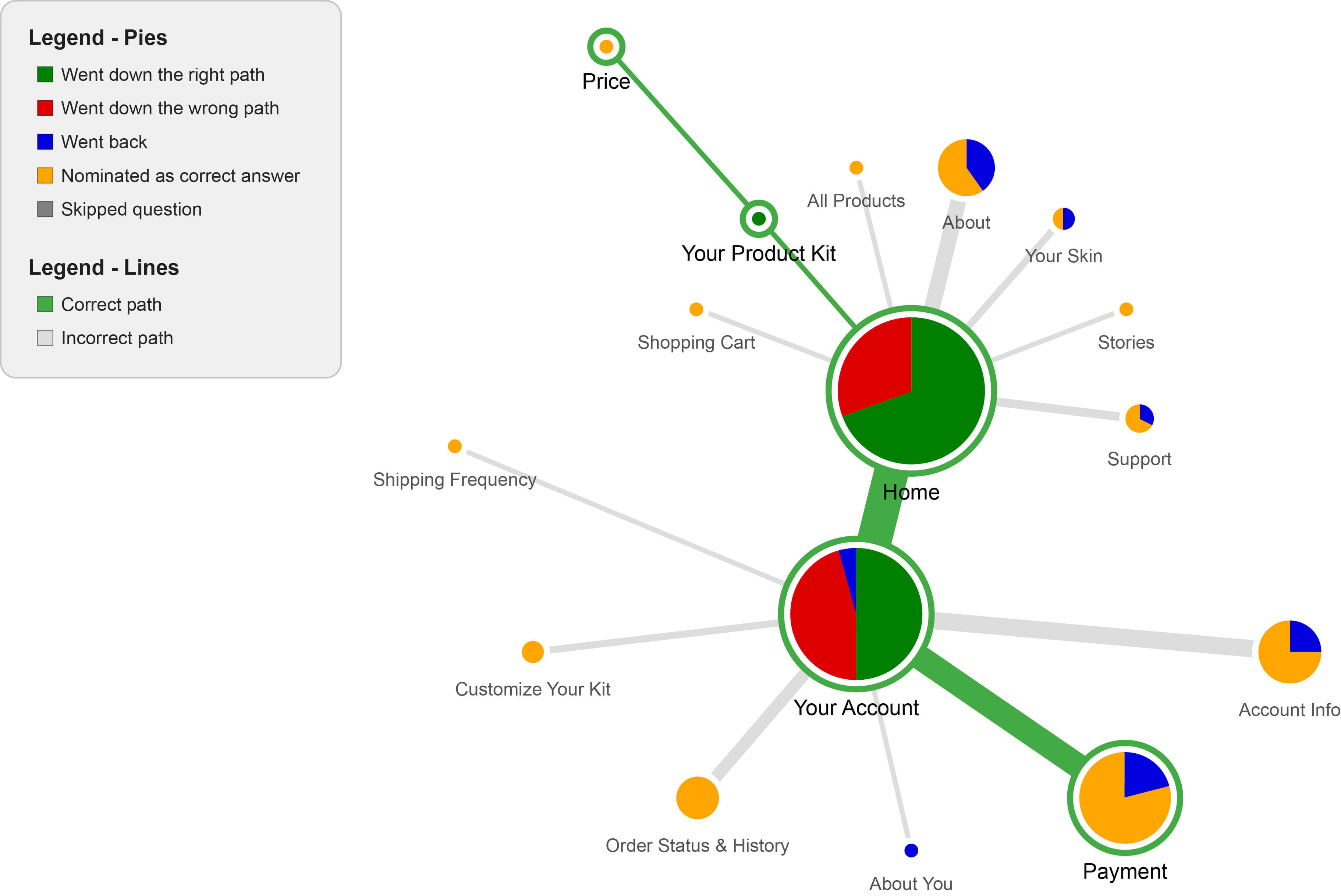
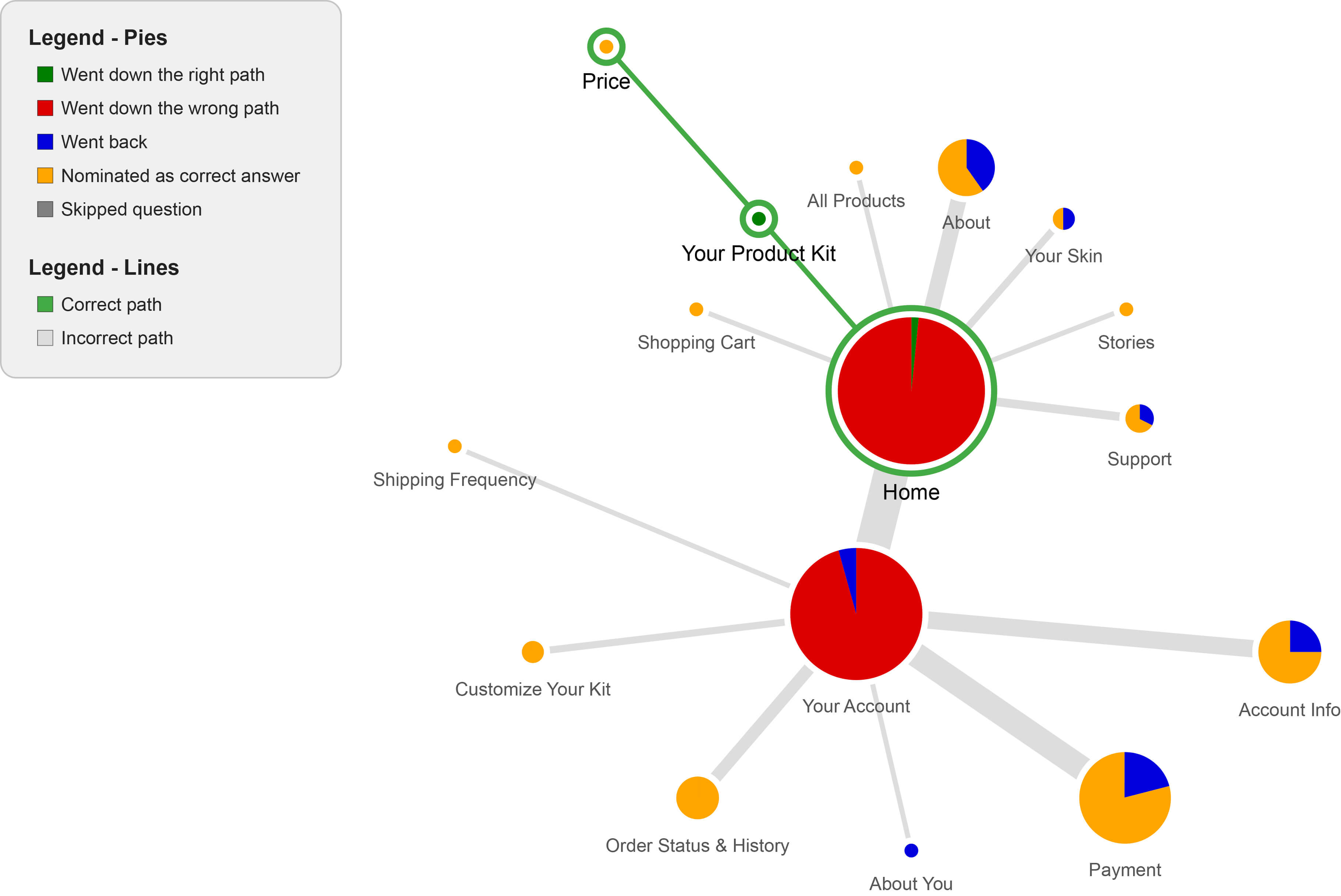
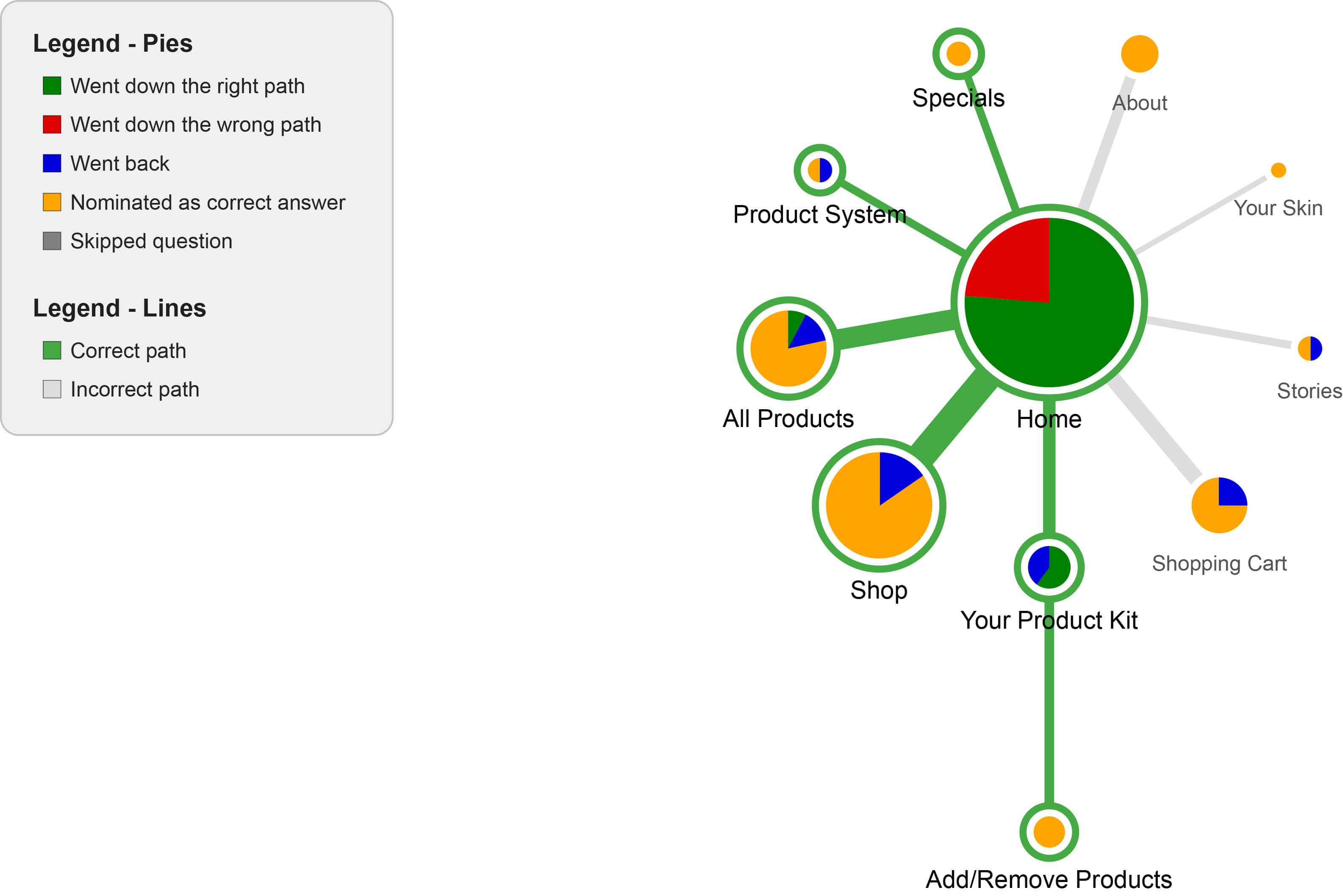
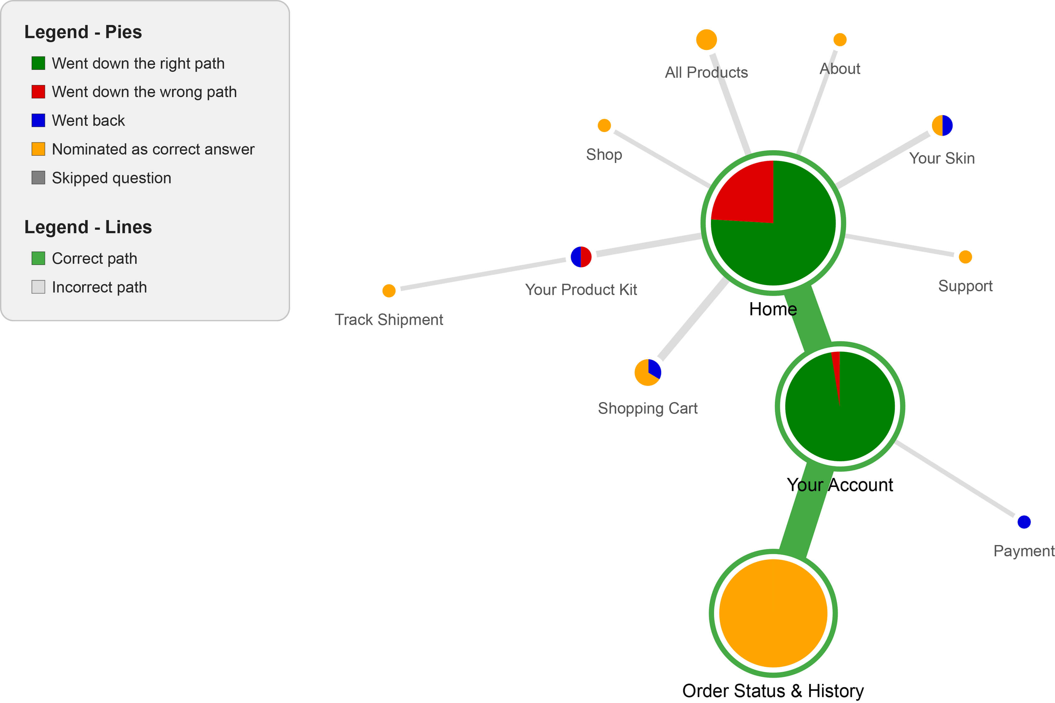
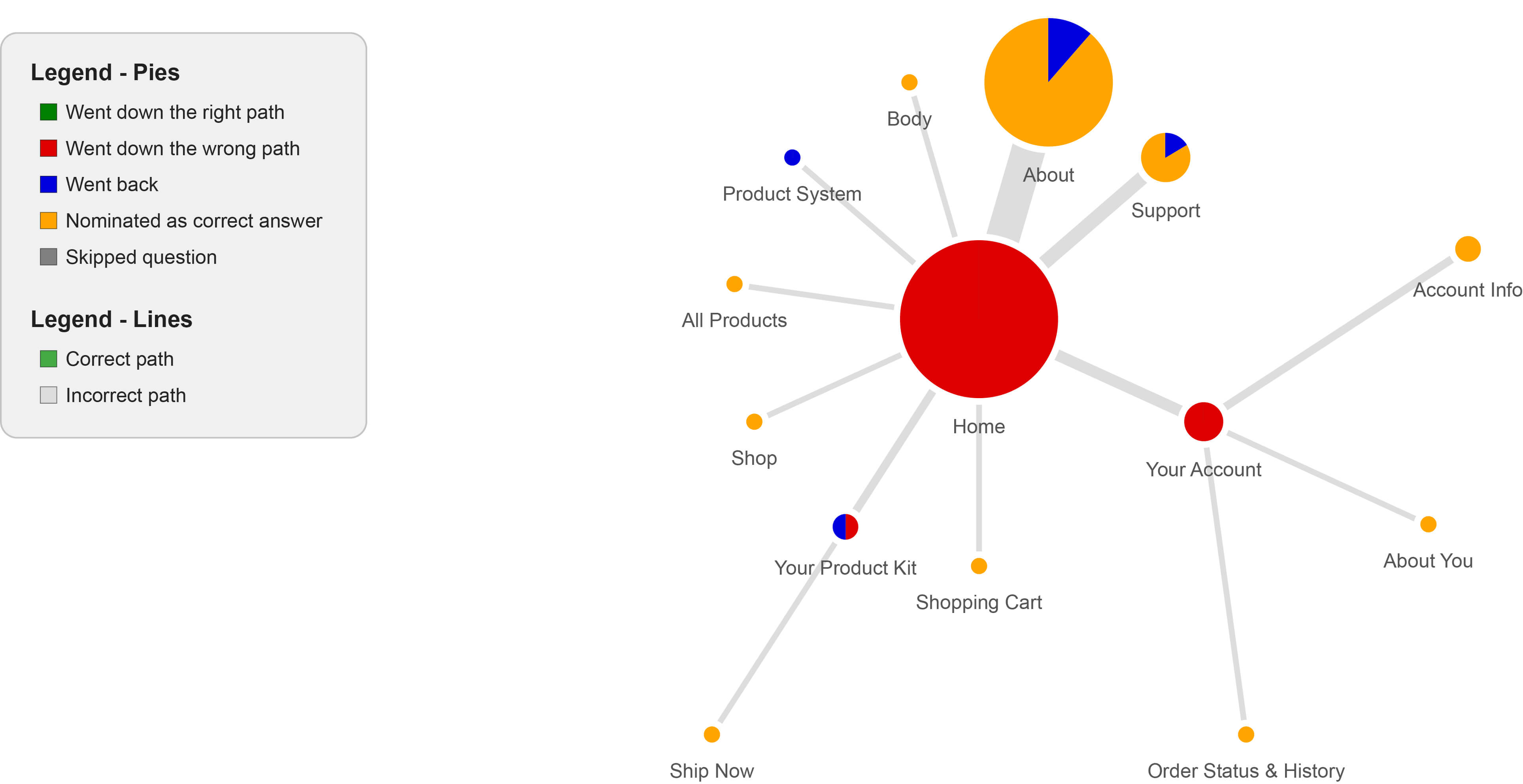
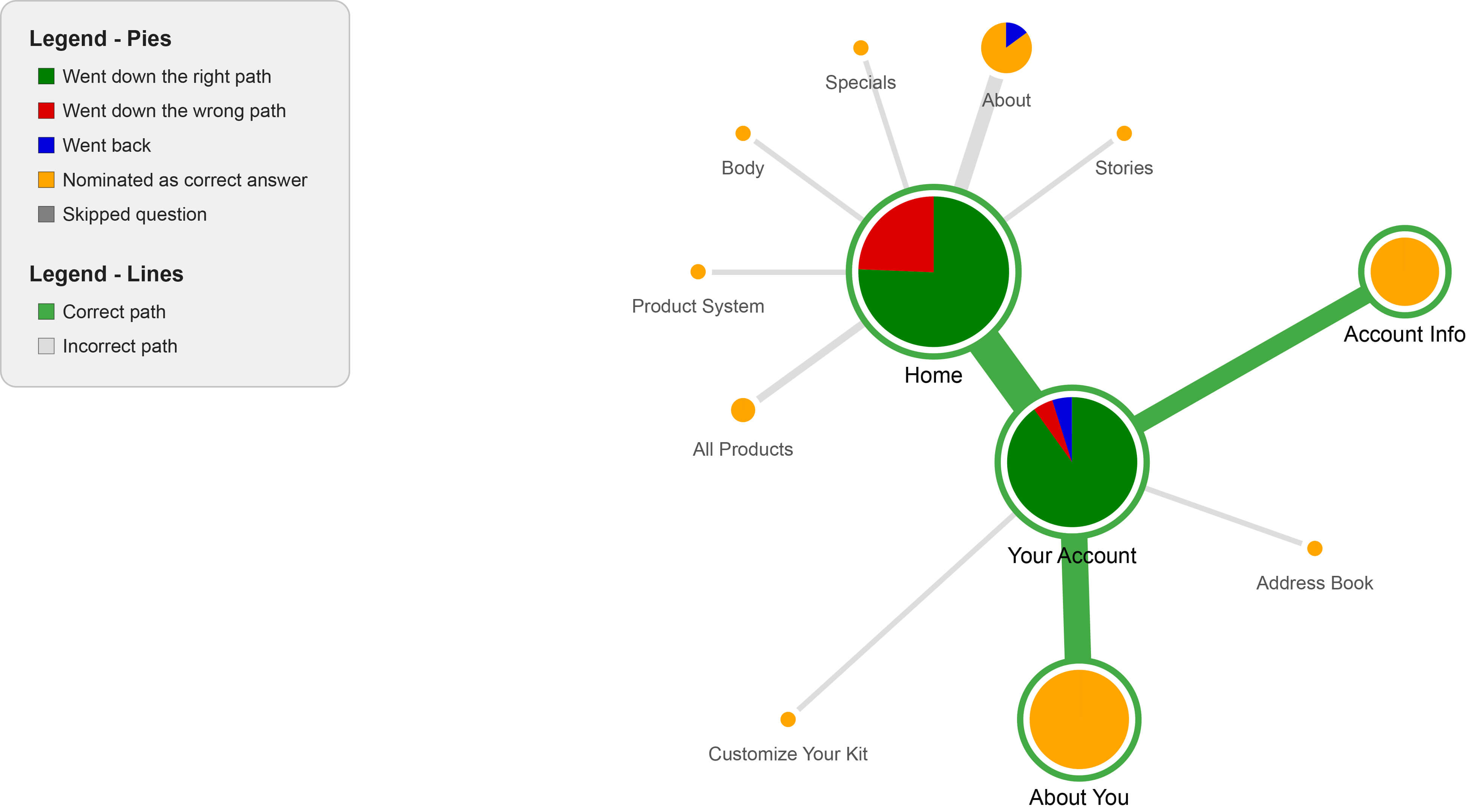
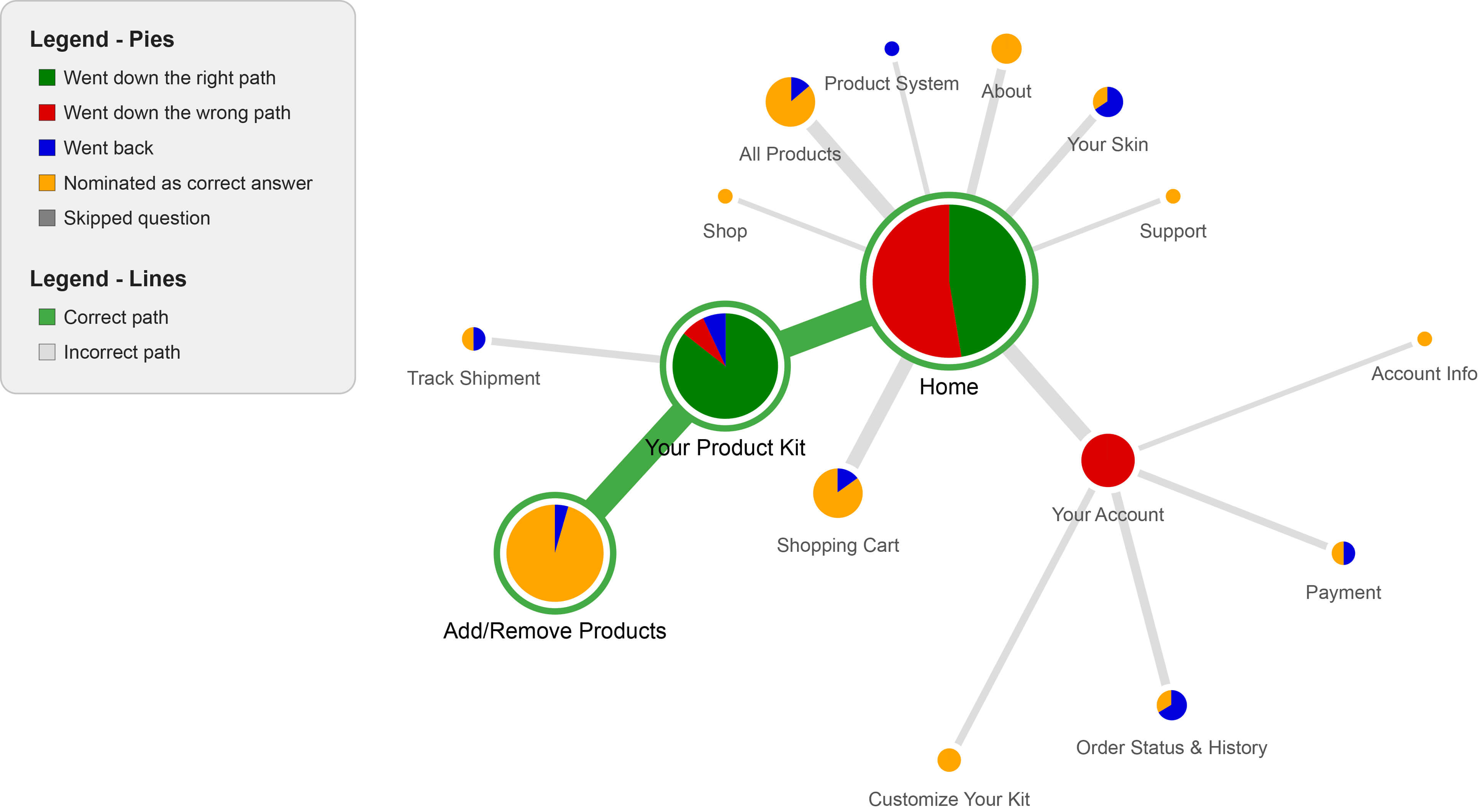
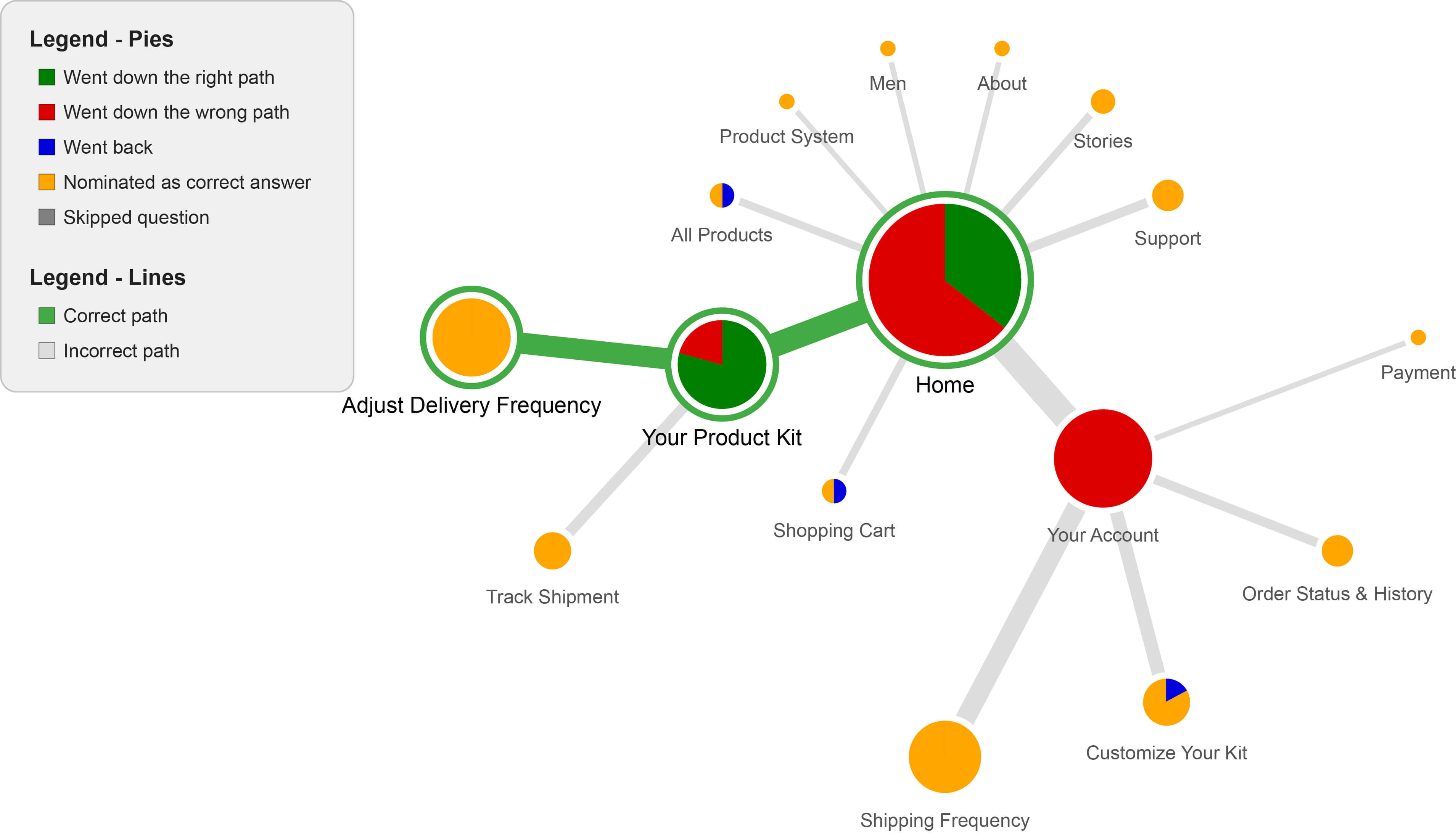
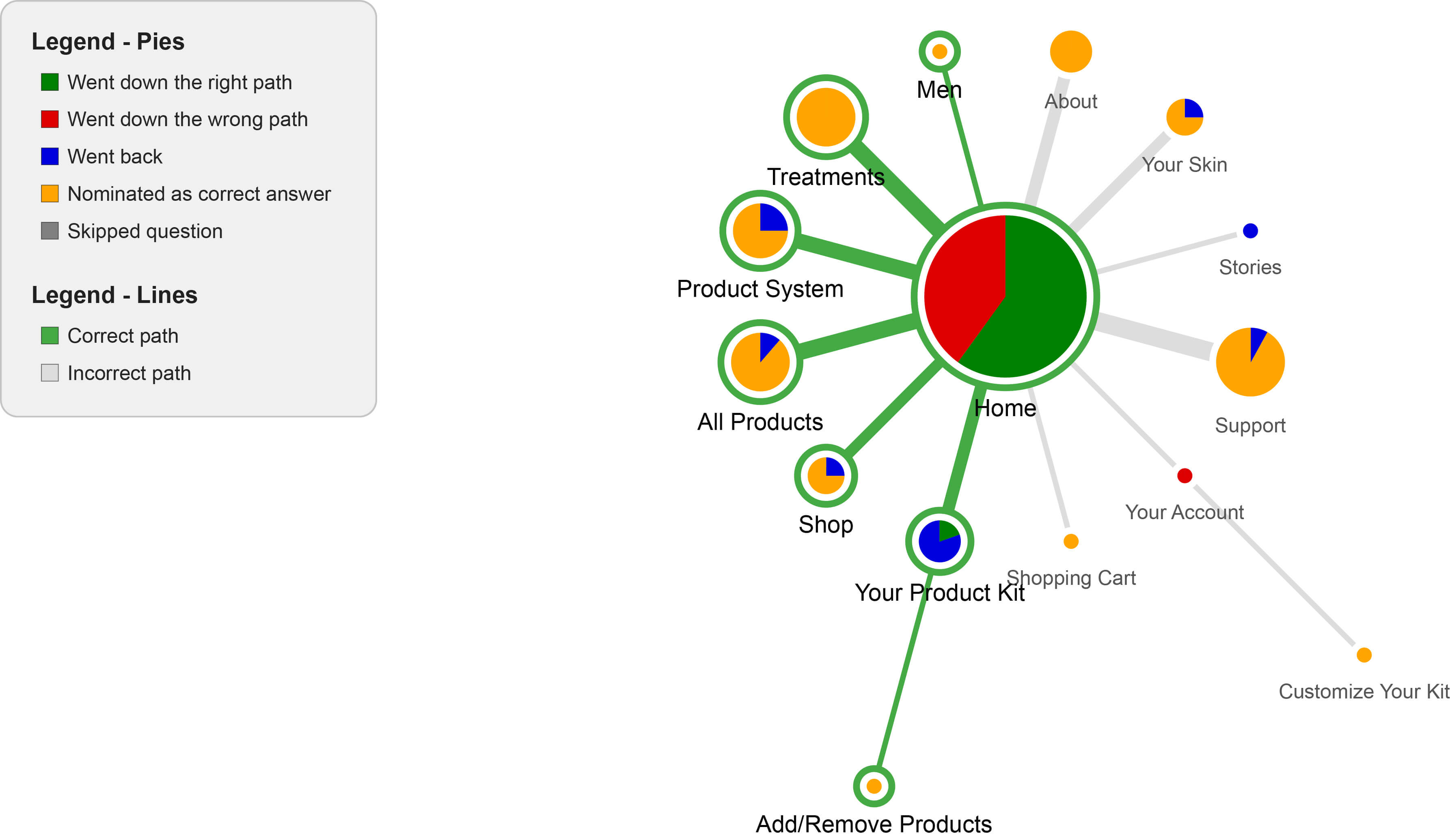
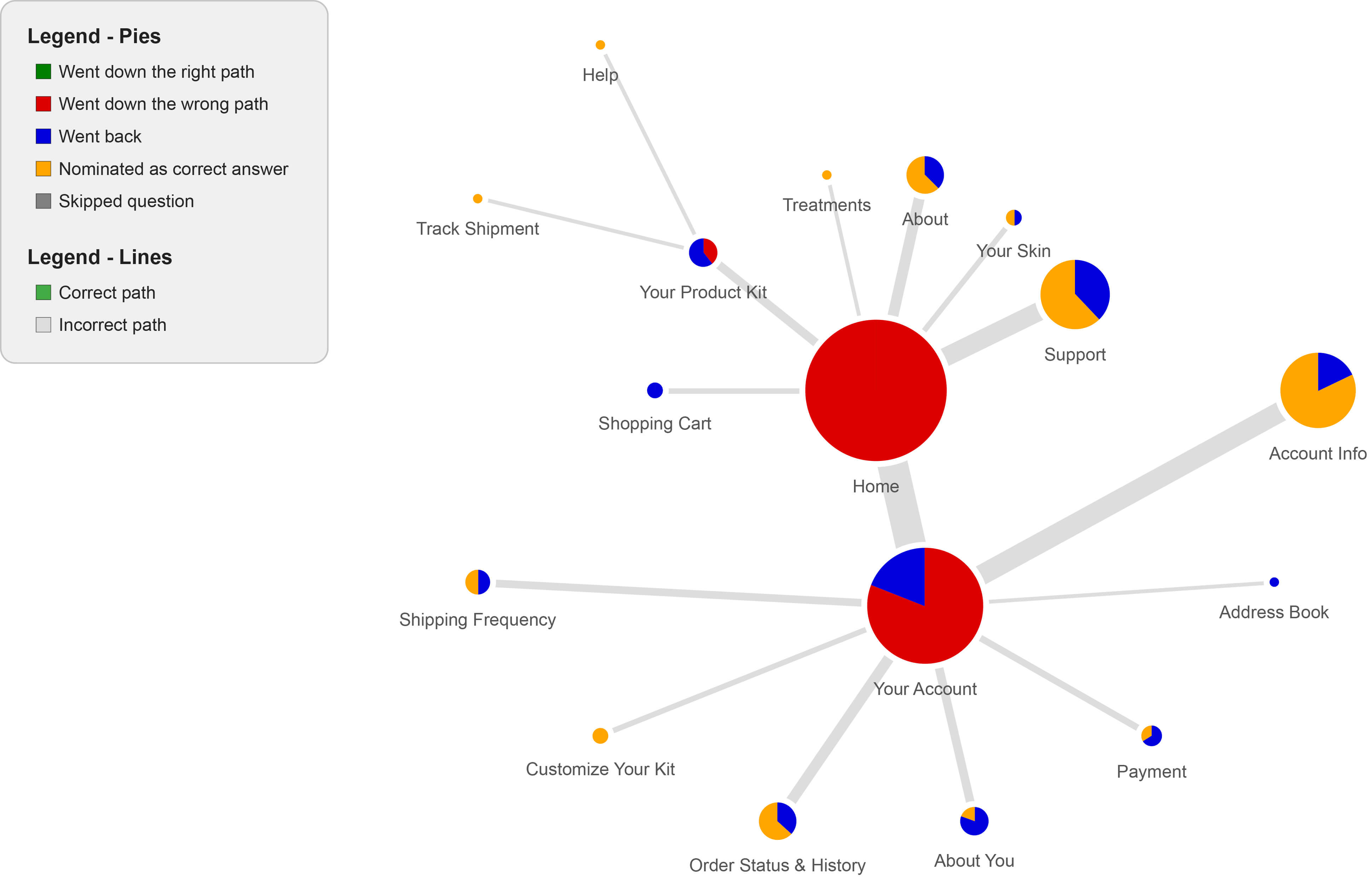
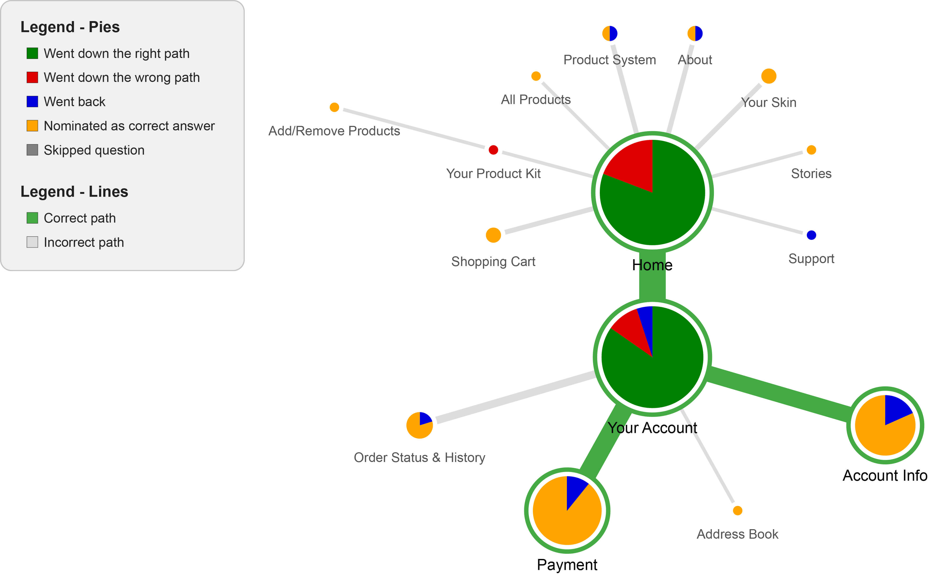
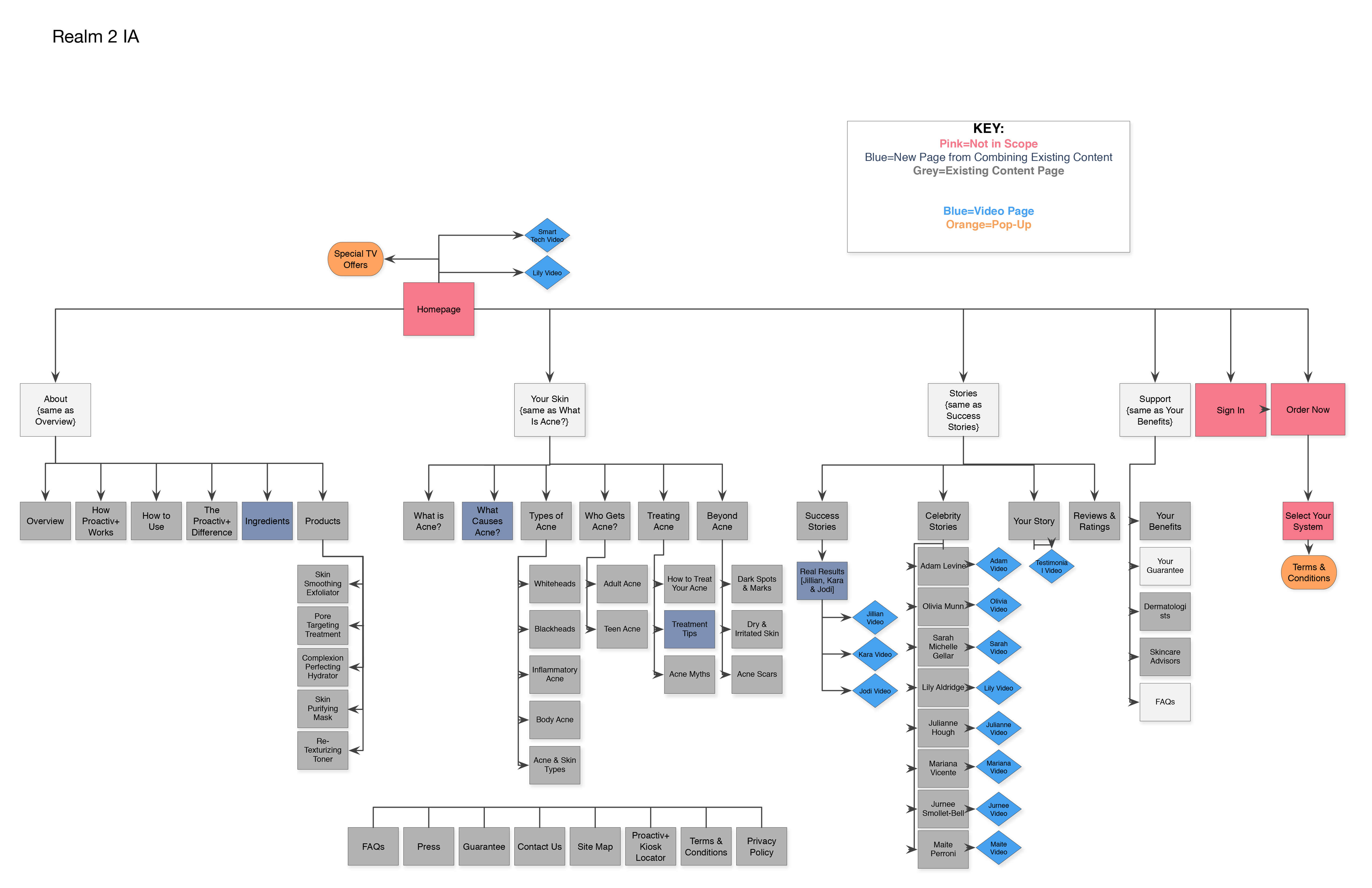
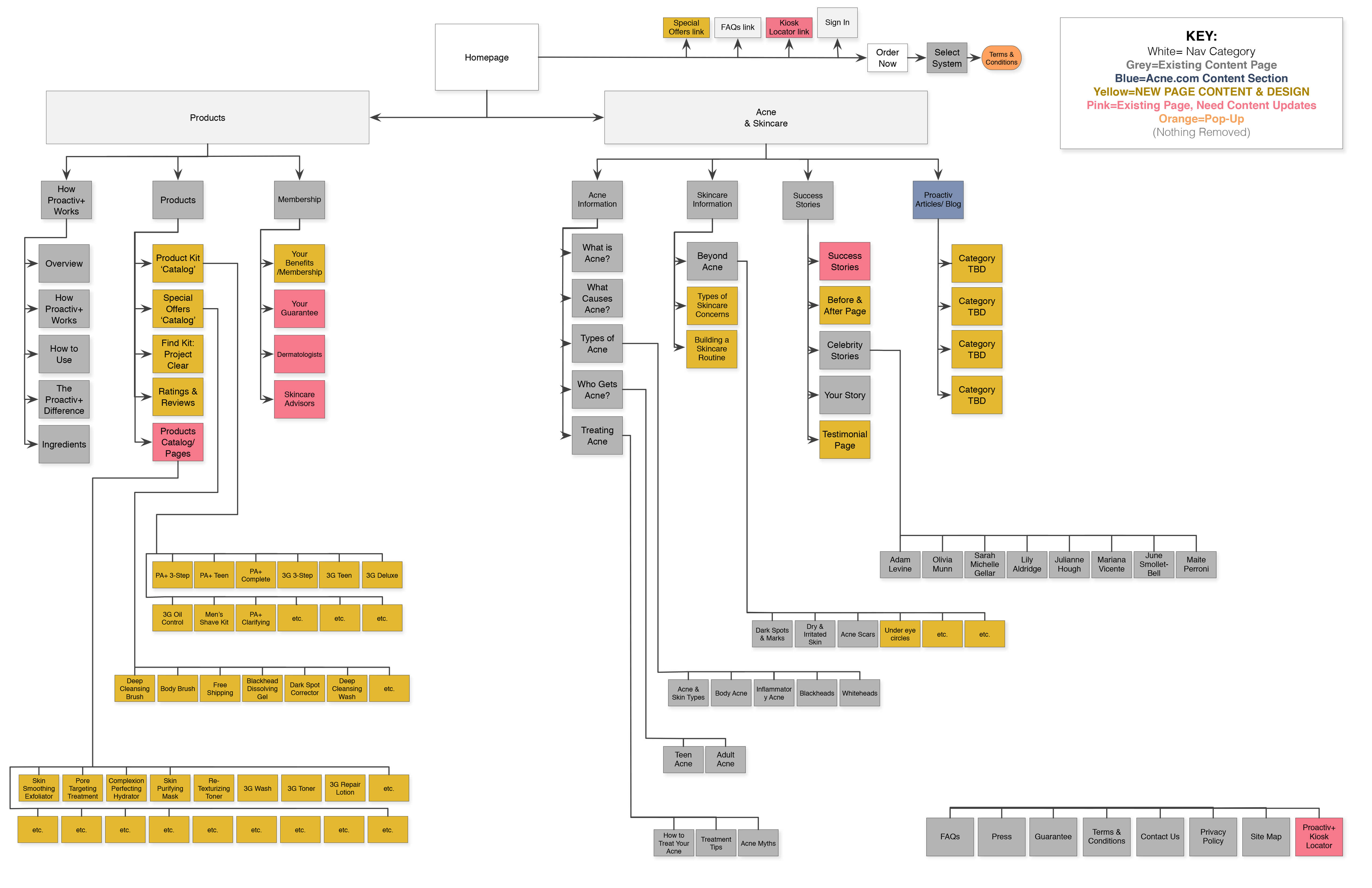
To test the new website navigation hierarchy we performed tree testing for evaluating the find-ability of topics and navigation elements in the new website.
From our initial findings we learned that users were looking for information on the products themselves, before and after testimonials, and most importantly – their own account information.
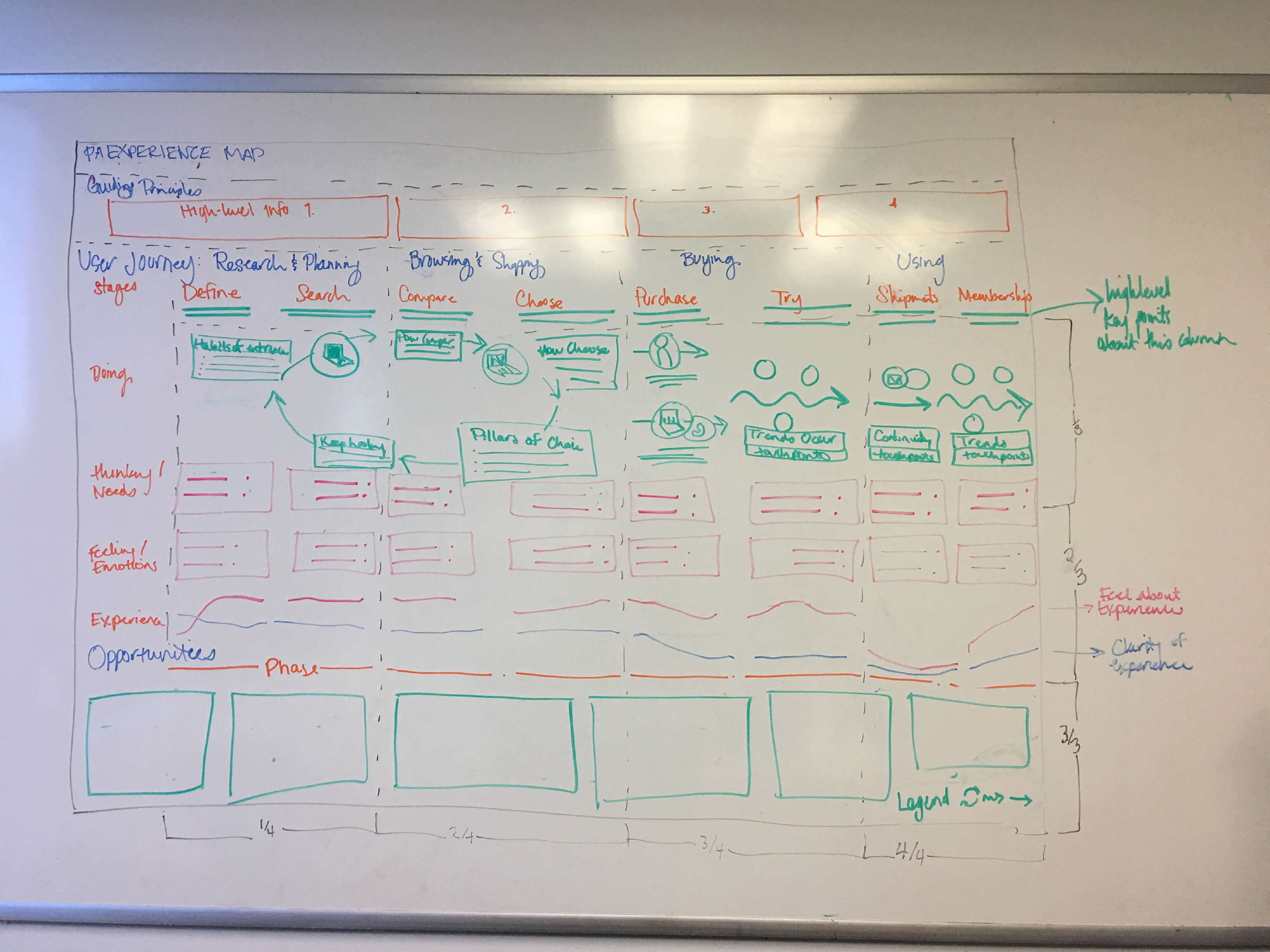
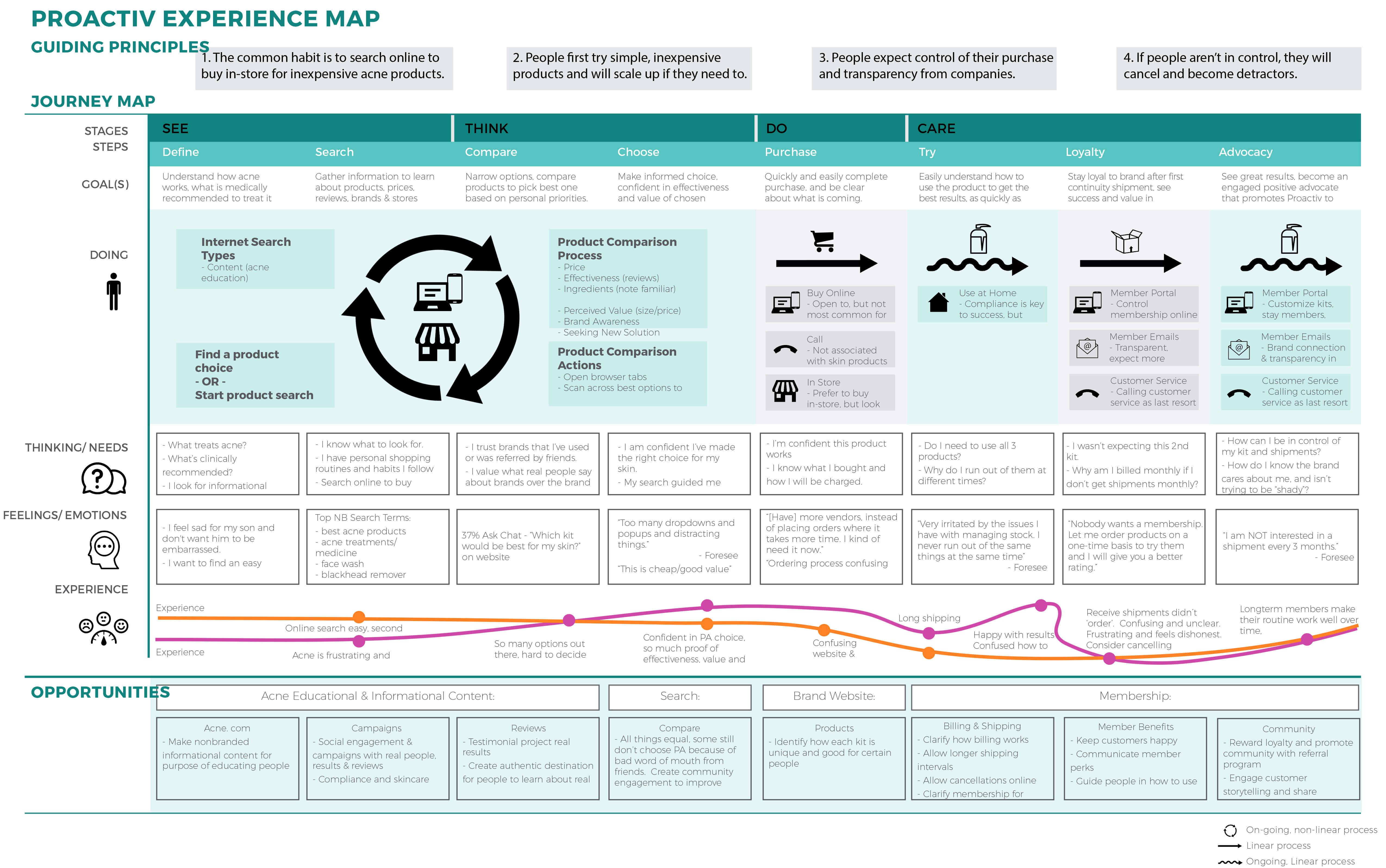
To understand the Heart of the Customer we created this visual story detailing how people interact with the Proactiv brand. Understanding that in real life, a user doesn’t take a linear journey, and different sections of the steps might overlap, for sake of the map we created this as a step-by-step illustration.
We took our general customer/user and divided their path into four swim lanes: phases, actions, thoughts, mindsets/emotions. From here we were able to determine that users finds acne frustrating – which is a given, users found the site confusing – too many drop-downs, the navigation wasn’t intuitive, and when receiving products they didn’t get what they wanted when they wanted. Lastly billing cycles were confusing and frustrating.
We created an experience map to illuminate the current Proactiv member’s site holistic customer experience. Unfortunately it provided a list of pain points and virtually no positives. Fortunately that gave us actionable items to move forward.
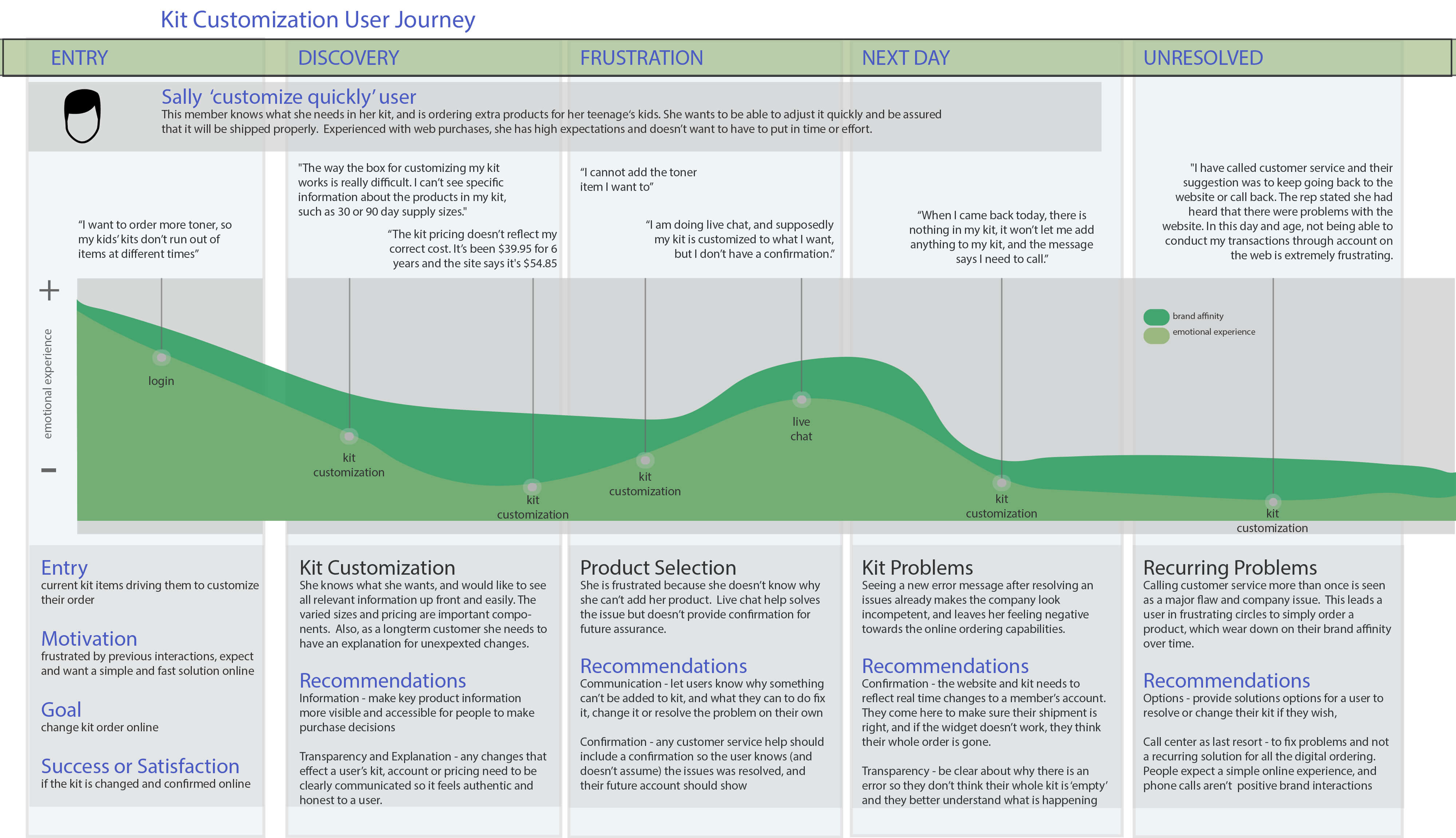
Customers were frustrated by the lack of detailed product information, the lack of information regarding why certain products couldn’t be added to their kits, and the irresolution of error messages that didn’t seem applicable to user’s action.
We resolved to fix these issues with clearer language, step-by-step iteration of products layouts that would alter as each product was chosen to show what could be added to their kits and what was restricted, and limit error messages to the dunning flow – the structure of non-payment.
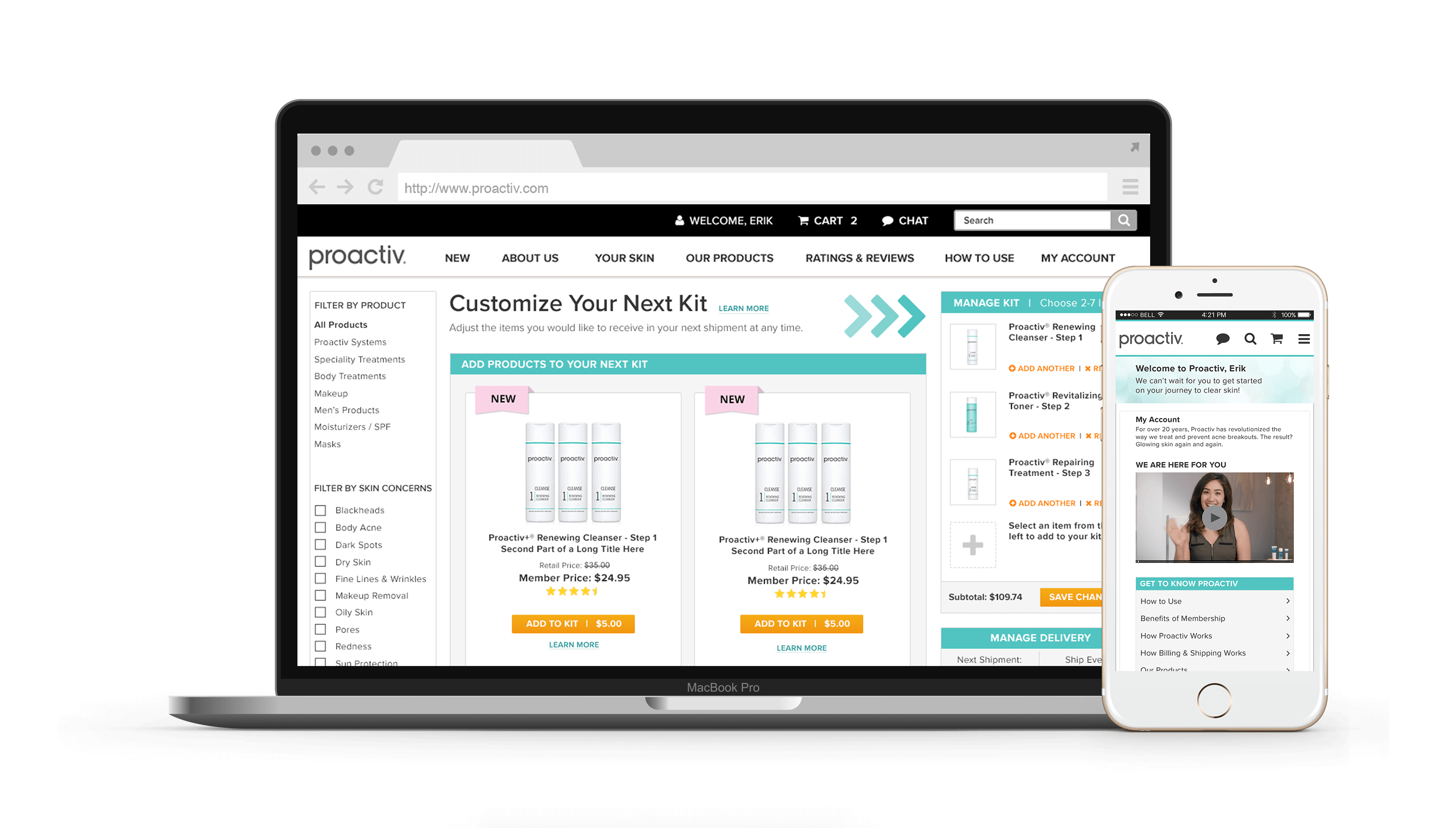
The New Proactiv
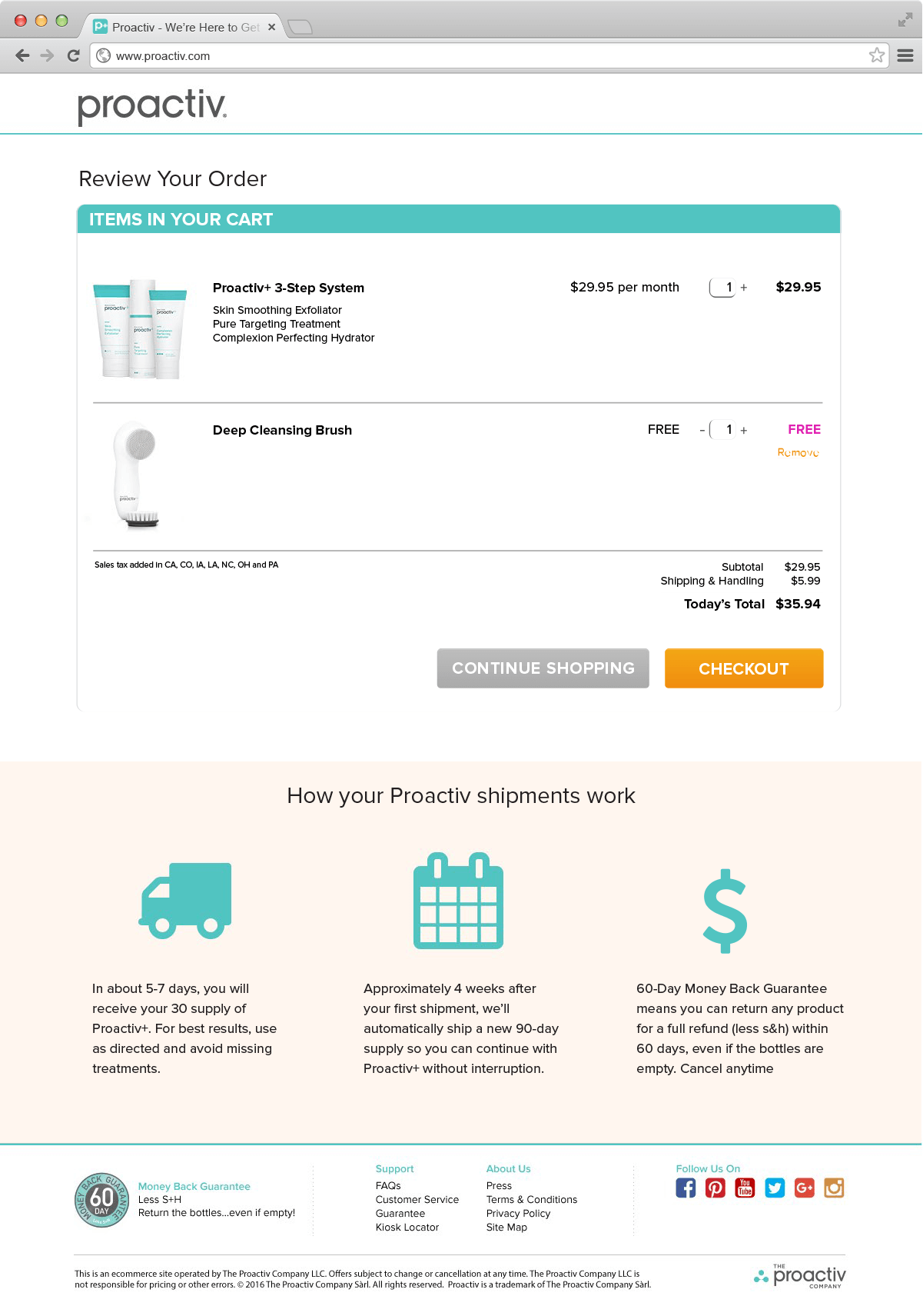
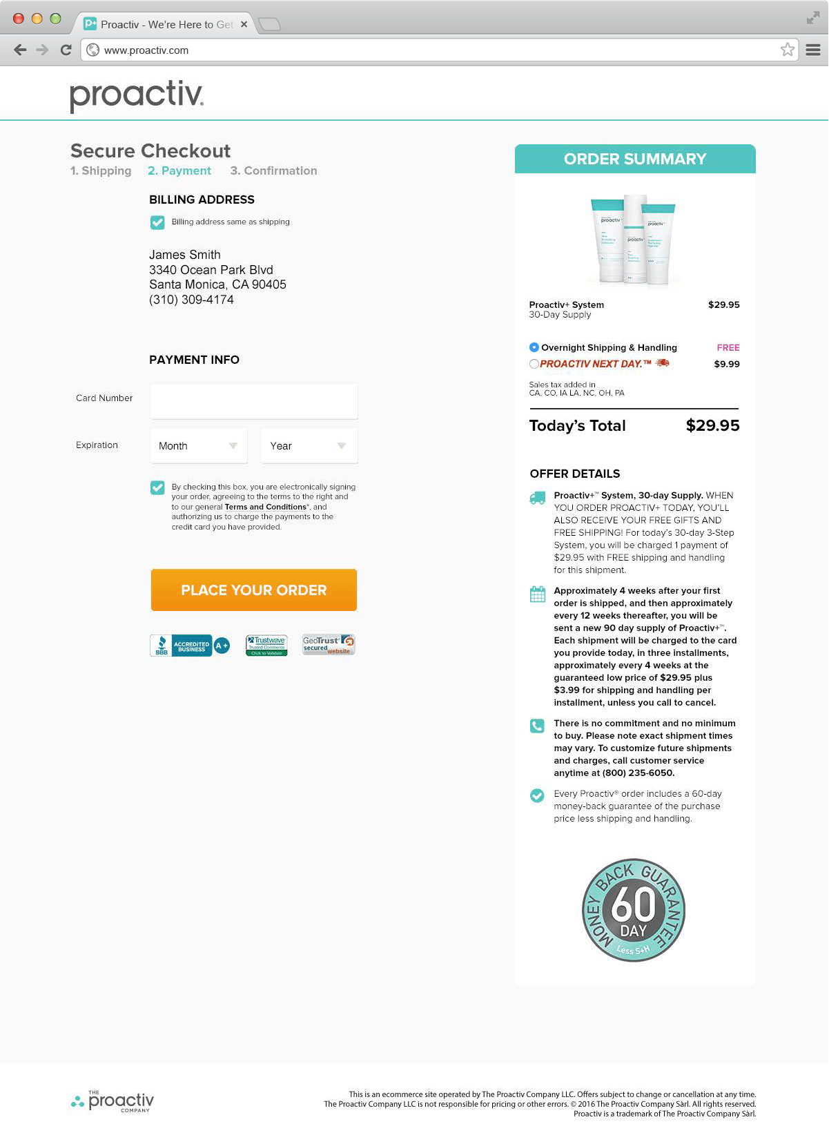
Welcome to the new front-facing Proactiv and the intuitive member’s site. The e-commerce-cart-based-system allows users to understand each product with the hover function and single tap on mobile. The right-hand-side (desktop/laptop) cart solved the user’s problem regarding what they can and cannot add to their personalized kit. Furthermore the filtration system allows the user to drill down to specific Proactiv products quickly, the toggles allow the user to change their shipping and billing all on one page and the top bar has the revamped chat function front-and-center.
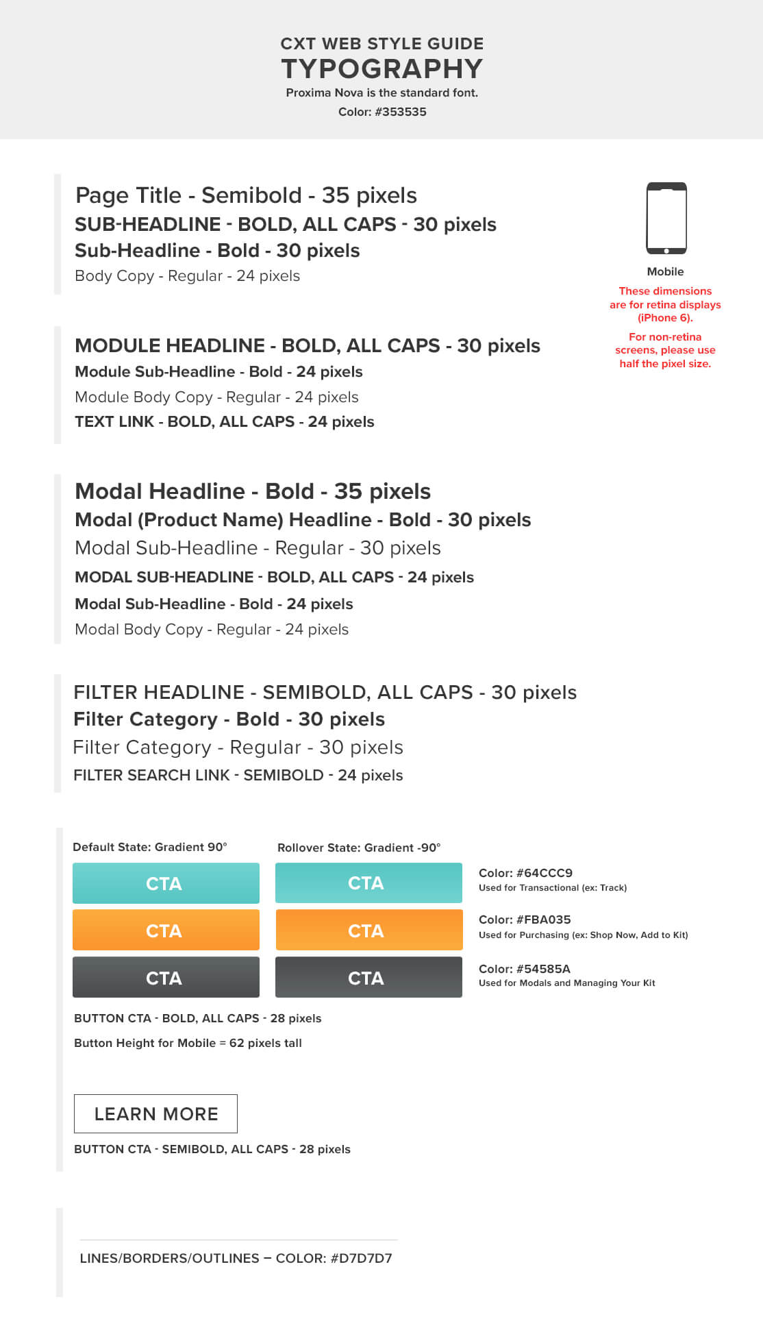
To further this large undertaking on in a timely manner the team and I built out a style guide detailing the necessary UI elements and their scalable systems to allow multiple designers to work on the composition step without falling off brand.
When the site was launched we created video tutorials for educating the users on kit customization and how to make the Proactiv kit customized for themselves.
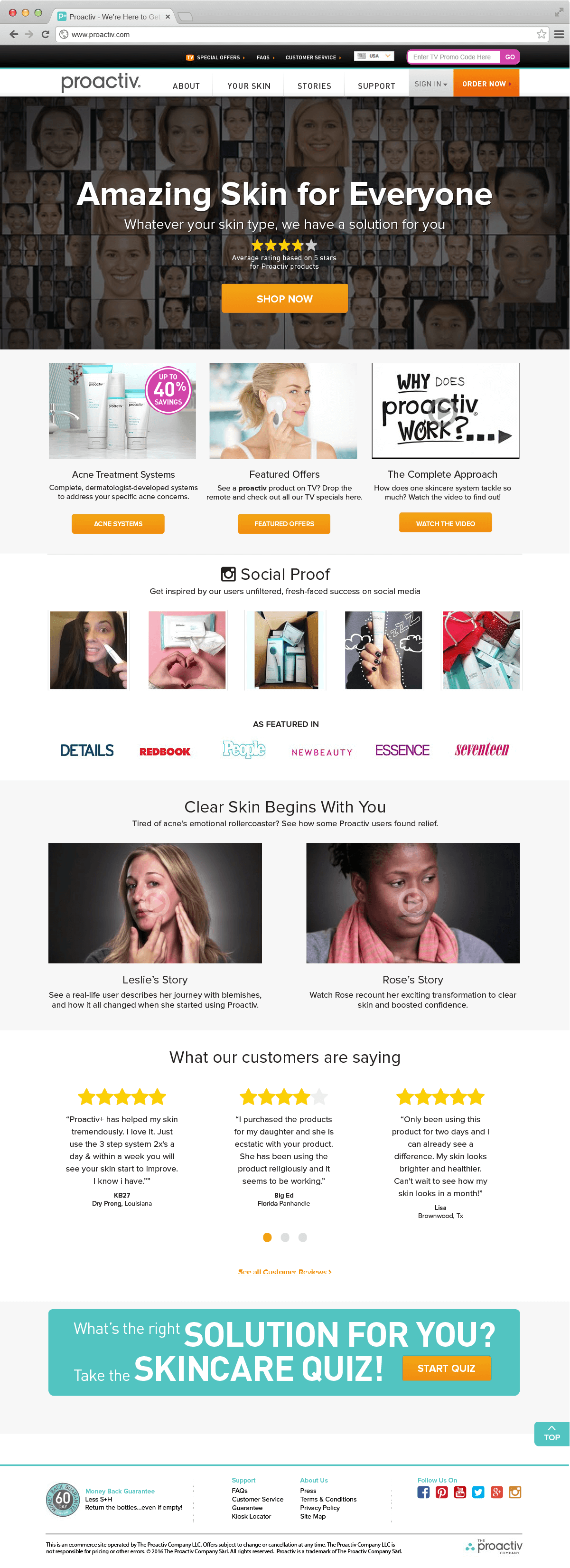
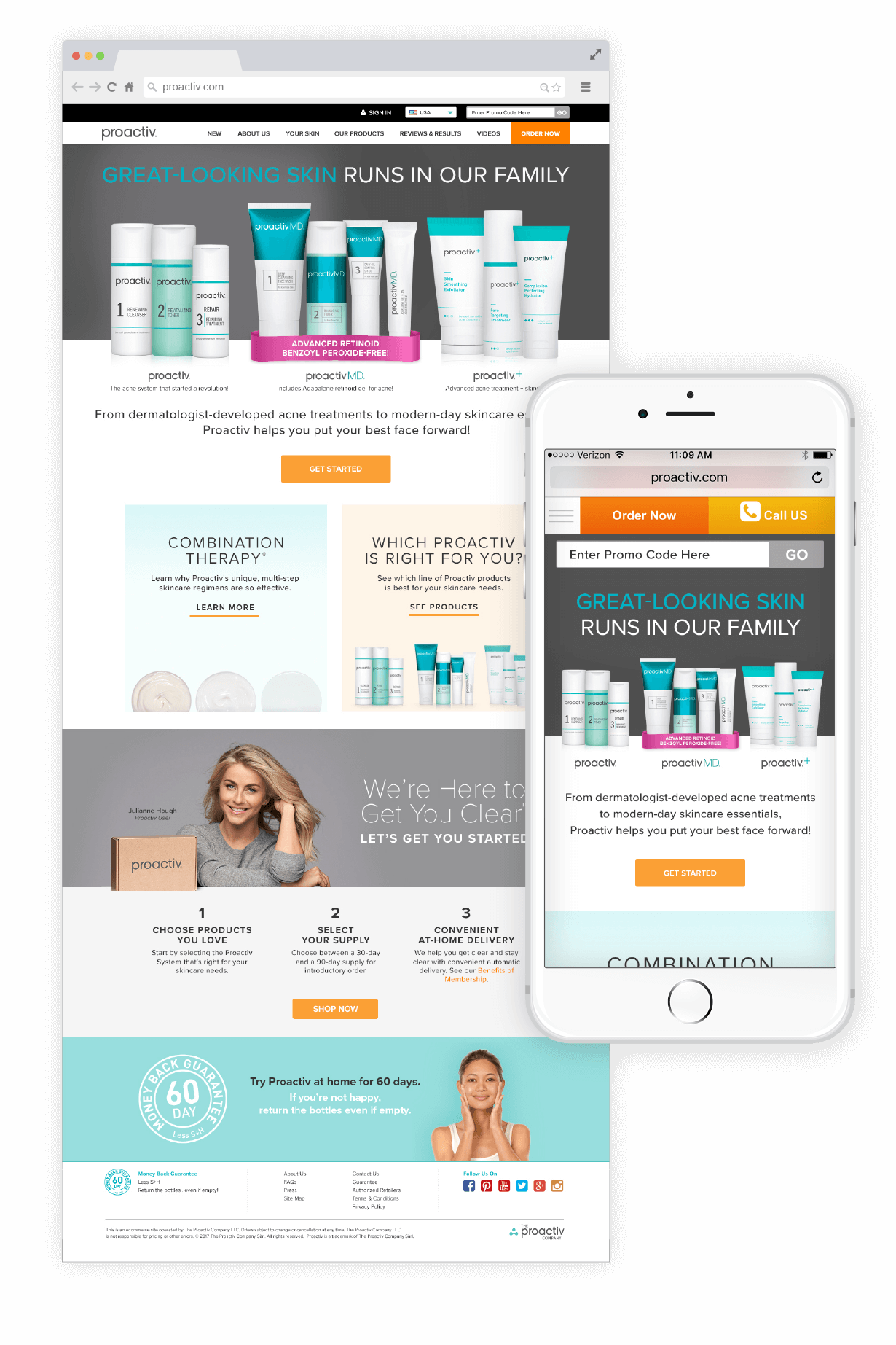
The new front-facing site was launched in conjunction with the member’s site to create a cohesive experience as well as an aesthetic congruence.
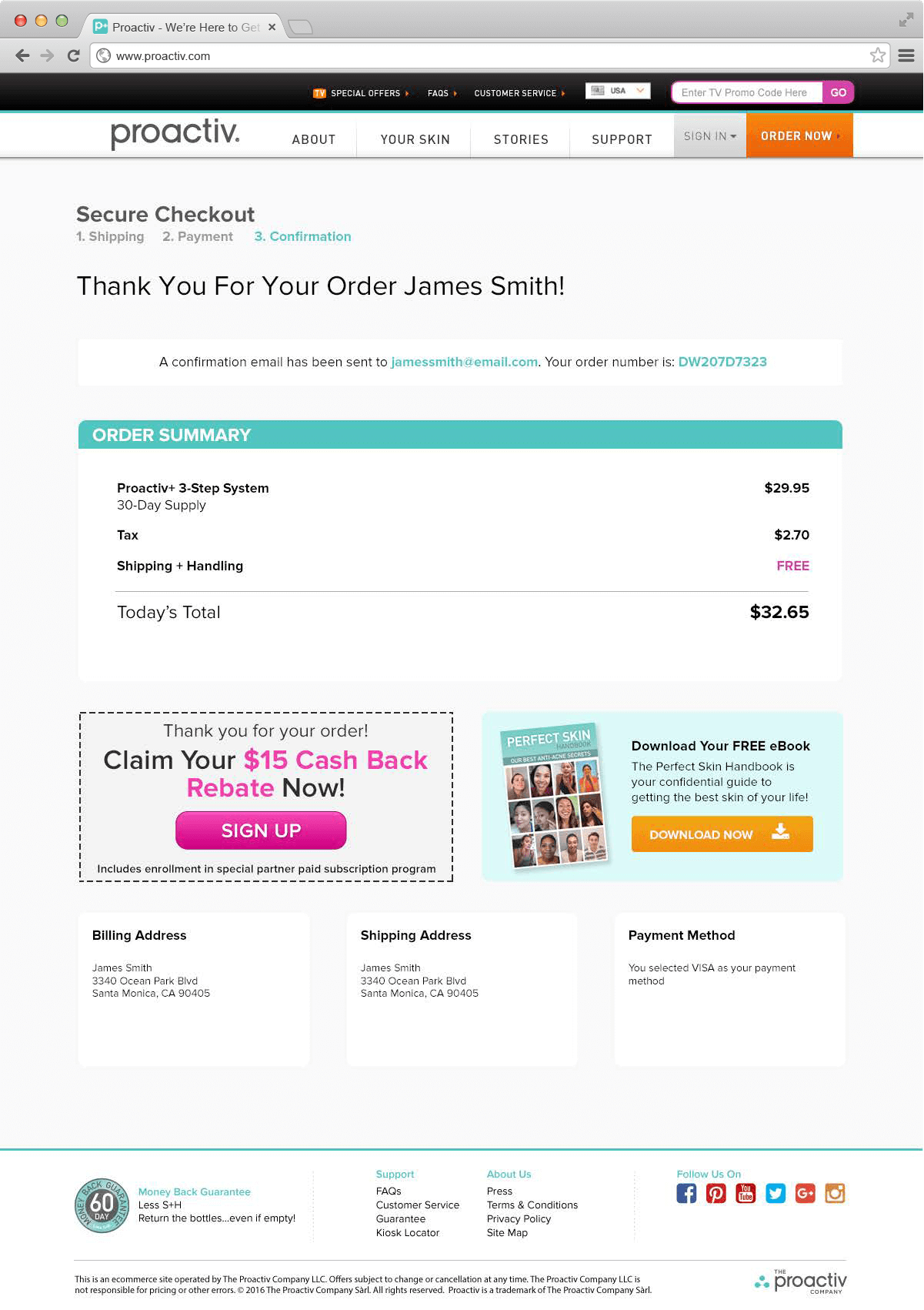
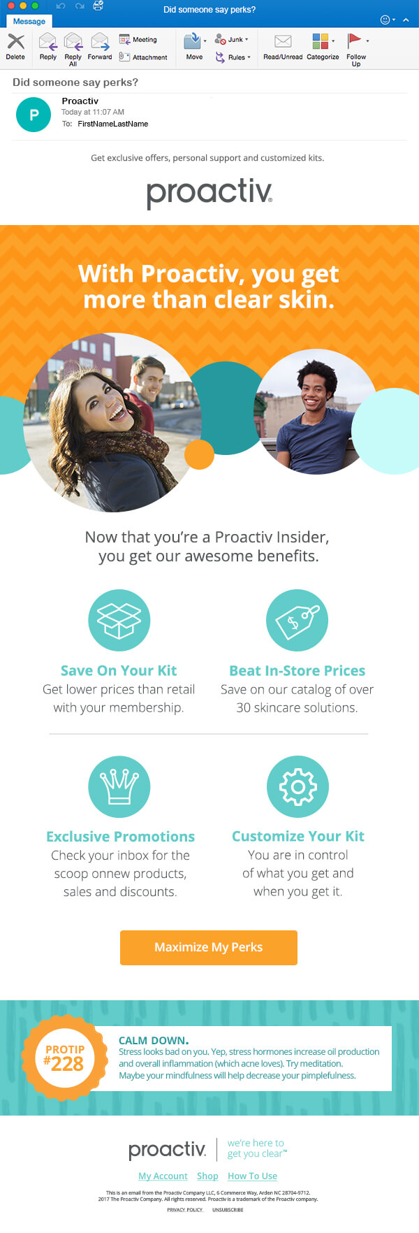
The new email designs drive the user to the new products and member side benefits page.
- Users were finally able to understand the billing cycle per kit delivery time.
- The dunning system – internal to Proactiv – became an actionable error.
- Proactiv was able to segment users into their life-time needs and action off that value proposition.
- Engagement with the member’s site went up exponentially and lead to a greater user understanding of Proactiv’s continuity program.
The redesign of the entire front-facing Proactiv brand and member’s site took a small army and six months from ideation, to testing, to launch. After launch and gathering further data Proactiv can safely say it has an experience to be proud of and an intuitive system for it’s users to get clear.
