The nonsectarian Pinecrest Schools now serves thousands of students from preschool to eighth grade at campuses in Woodland Hills, Thousand Oaks, Moorpark, Simi Valley and Canyon Country in Santa Clarita.
Pinecrest Schools is a private school system that has been serving the Southern California region for over 60 years. Since inception, it’s been providing high quality education to thousands of students at an affordable price. The Founder of the Pinecrest School Disctrict, Edna Mae Dye came to California, from Iowa with her husband, George, and three sons, Robert, Philip, and Don. As a teacher herself, she longed to provide an excellent education to as many students as she could reach. “This then, became the Pinecrest ideal; the intellectual, moral, and physical development of each student.”
In recent years, competition among the nation’s private schools has increased, placing a premium on each school’s reputation and brand. Pinecrest recognized this as an opportunity to reinvent themselves, while maintaining its core values, to increase the school system’s overall enrollment.
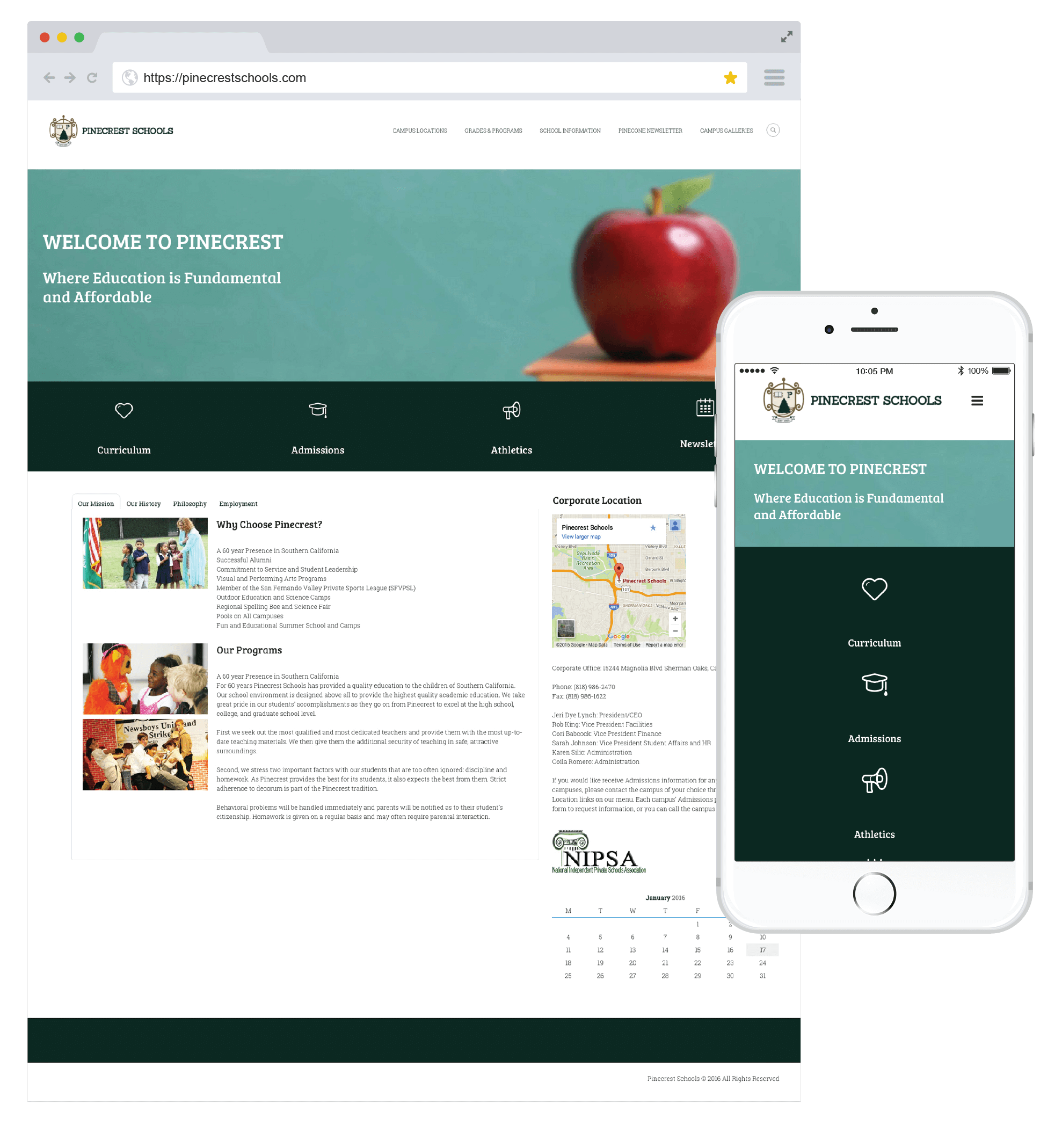
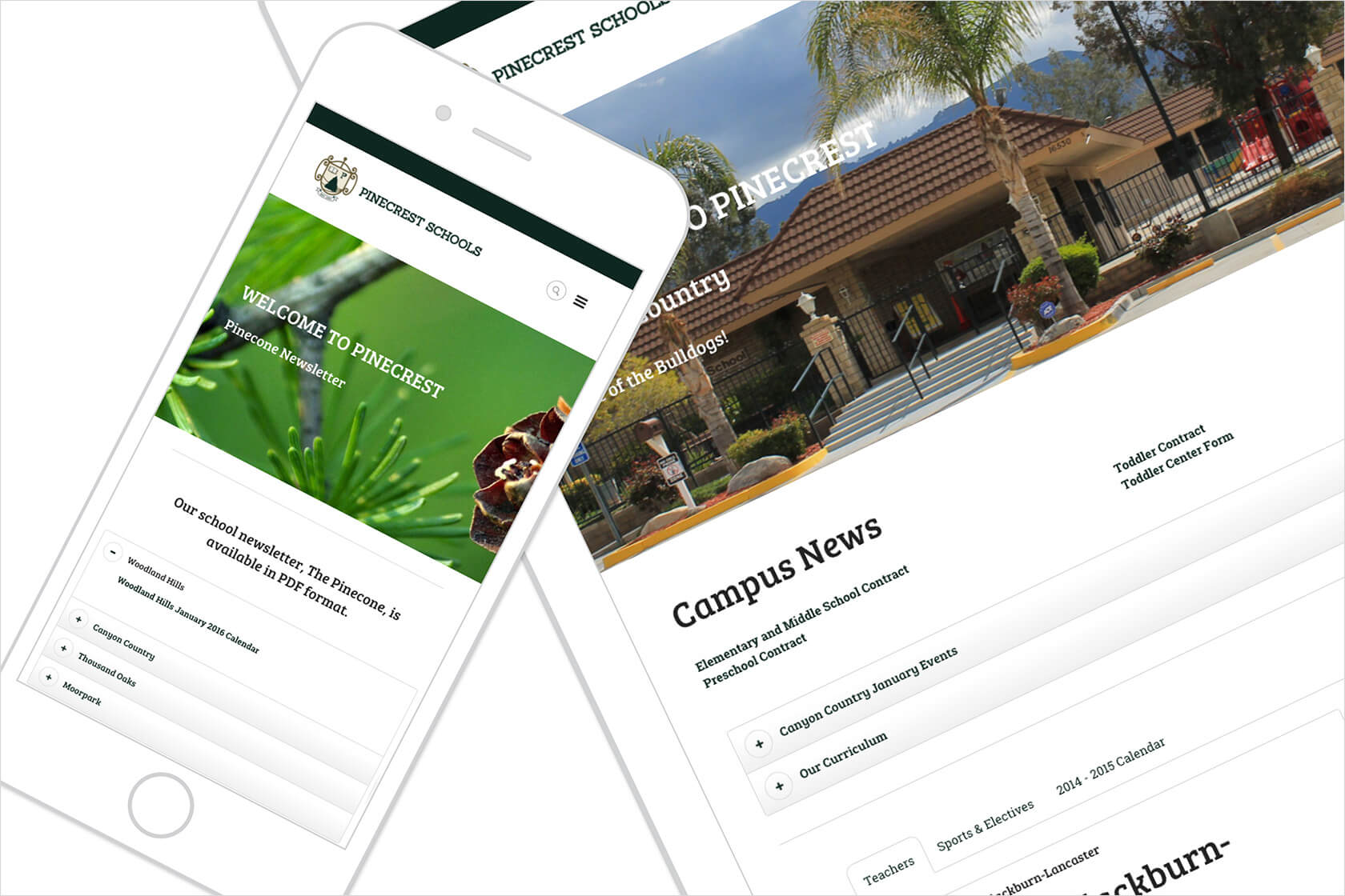
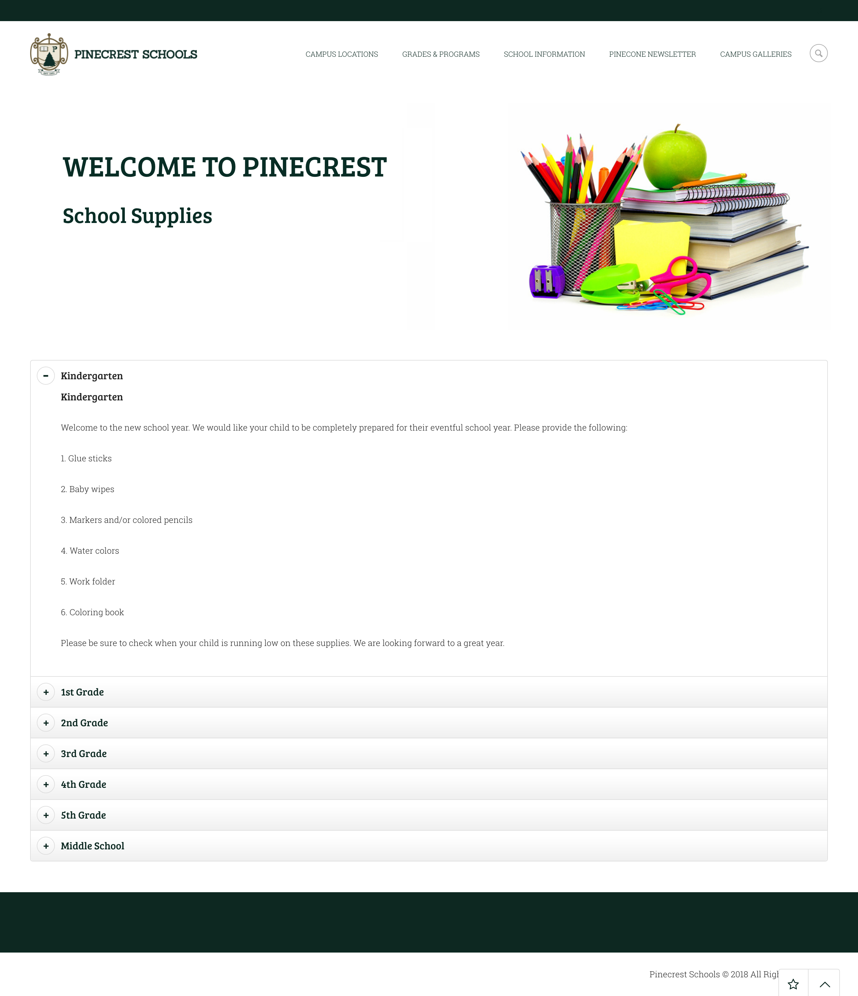
I worked with the major stakeholders of the Pinecrest School District to redesign the Pinecrest School’s brand, while keeping its fundamental values and principles, and (most importantly) creating a more modern website, that had to be both beautiful and useful, in order to increase enrollment.
The two main objectives were to make sure the design clean with focus on the curriculum information and calendar of events. Secondly, we wanted to build it with user friendly technology.
To accomplish the UX goals I removed unnecessary forms and links that distracted user focus. Each campus and grade has it’s own dedicated page with contact information. The mobile site has all the information paired down to campus locations and administrator contact information as we found our users on mobile devices only wanted to get to their child’s campus or potential campus and get on a phone call with the campus staff.
The site was designed to become a greater resource for current and future parents. For example, I added an interactive athletic calendar to the site. Parents can now keep up on the busy athletic schedules directly from their computer or phone. Previously, prospective parents had to go through a cumbersome process of registering students, which all had to be done in-person. In an effort to entice more signups, I created a streamlined registration process that could be completed entirely online.
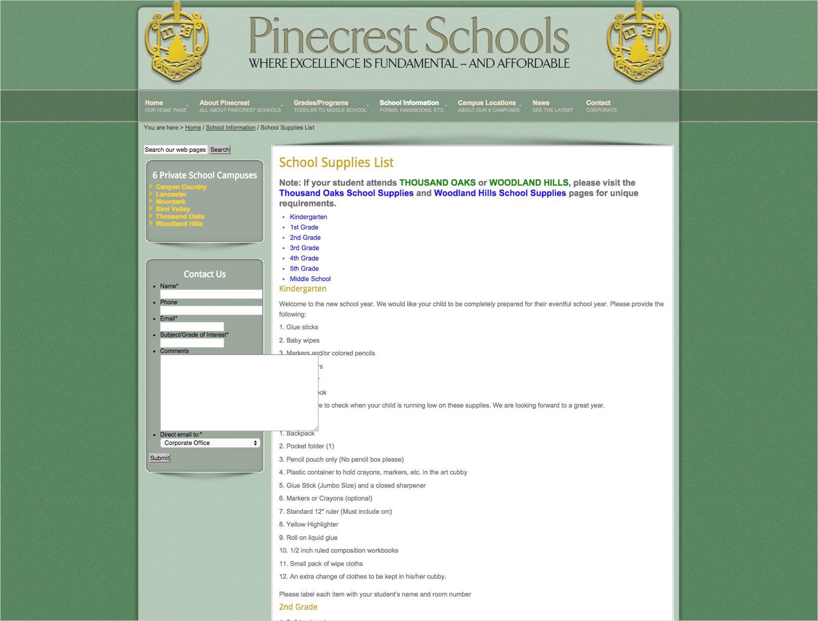
The original site didn’t have branding that allowed Pincrest to be congruent brand. The font selections made the copy difficult to read. The navigation elements were confusing to users – the original site had well over 100 navigation elements and the user couldn’t find the specific school they needed to access. Furthermore the site itself wasn’t responsive.
I chose three main colors and two variants to simplify the Pinecrest brand. This allowed for a consistency across all five campus locations as well as an ease of implementation for each brand asset – from signage to daily academic supplies.
The brand symbols were sculpted and refined to give an elegance as well as hint at collegiate aspirations that all Pinecrest students aim for. The book for knowledge, the pillar to represent a strong foundation, and the pine tree to represent growth and the school district’s roots.



Sanchez
I chose Sanchez for the Pinecrest masthead because it is friendly, upright and original, charming and versatile. I used this font-family to encapsulate the spirit of Pinecrest in typographic form to appeal to both parents enrolling their children as well as the students themselves.


Bree Serif
Pinecrest’s typographic set needed a companion font for use in body copy and display text. I found the thinner, yet still playful, Bree Serif to be both legible and aesthetically compatible with Sanchez.
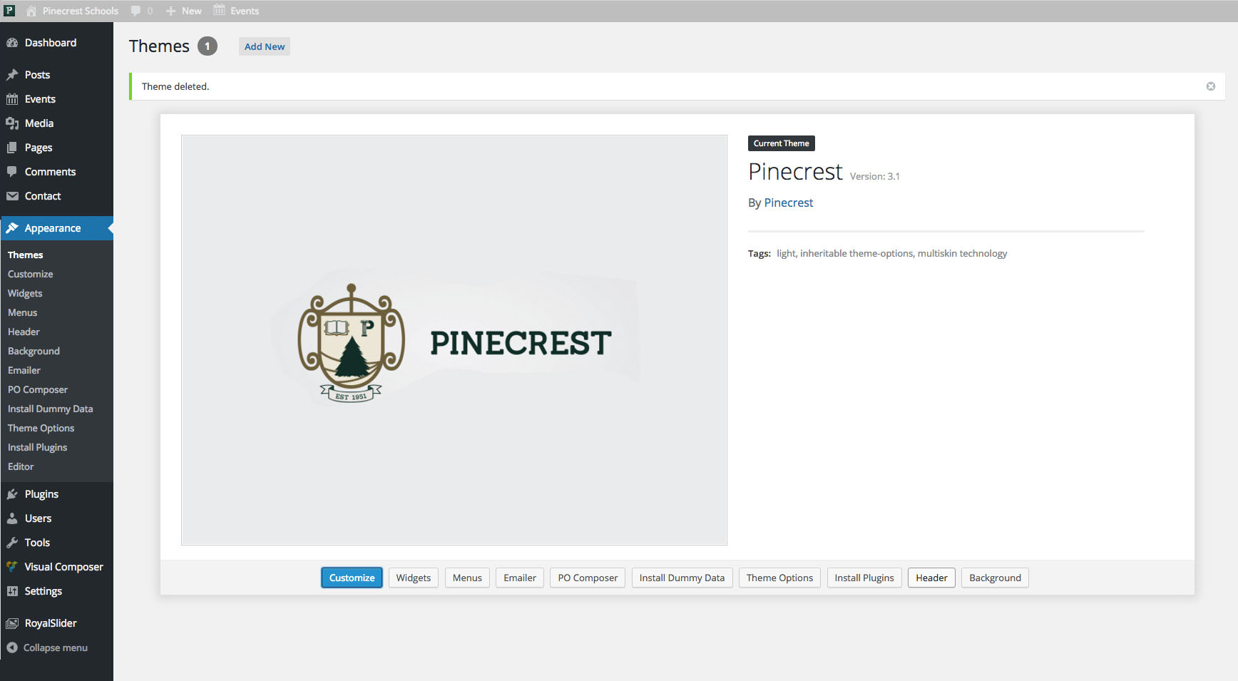
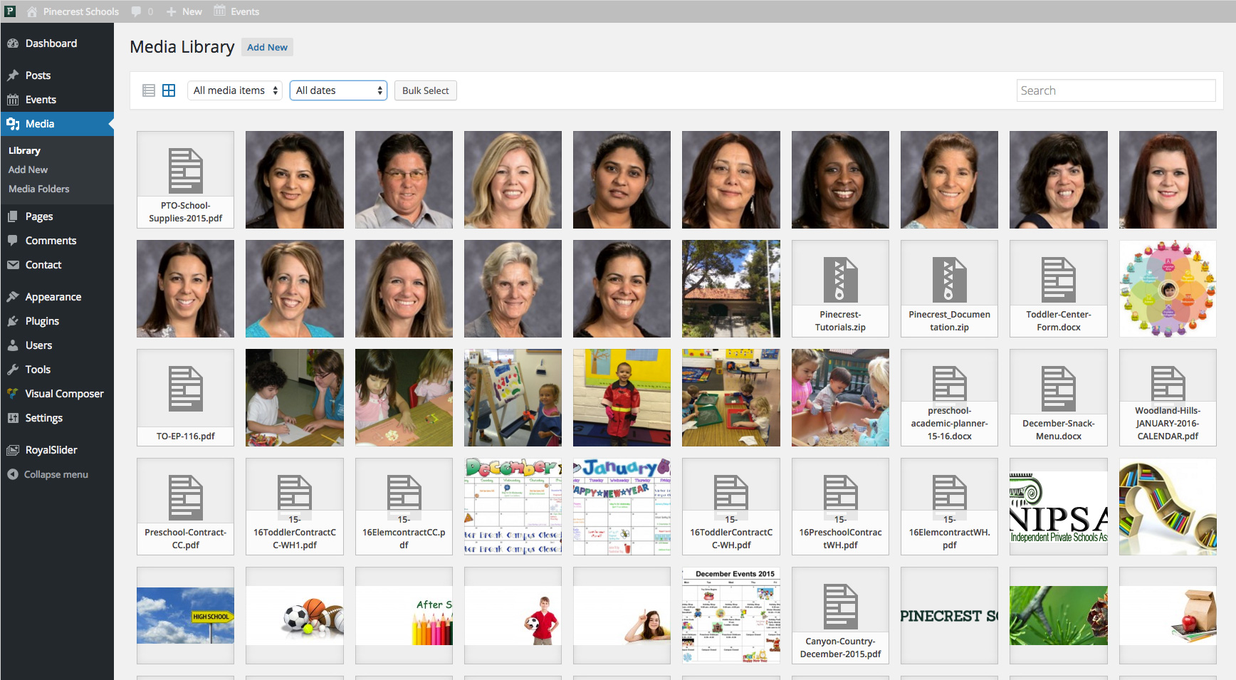
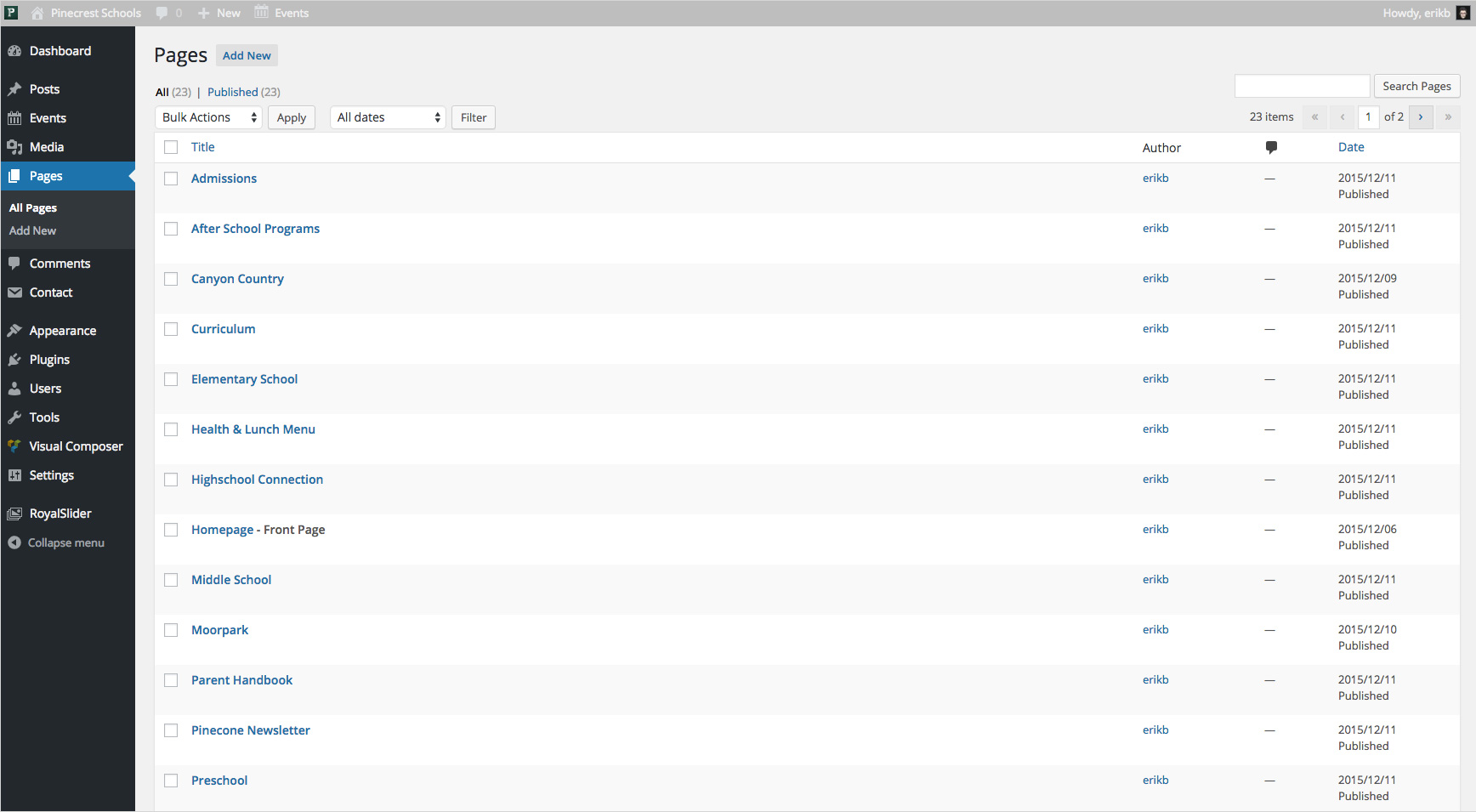
The Pinecrest School District is built on WordPress with a, from-the-ground up, custom theme. This allows the Pinecrest School administration to update the website on their own and not rely on a webmaster. Even the least technologically savvy is able to make the daily updates needed to communicate with parents.
By moving the site to a dedicated cloud server, we have eliminated slow load times and website crashes that plagued the previous site, which played a significant role in the decreased signups.
