People have asked me why I have the cursor that resizes on my portfolio as well as the sounds per click or link and the answer is very simple – accessibility.

Anyone needing audio feedback or using a reader will have an easier time using my portfolio.

Technology needs to be open to whomever needs to use it. Especially in the considerations for disabled workers. The interconnectedness of applications and the web means all types of people need to be able to use what designers and engineers build.


The WCAG (Web Content Accessibility Guidelines) gives us steps to become accessible compliant. There’s a myth that making a website accessible is difficult and expensive, but it doesn’t have to.

For a product team, this additional layer of design can seem daunting but if a team incorporates accessibility-first thinking in the early stages of the design and discovery process, accessibility problems won’t be found at the end, they will able to be overcome before they are larger issues.

Designing a product from scratch that meets the requirements for accessibility doesn’t add extra features or content; therefore there shouldn’t be additional cost and effort. We’re creating a design that allows for a diversity of methods of use across multiple kinds of abilities and disabilities.

When you design for that edge case, you’ll create a solution that accommodates a wider range of people and abilities. That design process becomes easier to solve because of your awareness of people of all abilities (or lack of).

There are over 56 million people in the United States (nearly 1 in 5) and over 1 billion people worldwide who have a disability. In 2017, there were 814 website accessibility lawsuits filed in federal and state courts. These two pieces of data alone should convince us of the importance of designing for accessibility.

There is also a strong business case for accessibility: studies show that accessible websites have better search results, they reach a bigger audience, they’re SEO friendly, have faster download times, they encourage good coding practices, and they always have better usability.
Designing for a Spectrum

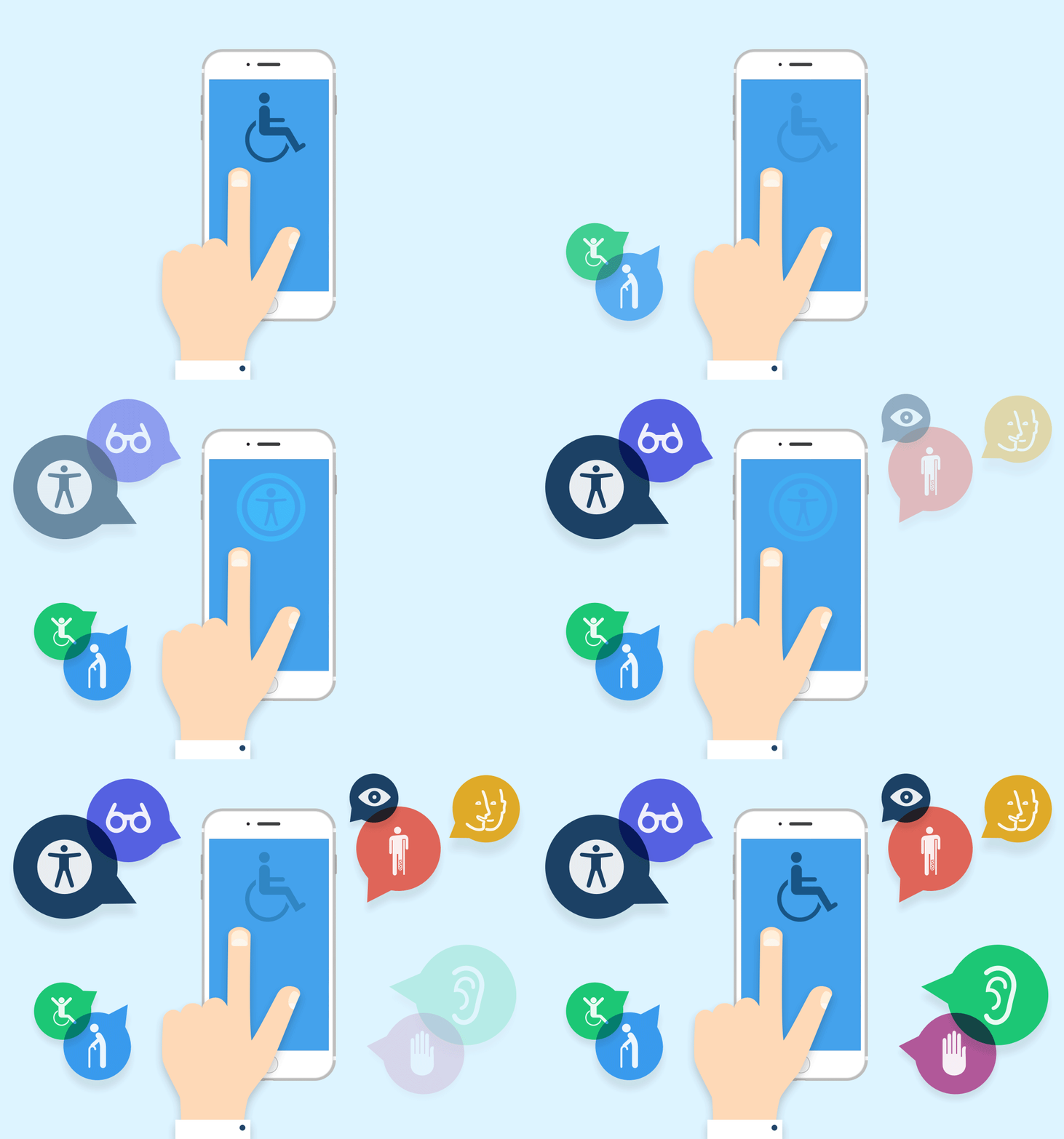
When we create inclusive and accessible designs it benefits a wide range of people. You may ask, “how?” Well, accessibility isn’t binary. It’s not a have or have not situation, rather it’s a spectrum.

The disability spectrum is a way of framing accessibility. We’re extending the concept of disability to include situational, temporary, and permanent disabilities.

  • Situational disabilities: a condition or context that limits a person’s ability.
  • Temporary disabilities: an injury, sickness or short term impairment.
  • Permanent disabilities: a defining character of a person’s body.


Let’s examine an example for hearing disabilities to break it down.

  • Situational: A person watching a video on their phone while riding a loud subway during rush hour.
  • Temporary: A person with an infected and clogged ear and headache.
  • Permanent: A person who is deaf and cannot hear out of both ears.

All of these degrees on the spectrum would benefit from the same solution. When we take permanent disabilities and their barriers into account, we’re also designing for temporary and permanent disabilities on the spectrum as well.

Early stage personas help with accessibility. Who are my users? What are their needs and challenges? Do they have a cognitive disability (Autism, ADHD, learning disabilities, etc.)? Can they hear the audio in videos on websites or apps? What are their potential barriers and how do we eliminate them?


Assets:

Microsoft’s Inclusive Design site has an assortment of practices and tools they’ve compiled to help others learn and practice inclusive design.

W3C has a quick reference guidefor those who are already familiar with the best practices and just need to reference a criterion.

@Beautifullyaccessible on Instagram is a great page dedicated to sharing accessibility best practices, tools, and tips to create inclusive designs.

WebAIM color checker allows you to check the contrast scale of the colours you’ve chosen to ensure they’ll create readable text.

Colorblindly is a really cool Chrome extension that simulates different types of colour blindness. It allows the creator to experience their designs in the same way a colour-blind user would.

Hemingway editor provides helpful grammar edits and shows the writer information like character counts, reading time, as well as the reading level.

HubSpot has created an amazing guide to writing image alt-text.