Shift promised a stress-free, fully online way to buy a car. Customers told us it felt exactly like the dealership they were trying to avoid.


Over several major releases, I rebuilt the checkout from a deposit-gated form and a phone call into a single online spine — reserve, complete, review, track — that customers finished on their own.


THE PROBLEM

  • The “fully online” positioning was mostly positioning. The online portion ended at a $250 non-refundable deposit and a three-card task page; everything after that — contract, loan docs, DMV, bank check, scheduling, title, trade-in, FedEx — happened offline through a sales advisor.
  • Operations leaned on advisors using inefficient processes and old-school dealership tactics. The few online screens had been executed hastily.
  • The result was a hostile experience that converted low and canceled high. CX data showed customers were afraid their car would get sold to a “faster” buyer while they were still mid-checkout.
  • Once an order was placed, there was no way to see where the car was. “Dude, where’s my car?” was a support-call category.


GOALS

  • Move the entire purchase online — from reservation through delivery — so the advisor call becomes a quick review, not the process itself.
  • Make the end (The Last Mile) always feel within reach: clear tasks, clear timing, clear progress.
  • Turn the Protection Plans step from a missed opportunity into the revenue engine it needed to be, without becoming the finance office we were replacing.


MY ROLE

  • Lead Product Designer: checkout architecture, dashboard and task design, onboarding and timer system, Protection Plans flow, order tracking, and the research loops (analytics, user studies, CX transcript review) that drove each release.
PROJECT RESULTS

Impact and Outcomes

Checkout completion went from 44% to 84% once the dashboard, onboarding, and purchase timer were in place — and low-intent traffic dropped 12% without a deposit doing the filtering.

One online spine: Reserve Page → Onboarding → Buyer Dashboard (order tasks, review, action items) → Order Tracking. The “dreaded advisor call” became a quick review step inside the flow instead of the gate to everything after it.

Commitment without coercion: removing the $250 deposit and replacing it with a one-hour reservation gave customers the assurance the car was theirs while they worked — and gave the business a cleaner intent signal than the deposit ever did.

Revenue inside the experience: a redesigned Protection Plans task educated instead of upsold — onboarding, a short driving-habits questionnaire, personalized plan offers, and honest pricing — and the same pattern was embedded in the financing application.

  • 300% faster average lead-to-purchase time
  • 250% increase in add-on sales for online purchases, leading to ~$1,000 additional growth revenue per unit
  • 150% drop in inbound “status update” phone calls
  • Gross profit up 43% YoY for two years; F&I sales up 200% (combined cross-functional effort)
  • Post-purchase survey: 197 responses, 5.8 average on a 7-point ease scale; 54% rated it “very easy”
To comply with my non-disclosure agreement, I have omitted and obfuscated confidential information in this case study.  The information in this case study is my own and does not necessarily reflect the views of Fair and/or Shift Technologies.
1 of 6 20%
GETTING SMART, FAST

Operating Rhythm

We didn’t guess at what was broken. The evidence was already sitting in four places nobody had put side by side: site analytics and heat maps, user interviews and surveys, CX emails, call logs, and chatbot transcripts, and the sales floor itself. That became the operating loop for every release.

  1. Diagnose from the record — heat maps and drop-off analytics on the old pages, paired with what customers were literally typing into the chatbot and saying on support calls.
  2. Rebuild the flow architecture first — map the starting state (online vs. offline) against the ending state (all online) before touching a screen.
  3. Ship in scoped releases: Reserve Page, Buyer Dashboard, Onboarding + Timer, Protection Plans, Order Tracking.
  4. Measure every release the same way — site analytics, unmoderated and moderated user studies, distressed-support-call volume, post-purchase surveys — and feed the results into the next one.

Evidence map

Before any screen changed, the diagnosis came from four channels nobody had read side by side. This table is what each one told us, and which release it informed.

Current state vs. future state

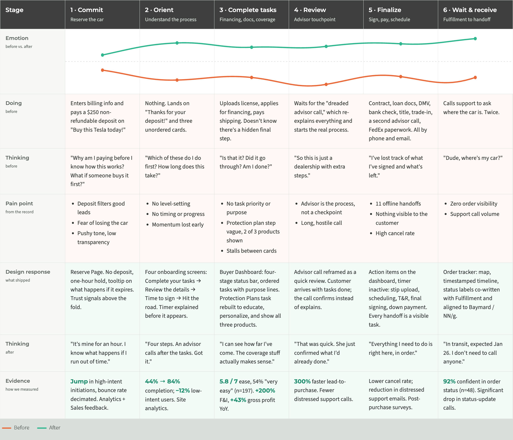
The starting point wasn’t a bad page. It was a process that went offline the moment it got hard. The redesign target was a single online spine from reservation to delivery, with the advisor call demoted from a gate to a review.

WHERE WE STAND

The Competition

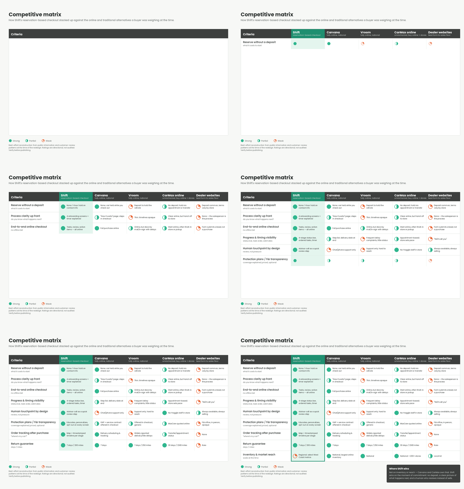
By 2022 a used-car shopper had three real alternatives to Shift: Carvana and Vroom, both fully online and national; CarMax, which had bolted a buy-online path onto 200+ stores; and the local dealer’s website, which is still a lead form that ends on the sales floor.

On inventory and reach, Shift lost. Carvana and CarMax simply had more cars in more places, and I never designed around that. Where Shift could win was the moment of commitment — and that’s exactly where every competitor had a weakness a buyer could feel:

  • Vroom asked for a deposit to hold the car and then went quiet; delivery and title delays were the most common complaint about the brand.
  • Carvana ran a clean online purchase, but the only human was a support line, and coverage was an add-on rather than an explanation.
  • CarMax handed you to a store to finish, which meant the pace was theirs.
  • Dealer sites promised a callback and delivered a salesperson.

So the reservation-based checkout was a bet on three things the matrix makes visible: no deposit to start, a clear picture of what happens next, and a human who reviews instead of sells. The return guarantee and tracking were table stakes among the online players; the onboarding, task dashboard, and Protection Plans task were not.

WHO WE'RE DESIGNING FOR

Three Buyers, Three Ways to Lose Them

The research didn’t produce formal persona documents — it produced patterns, and each one mapped to a specific way we were losing a sale. Three composites carry those patterns through the rest of this page:

  • Maya, 29 — the cautious first-timer. Won’t put $250 down before she understands the process, and is afraid the car will be sold out from under her. Lost at the deposit page.
  • Darius, 41 — the financing buyer. Longest task list, does it in three sittings, loses momentum with no sense of progress or timing. Lost mid-dashboard.
  • Priya, 36 — the decisive self-server. Skips anything that reads as an upsell, then spends fulfillment week calling to ask where the car is. Lost on revenue and on support cost.
2 of 6 35%
THE STATUS QUO

From Deposit Page to Reserve Page

Shift was asking too much, too early. A $250 non-refundable deposit just to begin checkout, wrapped in a page with thin information, a pushy tone, and low transparency. The stated goal was to filter out bad leads. It filtered out good ones too.

CX data surfaced a second problem hiding underneath the first: customers were afraid the car would be sold out from under them while they finished. The deposit wasn’t calming that fear — it was just charging for it.

Old: “Buy this Tesla today!” — billing info, card number, and a “Place $250 deposit” button before you’d learned anything about how the purchase actually worked.

New: “Ready, set, yours.” — a reservation. Enter contact info and how you want to get the car, and we hold it for one hour while you complete the next steps. No deposit. Trustpilot rating, what every purchase includes, and a plain tooltip explaining exactly what happens if the hold expires.

We solved both problems at once: eliminate the deposit, reframe the page as a reservation. High-intent purchase initiations jumped and bounce rate was decimated — measured through analytics and customer feedback via Sales.

3 of 6 50.0%
WHERE THE PURCHASE HAPPENS

The Buyer Dashboard

This is where the bulk of the purchase happens, and the old version gave people three cards, no order, no timing, and a “Thanks for your deposit!” headline that was the only warm sentence on the page. Analytics and heat maps showed it; user interviews and CX transcripts confirmed it. No instruction, no task priority, no sense of progress, and a tone that read as user-hostile.

I aligned every detail to best practices, established a clear hierarchy, and set expectations through content and progress indicators:

  • A status bar with four named stages — Order Tasks, Review, Action Items, Delivery — so the end is visible from the first screen.
  • Tasks in order, with purpose. Review Protection Plans, Apply for Financing, Upload License & Insurance, Take Care of Shipping, Review and Submit — each with one line on why it matters to the customer.
  • The timer, visible but calm, in the header next to the Shift logo rather than screaming at the top of the page.
  • Order details, FAQs, and contact below the fold, so the answers to the questions people were calling about lived on the page.

Checkout completion rates rose 44%, alongside significant improvements in user perception, confidence, and trust — measured via site analytics, unmoderated user studies, a reduction in distressed support calls and emails, and post-purchase surveys.

4 of 6 70%
THE END MUST FEEL WITHIN REACH

Timing and Onboarding

This was the trickiest thing on the roadmap to get right. Removing the deposit removed the commitment signal — the thing telling us who was serious and telling the customer the car was theirs. The one-hour reservation had to do that job, and a countdown clock on a $30,000 purchase is a dark pattern by default.

Testing made the gap obvious: even with the new dashboard, customers were still unsure what to expect and lost steam partway through their tasks. Purchase times exploded and advisors had to intervene.

The fix was to make the timer the least important part of the timer system. Four onboarding screens do the level-setting before the clock ever appears:

  1. Complete Your Tasks — we hold your car for one hour while you work, and these tasks finish well inside that window. (Longer if you’re financing with Shift — the constraint should never punish the customer for the path that takes longer.)
  2. Review The Details — once you finish, an advisor calls to verify documents and payment and walk through next steps.
  3. Time to Sign — payments, e-signature, DMV docs.
  4. Hit The Road! — ready?

Then the timer itself: a countdown component in the header, an animation spec, and a tooltip that says exactly what happens when time runs out — we release the hold and refund, other shoppers get the chance, and you can still buy the car if it’s available. No trapdoor.

Completion rate went from 44% to 84%, and low-intent users dropped 12% — the deposit’s real job, done by clarity instead of a credit card.

5 of 6 85%
FOLLOW THE MONEY

Protection Plans Education

Protection plans accounted for 50% of Shift’s revenue, and attach during checkout was the key to reversing a −5% QoQ decline. The old task was leaving most of it on the table: vague labeling and a disjointed subhead on the dashboard card, ambiguous content with broken coverage links, only two of three products shown, static numbers that could differ wildly from actual customer rates, and unfocused, inconsistent CTAs.

The design problem was to sell more coverage while being less like the dealership finance office. So the new task educates first and sells second:

  • Onboarding screens to set the scene — “Shift the way you think about protecting your car.” A few dollars a month vs. a sudden repair bill; the most you’ll pay at the shop is a small deductible.
  • A brief questionnaire about driving habits — how long you keep a car, miles per year, kind of roads — and a short “customizing your coverage offers” moment.
  • Personalized plan offerings — Gap Coverage, Vehicle Protection Plan (Premium / Plus / Standard), and a Convenience Package, each with a sample brochure link, plain-language “what this covers,” honest estimates, and an explicit “continue without coverage” option on every screen.
  • A more nuanced version embedded in the financing application, where the numbers are real.

The combined effort with cross-functional teams increased gross profit 43% YoY for two years and boosted F&I sales by 200% — measured through self-attach rates, advisor-attach rates, customer feedback via Sales, and site analytics.

6 of 6 100%
MAKING IT REAL

Order Tracking, and What Came Next

The old dashboard offered no way to track your purchase, which is how “dude, where’s my car?” became a high-volume support category. The new order tracking view shows where the car is at every stage.

I partnered with the Fulfillment team to develop status labels and descriptions that were meaningful to customers, consistent with internal fulfillment statuses, and aligned with UX best practices (Baymard, NN/g). Each state — Quality Inspection in Progress, Preparing for Shipping, In Transit with an expected delivery date, Car Delivered — pairs a map, a timestamped shipping timeline, and a “your action items are complete” reassurance block so the customer never wonders whether the ball is in their court.

Result: a significant reduction in support phone calls and emails, measured through customer support data, user testing studies, and post-purchase surveys. In post-purchase testing, 92% of customers agreed or strongly agreed they felt confident in the status of their vehicle order (48 responses; 54% agree, 38% strongly agree, 8% neutral, 0% disagree).

Outcome. I’m proud of the many initiatives I led to reach this point. And just as we turned our gaze to the road ahead, a new behemoth was rushing into view. Under the hood, the platform had been built to reconfigure rapidly in the event of a full-scale pivot — which then happened twice: omni-channel sales, then a marketplace model. The checkout was held.

PROJECT RESULTS RECAP

Impact and Outcomes

Checkout completion went from 44% to 84% once the dashboard, onboarding, and purchase timer were in place — and low-intent traffic dropped 12% without a deposit doing the filtering.

One online spine: Reserve Page → Onboarding → Buyer Dashboard (order tasks, review, action items) → Order Tracking. The “dreaded advisor call” became a quick review step inside the flow instead of the gate to everything after it.

Commitment without coercion: removing the $250 deposit and replacing it with a one-hour reservation gave customers the assurance the car was theirs while they worked — and gave the business a cleaner intent signal than the deposit ever did.

Revenue inside the experience: a redesigned Protection Plans task educated instead of upsold — onboarding, a short driving-habits questionnaire, personalized plan offers, and honest pricing — and the same pattern was embedded in the financing application.

  • 300% faster average lead-to-purchase time
  • 250% increase in add-on sales for online purchases, leading to ~$1,000 additional growth revenue per unit
  • 150% drop in inbound “status update” phone calls
  • Gross profit up 43% YoY for two years; F&I sales up 200% (combined cross-functional effort)
  • Post-purchase survey: 197 responses, 5.8 average on a 7-point ease scale; 54% rated it “very easy”
To comply with my non-disclosure agreement, I have omitted and obfuscated confidential information in this case study.  The information in this case study is my own and does not necessarily reflect the views of Fair and/or Shift Technologies.