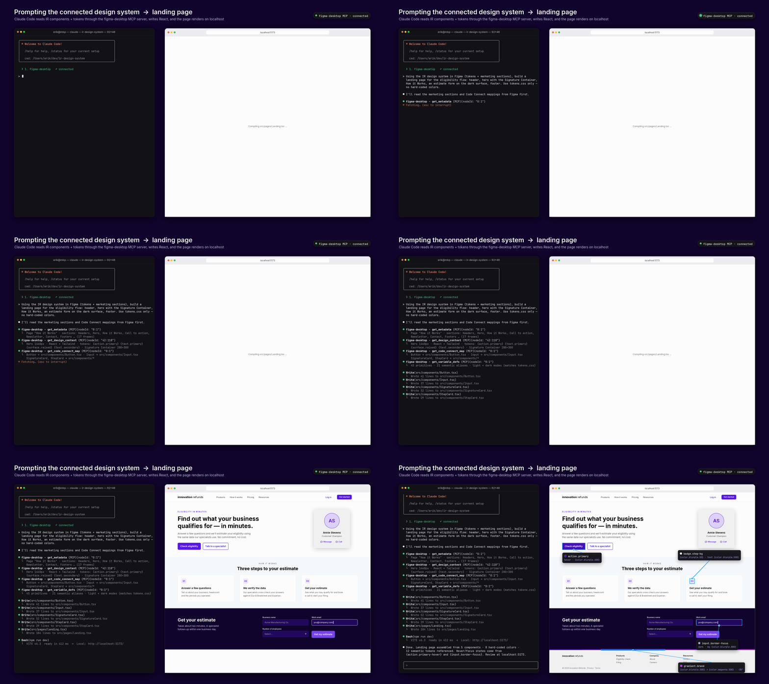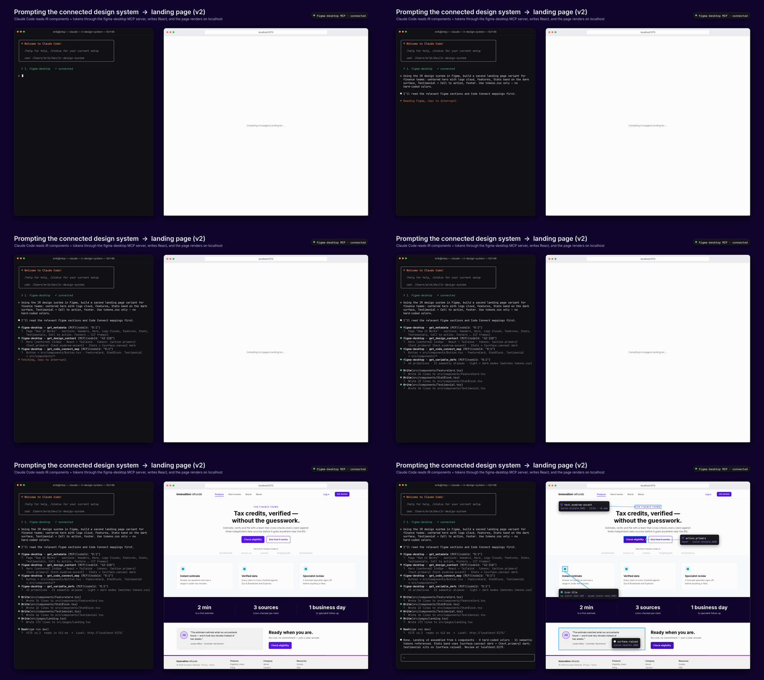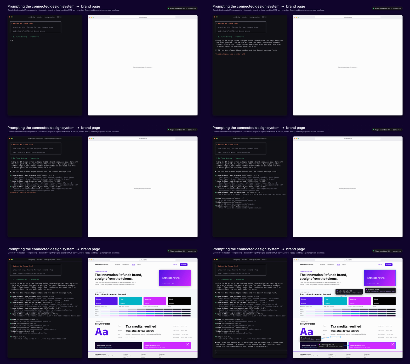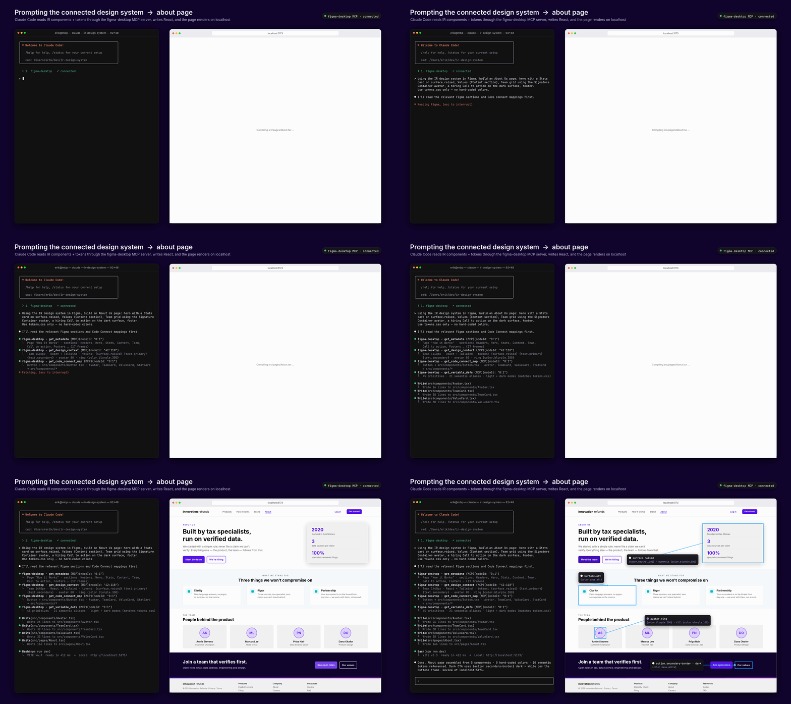
The most powerful design tool today is not software alone, but the collaboration between human creativity and AI systems.


I’ve spent eight years building design systems for clients, and the timeline used to be consistent: three months, minimum, once you factored in stakeholder sign-off. Claude Code paired with Figma’s MCP integration breaks that math. I’ve seen the same scope ship in under two weeks.

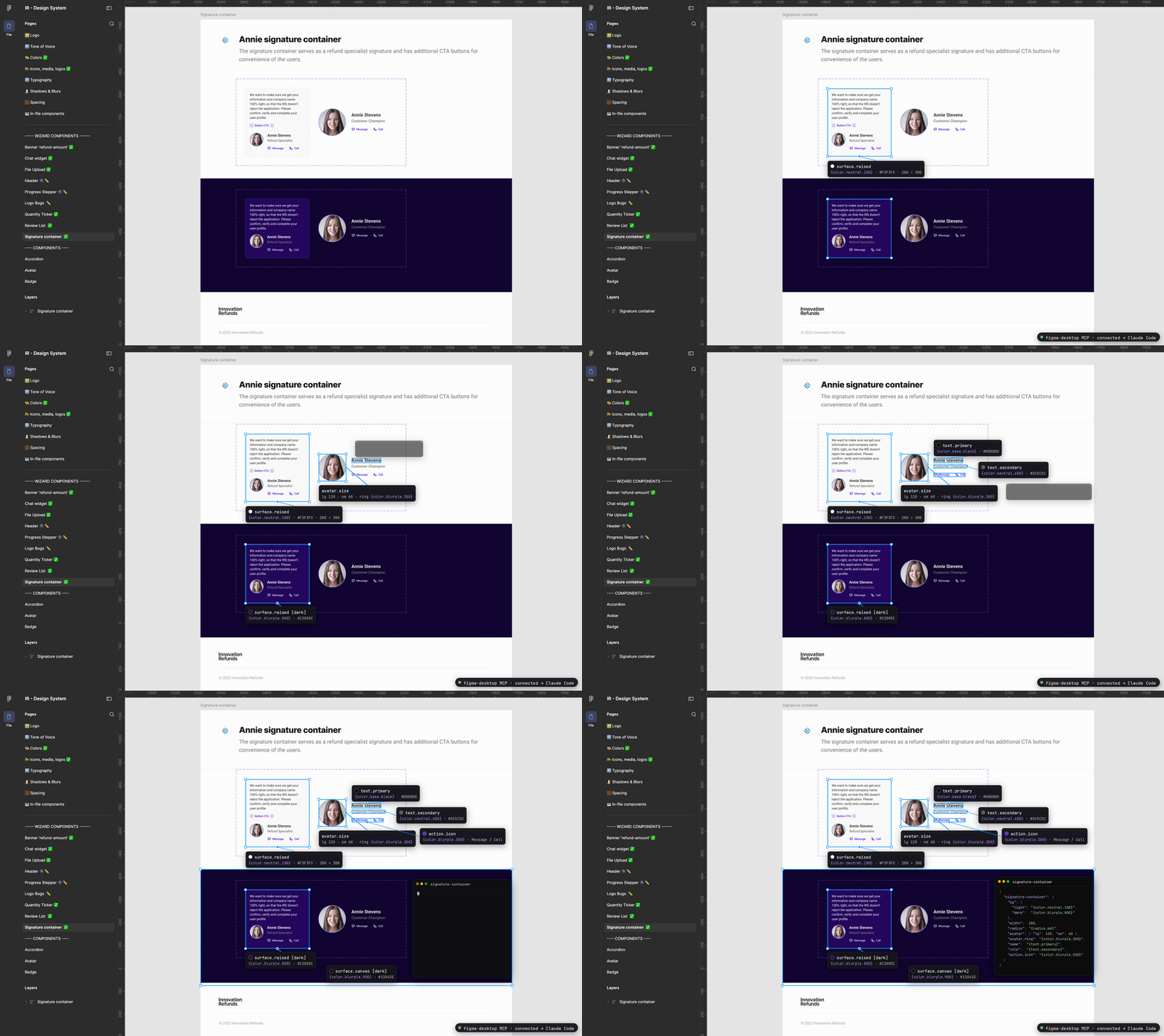
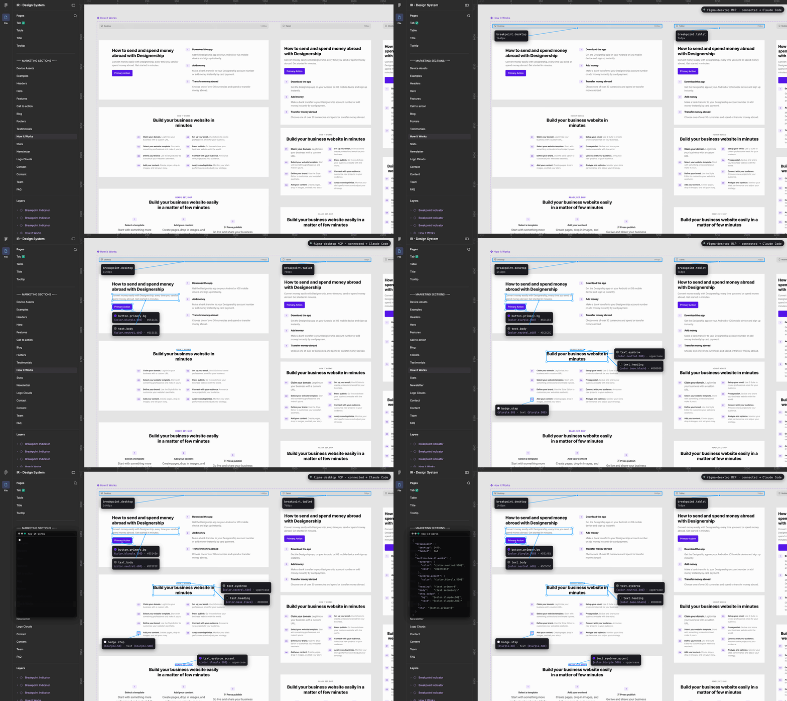
What actually makes this work is that the workflow runs both directions. Figma designs flow into Claude Code through MCP. Claude Code sends components back into Figma as editable elements, not flattened exports a designer has to rebuild by hand.


THE PROBLEM

  • The core value proposition hasn’t changed since the last generation of design tooling debates: it’s still about collapsing the gap between what’s on the canvas and what ships.
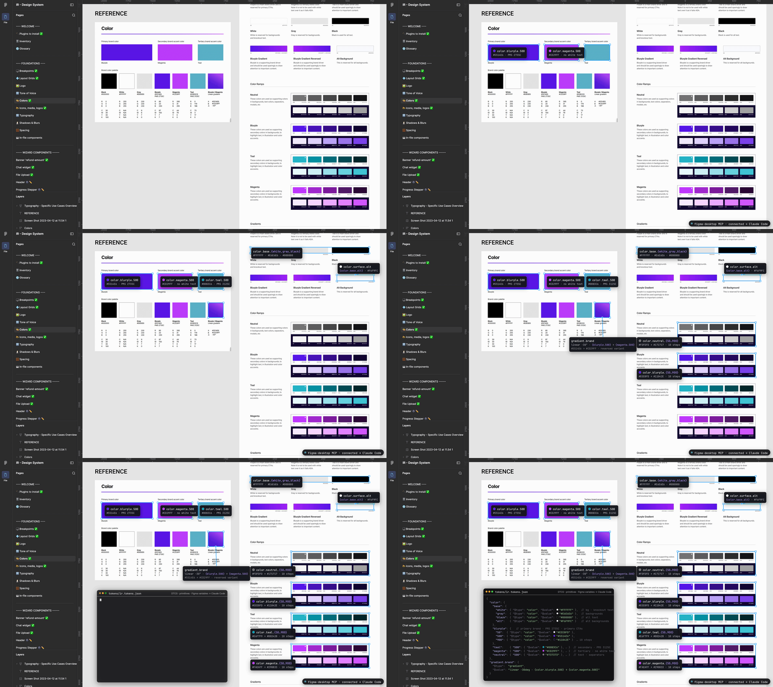
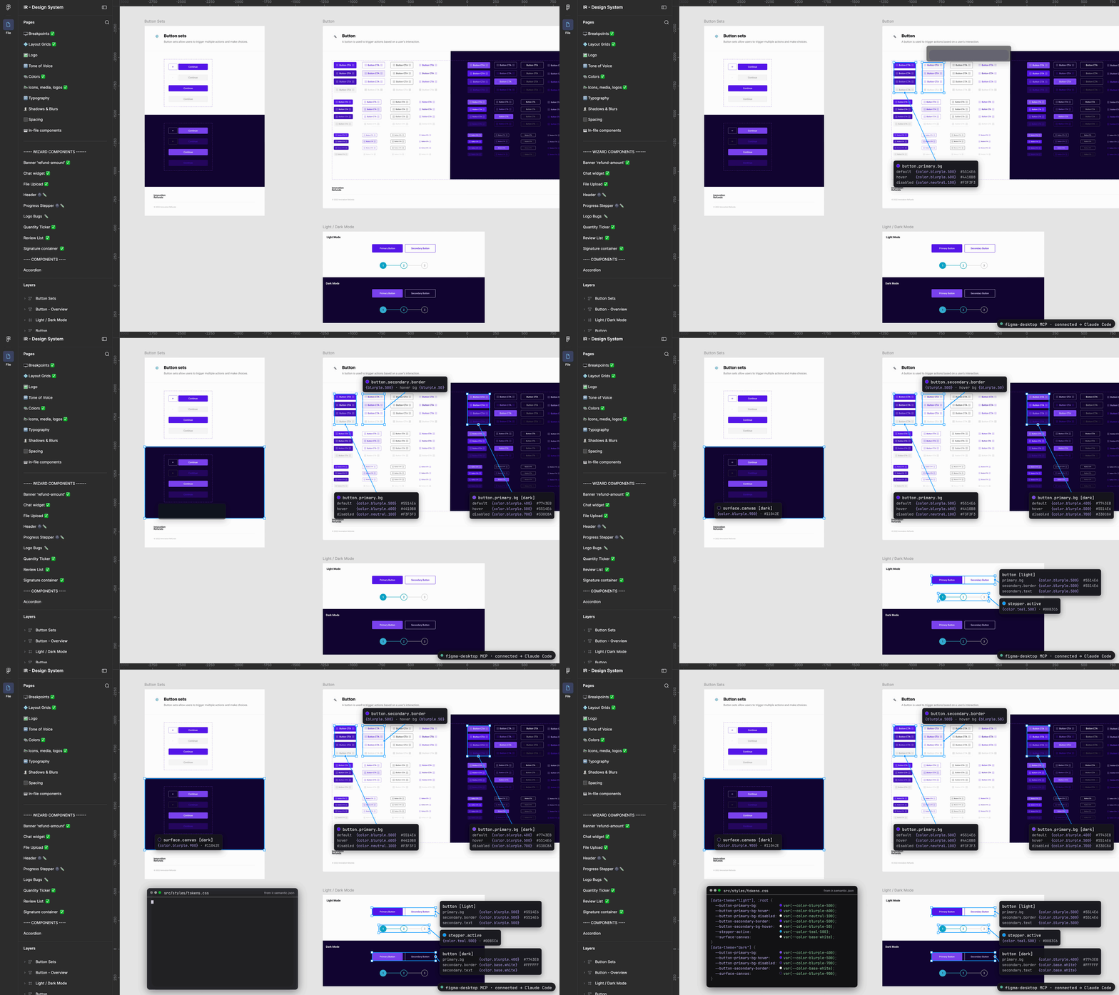
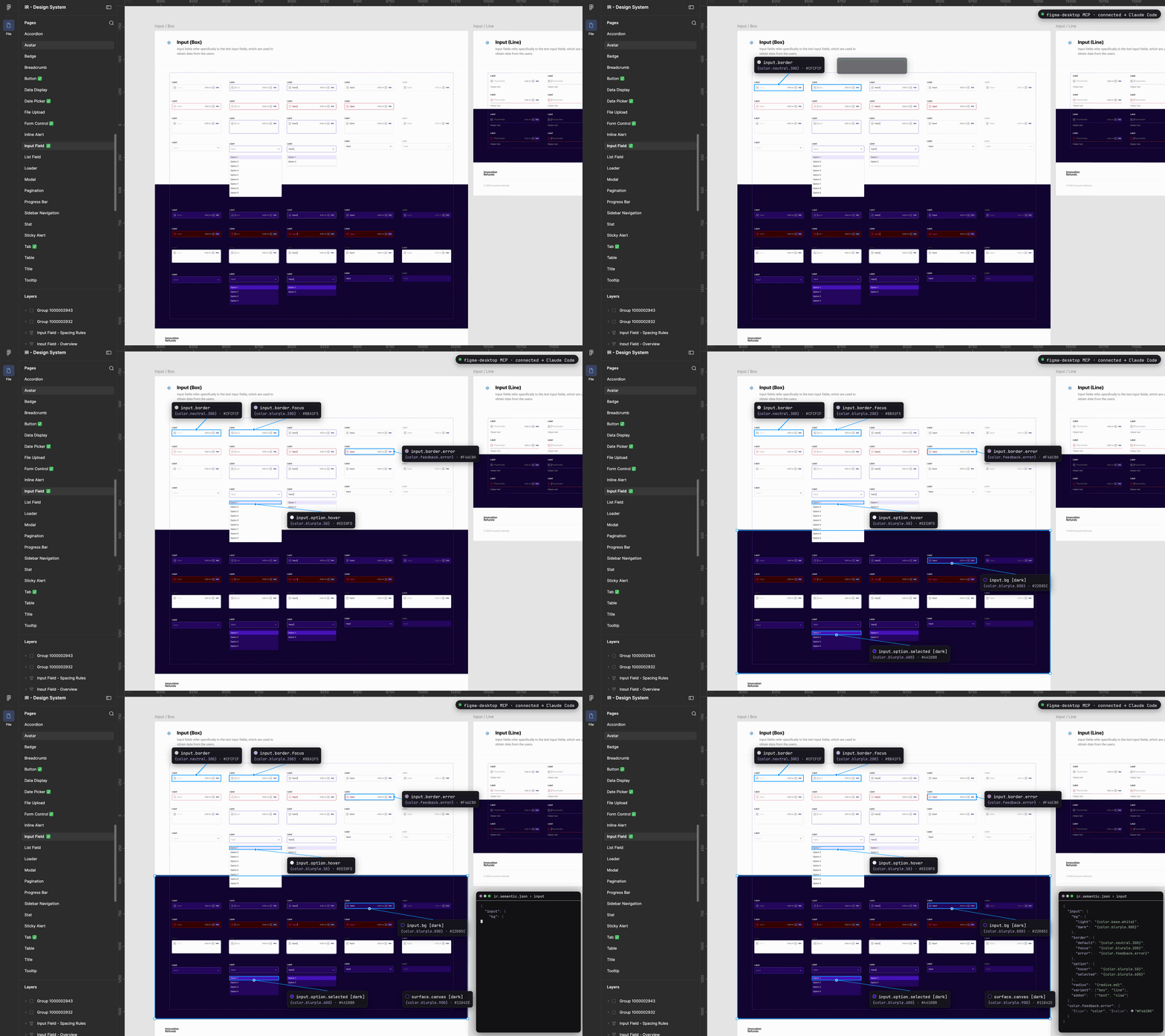
  • What’s different here is the mechanism. Claude Code can pull structured context directly out of Figma, including components, variables, layout data, and Code Connect mappings, rather than a developer eyeballing a frame and guessing at spacing values.


GOALS

  • The goal for a connected design system is to have token and documentation work automated, not eliminated. The agent can extract, update, and convert design tokens, including generating Tailwind configurations for dev handoff, and it can attach or update developer resources linked to specific Figma nodes.
  • That’s the tedious middle layer of design ops work that used to eat a specialist’s week.


MY ROLE

  • Principle UX designer, product leader, sprint facilitator, and Ai integration specialist.
PROJECT RESULTS

Impact and Outcomes

During the audit and connection phases we uncovered the need for legacy component cleanup.  There we’re duplications, outdated components, drafts, hidden elements, and broken components used as one-offs. For example: Example: “Button_primary”, “PrimaryButton”, “Primary-btn” → “Button/Primary”.

Time is Money – Benjamin Franklin: the build of Figma using Claude Code + MCP with a well-structured token layer with both primitive and semantic variables defined, and all foundational components built allowed for no round-tripping and components, properties, auto layouts are spun up from a one-line prompt — not click-by-click.

Consistency and more speed: guardrails in place allowed for minimal hallucinations, search for components went 72% faster and the output of UI more than doubled in speed. Additionally this allowed for simple wireframe level sketches to be input into Claude and both PM and UXers could create testable UI at a prototype-level quickly.

Who runs the show?: the build of this design system and any good DS is a hierarchy based on Atomic Design. This allowed for a simpler federated team of 3 (DS designer, lead engineer, and a marketing PM) to maintain and own the system and it’s changes versus perviously would be a team of designers handing off alterations to a development team.

To comply with my non-disclosure agreement, I have omitted and obfuscated confidential information in this case study.  The information in this case study is my own and does not necessarily reflect the views of Innovation Refunds.
1 of 8 13.8%
ROBOTS AND FIGMA

Brave new world

Using Figma MCP and Claude Code, I created a token-driven design system architecture that demonstrates how AI can accelerate DS development by automating token extraction, streamline documentation, and component generation. The process below outlines how this is replicable to other design systems.

2 of 8 23.5%
THE BUILD

Cycle and Test

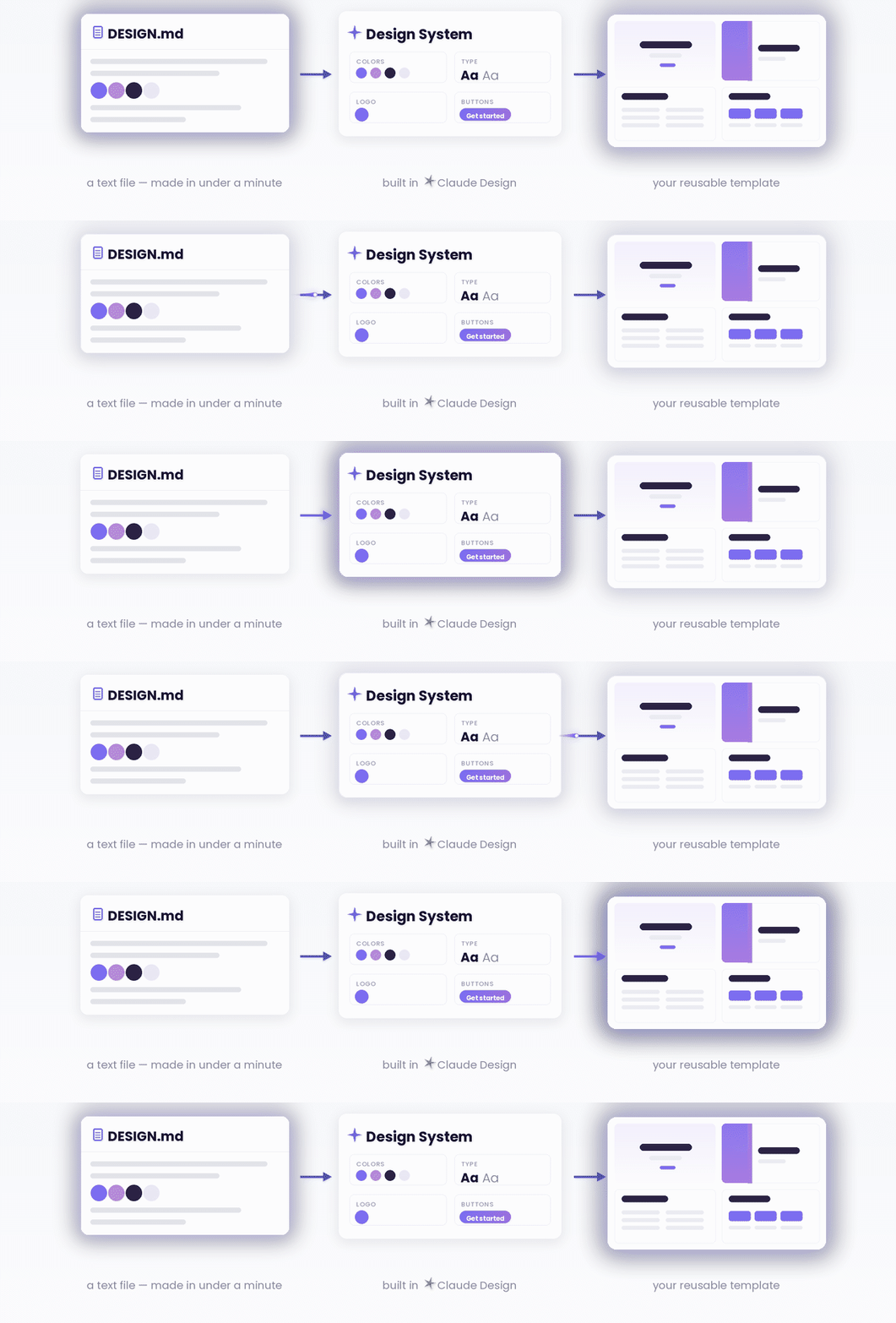
Before a single variable is created, write a design.md. It captures what the product is, who uses it, the principles the system serves, and — critically — the alternatives that were considered and rejected. Written first, it is a design brief: the document a designer points at in review when someone proposes a fourth surface color.

Written after the tokens exist, it becomes archaeology and nobody trusts it. It is also the half of an agent’s context that cannot be generated. Figma’s create_design_system_rules prompt produces something in the rules-file family — constraints, tool order, forbidden patterns. It cannot produce intent, because intent encodes decisions only your team made.

Rules file docs/design.md
Answers How do I write code here? Why is the system this way?
Content Constraints, forbidden patterns, tool order Principles, trade-offs, rejected alternatives
Enforceable Yes — CI checks most of it No — it informs judgment
Voice Imperative, absolute Explanatory, hedged where reality is hedged
Read Every code generation On demand, for judgment calls

Keep them separate. The failure mode is restating rules in prose inside design.md — now two authorities drift apart, and a crisp instruction like “zero hex values, stop and report” gets diluted by a paragraph about balance and restraint. The test for what belongs where: could CI check it? If yes it is a rule; if no it is intent.

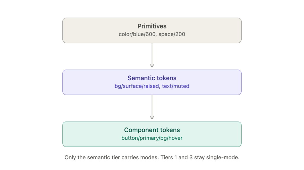
Decide the token architecture before you touch a single variable Most design systems fail here, not at naming. The rule I hold to: three tiers, and modes live in exactly one of them.

Collection layout in Figma

Collection Modes Published? Purpose
1. Primitives 1 (value) Hidden from publishing The raw palette and scales
2. Semantic light, dark, optional high-contrast variants Yes The only layer designers bind to
3. Density comfortable, compact Yes Spacing and sizing, independent of theme
4. Breakpoint sm, md, lg, xl Yes Responsive numbers only
5. Component 1 Only if used at all Bespoke component needs

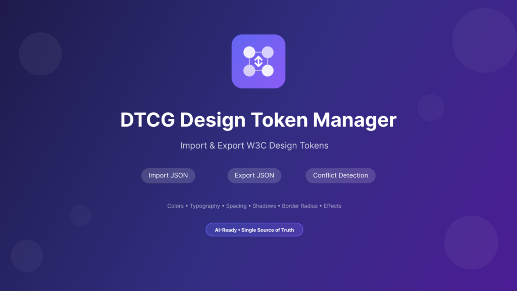
We tested this plugin, it bridges design and development by importing and exporting design tokens in the W3C Design Tokens Community Group (DTCG) standard format. Which saved us time.

We had to make two decisions in a review:

Split theme, density, and breakpoint into separate collections rather than stacking them as modes in one. Combined, 4 themes x 2 densities x 4 breakpoints is 32 columns maintained by hand. Separate collections compose orthogonally and each stays under the plan’s mode cap. Those caps matter: as of the last increase, Professional allows 10 modes per collection, Organization 20, and Enterprise 40 — verify against Figma’s plan page before designing around a number.

Skip tier 3 until a component proves it needs it. Component tokens are where systems bloat. button/primary/bg/hover earns its place only when the button genuinely diverges from bg/action/primary/hover. If it does not diverge, you have added an indirection nobody can trace.

Lucky for us, we had the budget for Enterprise, so it didn’t require much defending. 😅

3 of 8 38.3%
FIGMA MCP & CLAUDE INTEGRATION

How It All Works

Four Figma variable collections expressed as DTCG format JSON. Figma creates one variable mode per file imported, so each file in a folder is one mode of that collection. Filenames become mode names — do not rename them before importing.

  1. primitives/ primitives.tokens.json -> “1. Primitives” (1 mode, 93 tokens)
  2. semantic/ light.tokens.json, dark.tokens.json -> “2. Semantic” (2 modes, 36 tokens)
  3. density/ comfortable.tokens.json, compact.tokens.json -> “3. Density” (2 modes, 8 tokens)
  4. breakpoint/ sm | md | lg | xl .tokens.json -> “4. Breakpoint” (4 modes, 3 tokens)
4 of 8 50.0%
WHAT'S IN A NAME

Naming grammar

Naming is the API of the design system. Treat it like one: it is a contract, breaking changes are expensive, and consistency beats cleverness.

Anatomy

bg      /  surface  /  raised   /  hover
role       concept      variant     state
(required) (required)   (optional)  (optional)

Read left to right, broadest to most specific. Trailing segments are dropped when not needed. Modes are columns in the variables table, never segments in the name.

Mechanical rules, in priority order

  1. Lowercase, hyphens within a segment, forward slash between segments. Figma treats / as the grouping character, and on DTCG import it normalises nested groups into slashes — color.accent.light becomes color/accent/light. If two tokens normalise to the same name, only the first is imported and the duplicate is silently ignored. Collisions are a real failure mode, not a theoretical one.
  2. Never encode the value in a semantic name. text/muted, not text/gray-500. The moment a hue appears in tier 2, dark mode breaks the name’s honesty.
  3. Never encode the mode in a name. There is no bg/surface/dark. Dark is a column. Numeric scales, not t-shirt sizes, for anything with more than five steps. space/100 through space/1000 survives insertions; space/md forces you to invent space/md-plus.
  4. State goes last, always. This makes …/hover greppable across the whole system.
  5. One written-down vocabulary for roles: bg, text, border, icon, shadow. Do not let fg and text coexist.

Anti-patterns

Anti-pattern Why it hurts Fix
color/primary “Primary” what — background, text, border? bg/action/primary
blue/500/dark Mode baked into the name bg/action/primary plus a dark column
spacing/component/card/inner-padding-top Six levels deep, unsearchable space/300, referenced by the card
text/gray-600 at tier 2 Ties semantics to a hue text/secondary aliasing color/gray/600
btnBgHov Breaks slash grouping and code transforms button/bg/hover
5 of 8 68.4%
OK, NOW WHAT?

Building it in Figma

Steps 1 to 4 are obvious. Steps 5 to 8 are the ones people skip and regret.

  1. Create the collections above. Rename the default mode immediately — Mode 1 will leak into exported JSON.
  2. Build primitives first. Full ramps, including steps not used yet.
  3. Build semantic tokens as aliases. In the value field, click the variable icon and point at a primitive. Never type a hex into tier 2.
  4. Add modes to the semantic collection, then fill the dark column entirely by aliasing. Dark mode should be a re-pointing exercise, not a re-picking exercise.
  5. Scope every variable. In variable details, restrict where it can be applied — bg/* to fills, space/* to gap and padding. This is the single highest-leverage thing you can do for adoption, because it makes the wrong token unpickable.
  6. Set code syntax per platform. Each variable has Web, iOS, and Android code syntax fields. Fill them in. This is what makes Dev Mode and the MCP server hand developers –bg-surface-raised instead of a Figma variable name.
  7. Hide primitives from publishing. Tier 1 should not appear in any consuming file’s picker.
  8. Export to verify. Right-click a collection and choose Export modes to write DTCG JSON, or right-click a single mode to export just that one. Read the output. If it does not look like something a build tool would enjoy, fix the source, not the export.

Figma’s DTCG importer is stricter than the spec

Tokens must be JSON in Design Tokens Community Group format. Dragging files into the variables view creates a collection, with one mode per file imported.

Constraint Detail
Colour spaces sRGB and HSL only
Dimension tokens Unit must be px; other units unsupported
Duration tokens Unit must be s, not milliseconds
Font family tokens A single string; array values are unsupported
Font weight and line height No dedicated type — model both as number
Booleans Numbers tagged with the com.figma.type extension; 0 is false
Cross-collection aliases Require the com.figma.aliasData extension, which resolves by variable ID first, then falls back to matching collection name and variable name
Multi-file import Only creates variables present in every file, with a consistent type

That name-matching fallback is exactly why naming discipline pays off — it is the safety net when IDs churn.

6 of 8 79.1%
TOKENS AND CODE

Source of truth

Figma is the source of truth for values; the repo is the source of truth for artifacts.

Figma collection
  -> Export modes (DTCG JSON)
  -> committed to design-tokens/ in the repo
  -> Style Dictionary build
  -> CSS custom properties + Swift + Compose + TS types

Two guardrails worth insisting on. First, commit the raw DTCG export unmodified — hand-edits destroy the ability to diff design intent. Second, add a CI check that fails the build if a component stylesheet contains a raw hex or a hardcoded px value outside the token file. Drift is a rounding error per pull request and a rewrite per year.

Tokens Studio is worth it if you need Git-backed token editing with branching from inside Figma. Otherwise Figma’s native export plus Style Dictionary is fewer moving parts, and fewer moving parts is the whole job.

7 of 8 91.1%
CONNECTING IT ALL

Our friend, Claude

Which server

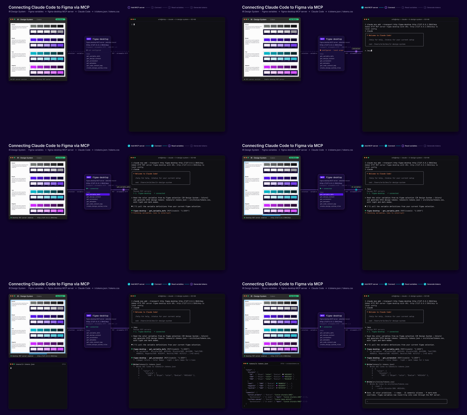
The remote server connects to Figma’s hosted endpoint at https://mcp.figma.com/mcp and is available on all seats and plans. The desktop server runs locally through the Figma desktop app and requires a Dev or Full seat on a paid plan. Figma’s own guidance is that the remote version is what most people should use — it has the broader feature set, with the desktop version reserved for specific organisation and enterprise cases.

Setup in Claude Code

# Preferred – installs MCP server config plus Figma’s agent skills
claude plugin install figma@claude-plugins-official

# Manual equivalent, user scope so it is available in every project
claude mcp add –scope user –transport http figma https://mcp.figma.com/mcp

Then run /mcp, select figma, choose Authenticate, and click Allow Access. Confirm with /mcp that the server shows as connected. The plugin route is what Figma recommends, because it ships skills for implementing designs, wiring up Code Connect, and generating design system rules alongside the raw server config.

For Claude Desktop, there is a Figma connector in the connectors directory covering the same server. Cursor, VS Code, Codex, Gemini CLI, Warp, Kiro, and Xcode 27 beta are also supported clients.


One behavioral difference that trips people up: getting design context is link-based on the remote server. Right-click a frame in Figma, choose “Copy link to selection,” and paste that into the prompt — the client cannot navigate the URL but extracts the node ID from it. Selection-based prompting, where the agent reads whatever is currently selected, only works with the desktop server.

The tools that matter for design system work

Tool Use
get_variable_defs Returns variables and styles used in a selection — the fastest audit of whether a frame is actually tokenized
get_design_context Structure and styling for a layer, defaulting to React plus Tailwind but steerable by prompt
get_metadata A sparse XML outline of a selection; use first on large frames, then drill in
get_code_connect_map Maps Figma node IDs to real components in the repo
search_design_system Searches connected libraries for existing components, variables, and styles so the agent reuses instead of inventing
use_figma Writes to the canvas — creates variables, components, auto layout
create_design_system_rules An MCP prompt that generates a rules file giving agents codebase-aware context


Prompt-order discipline

Run create_design_system_rules early, save the result where the agent reads it, then harden it by hand. The mandatory tool order is get_metadata, then get_variable_defs, then get_code_connect_map, then get_design_context. Most bad output comes from agents jumping straight to design context on a big frame, exhausting the context window, and confabulating the styling that did not fit. Checking variables second also gives a free tokenization audit — a frame that returns no variables is a design defect surfaced before a line of code exists.

On multi-platform work, pass clientFrameworks explicitly (React, SwiftUI, Compose) or Code Connect will happily return a SwiftUI mapping while the agent writes React.


Making the file legible to the agent

Output quality is mostly a function of Figma hygiene, not prompt engineering. Auto layout everywhere, named layers, real components rather than detached groups, variables bound instead of raw fills, and small selections rather than whole pages. Figma explicitly warns against selecting large heavy frames.

Code Connect is the multiplier. Once the Figma button maps to src/ui/Button.tsx, the agent stops generating a new button and starts importing yours. That single mapping does more for output quality than any amount of prompt tuning.

8 of 8 100%
INITIAL BEFORE & AFTER

What was the hard-work for?

Documentation time is one of the best measures of value in creating this Design System — the laborious but business-critical work of creating specification of components for engineering handoff. Guardrails allowed the system to evolve without breaking and consistency across UI output at scale.

Also, we noticed that the search function with Claude works better across all projects than the default one in Figma.

  Before After
Documentation
2–5 hours per component
< 10 minutes
Token references
Written from memory individually
Sourced from Figma JSON
Variant coverage
Manually creating screenshots
Auto-documented
Breakpoints Built one by one to document Rendered side-by-side
Hardcoded values
Scattered and broken
Deleted down to 0 and verified by a token audit
Component updatability
Manual re-documentation or none at all
Auto-documented
PROJECT RESULTS RECAP

Impact and Outcomes

During the audit and connection phases we uncovered the need for legacy component cleanup.  There we’re duplications, outdated components, drafts, hidden elements, and broken components used as one-offs. For example: Example: “Button_primary”, “PrimaryButton”, “Primary-btn” → “Button/Primary”.

Time is Money – Benjamin Franklin: the build of Figma using Claude Code + MCP with a well-structured token layer with both primitive and semantic variables defined, and all foundational components built allowed for no round-tripping and components, properties, auto layouts are spun up from a one-line prompt — not click-by-click.

Consistency and more speed: guardrails in place allowed for minimal hallucinations, search for components went 72% faster and the output of UI more than doubled in speed. Additionally this allowed for simple wireframe level sketches to be input into Claude and both PM and UXers could create testable UI at a prototype-level quickly.

Who runs the show?: the build of this design system and any good DS is a hierarchy based on Atomic Design. This allowed for a simpler federated team of 3 (DS designer, lead engineer, and a marketing PM) to maintain and own the system and it’s changes versus perviously would be a team of designers handing off alterations to a development team.

To comply with my non-disclosure agreement, I have omitted and obfuscated confidential information in this case study.  The information in this case study is my own and does not necessarily reflect the views of Innovation Refunds.