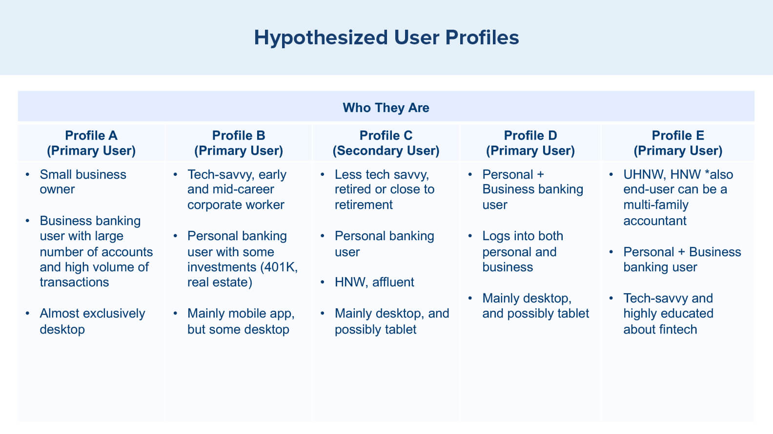
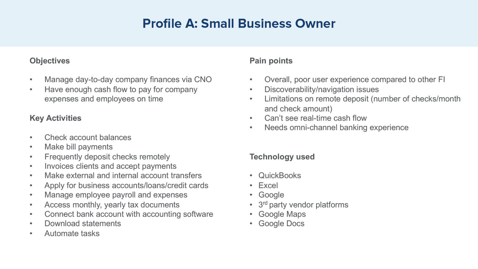
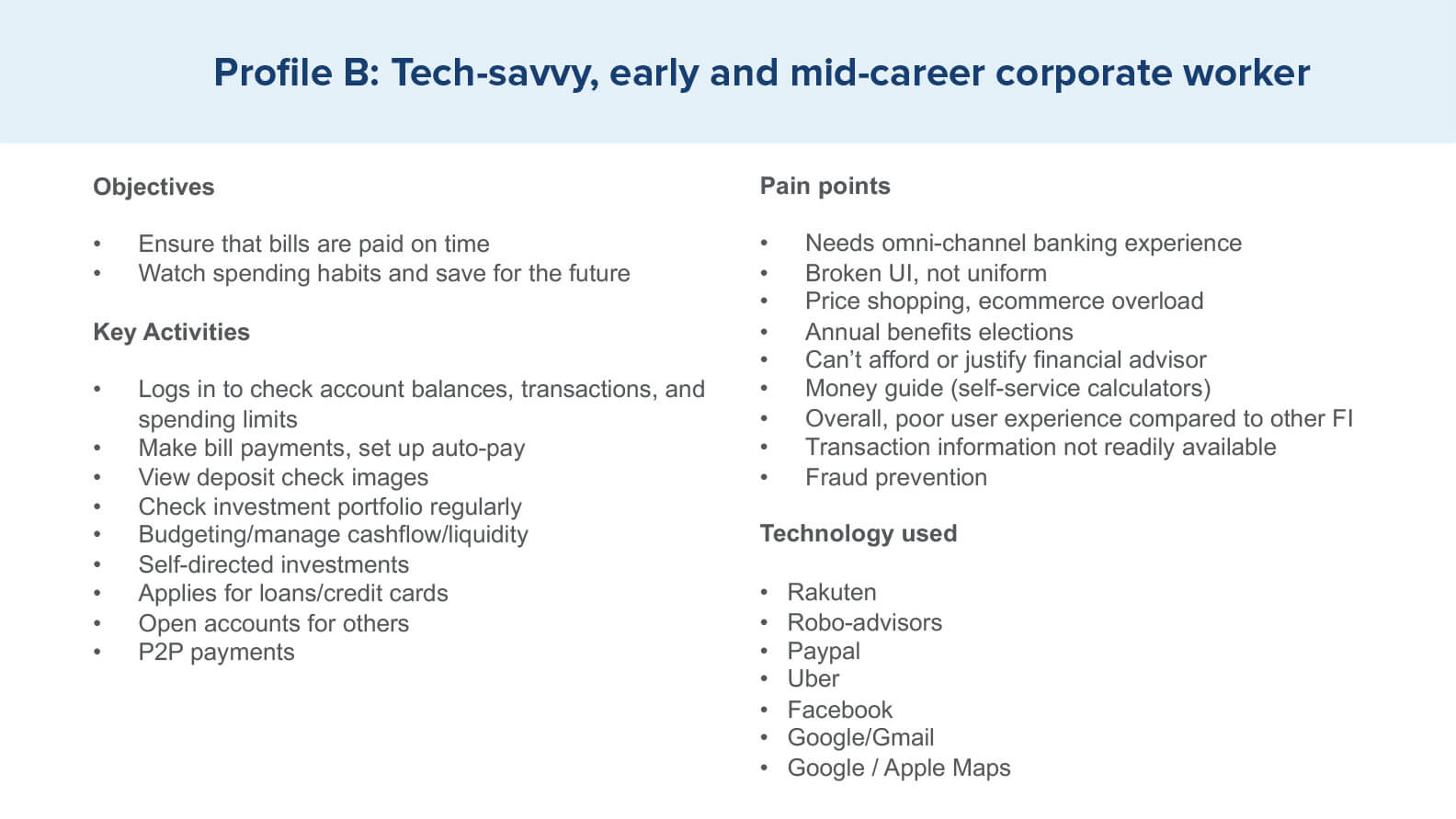
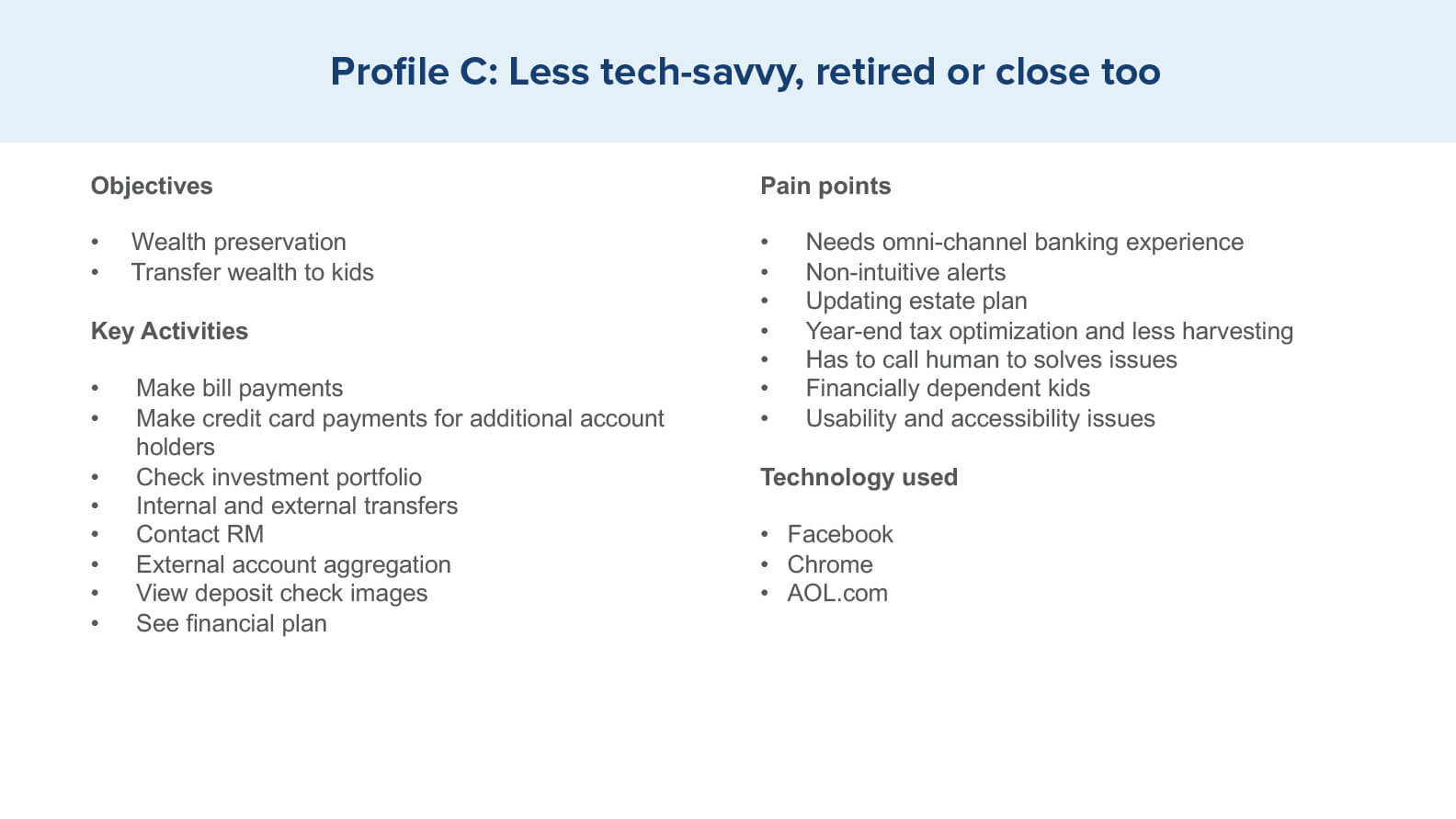
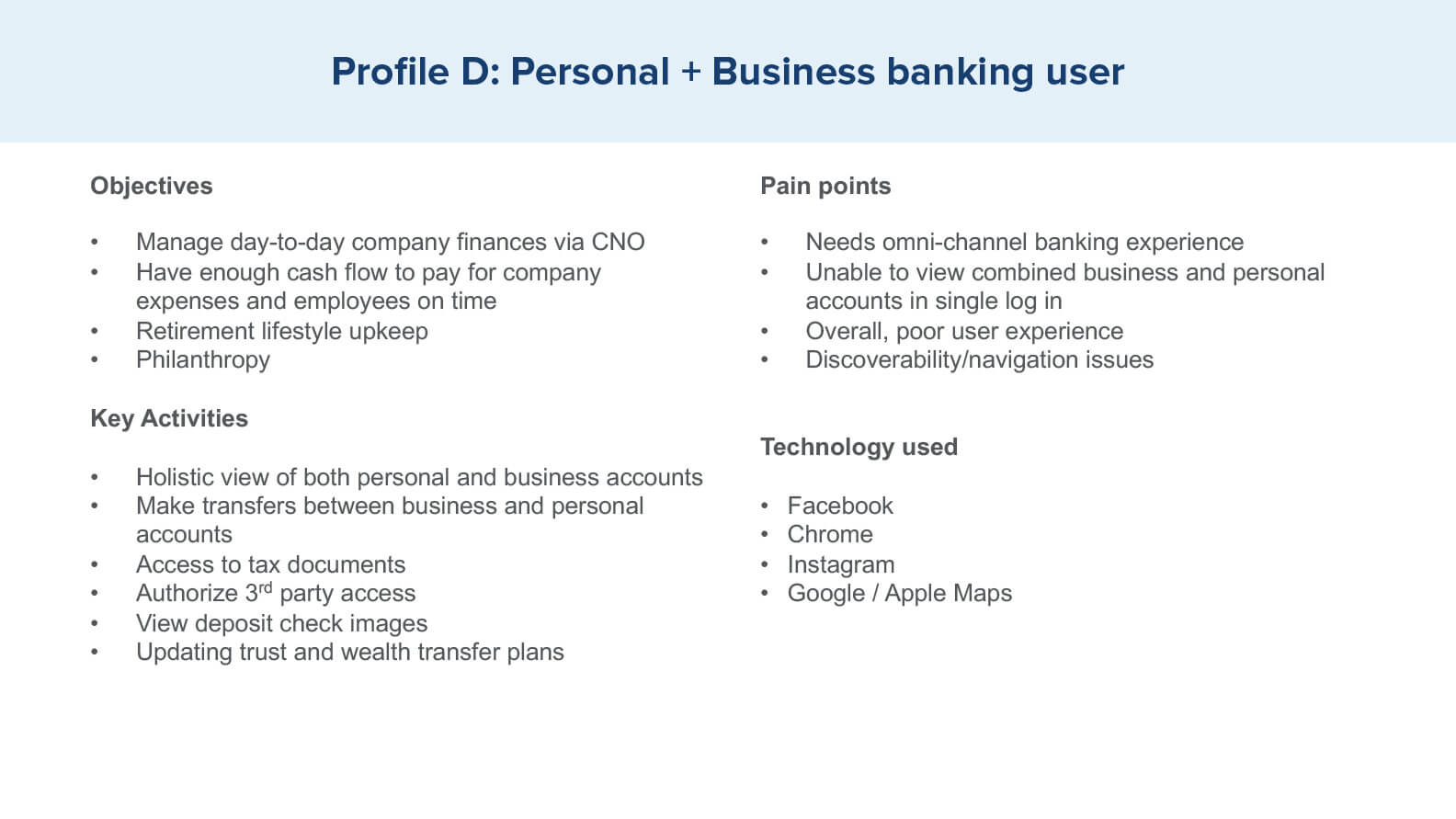
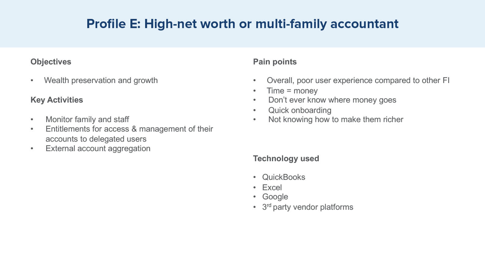
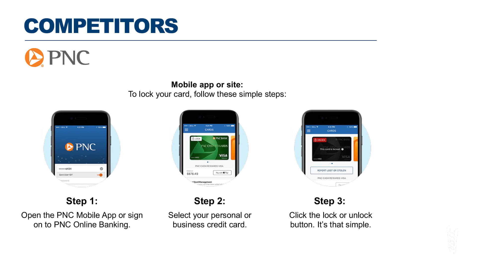
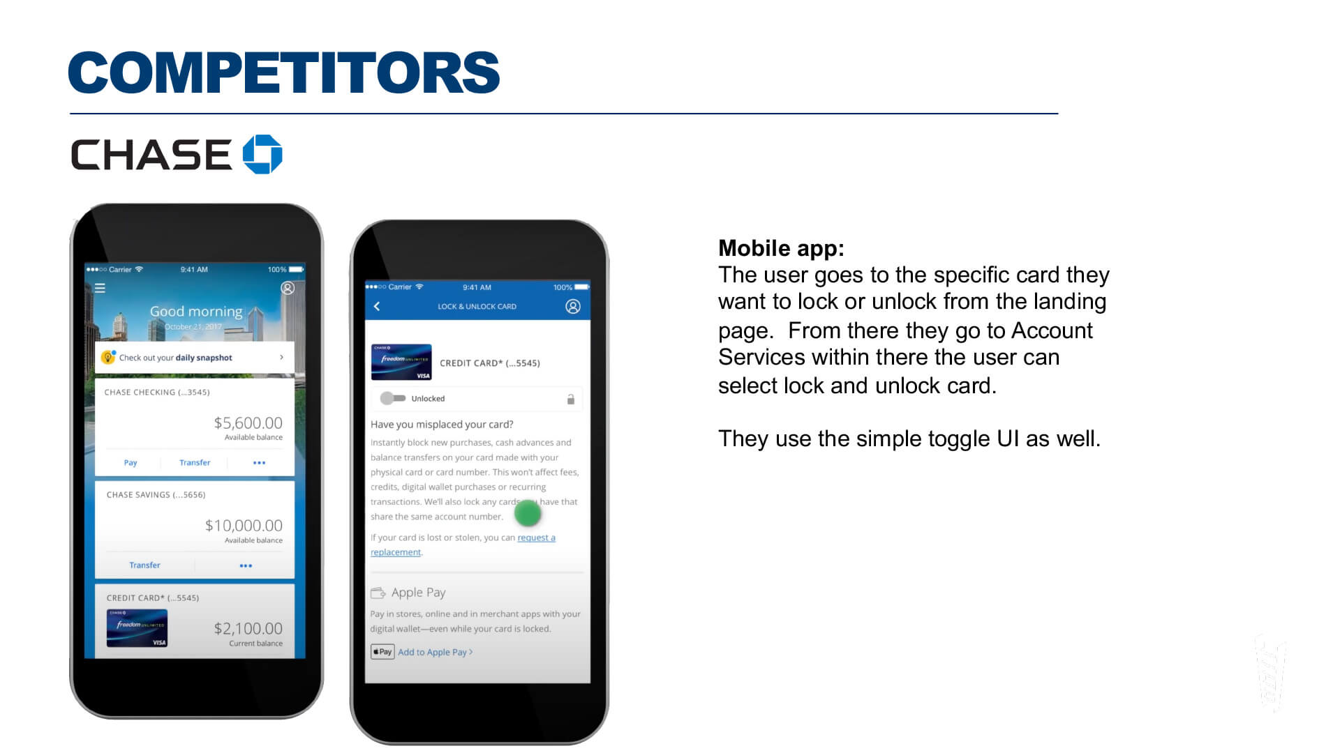
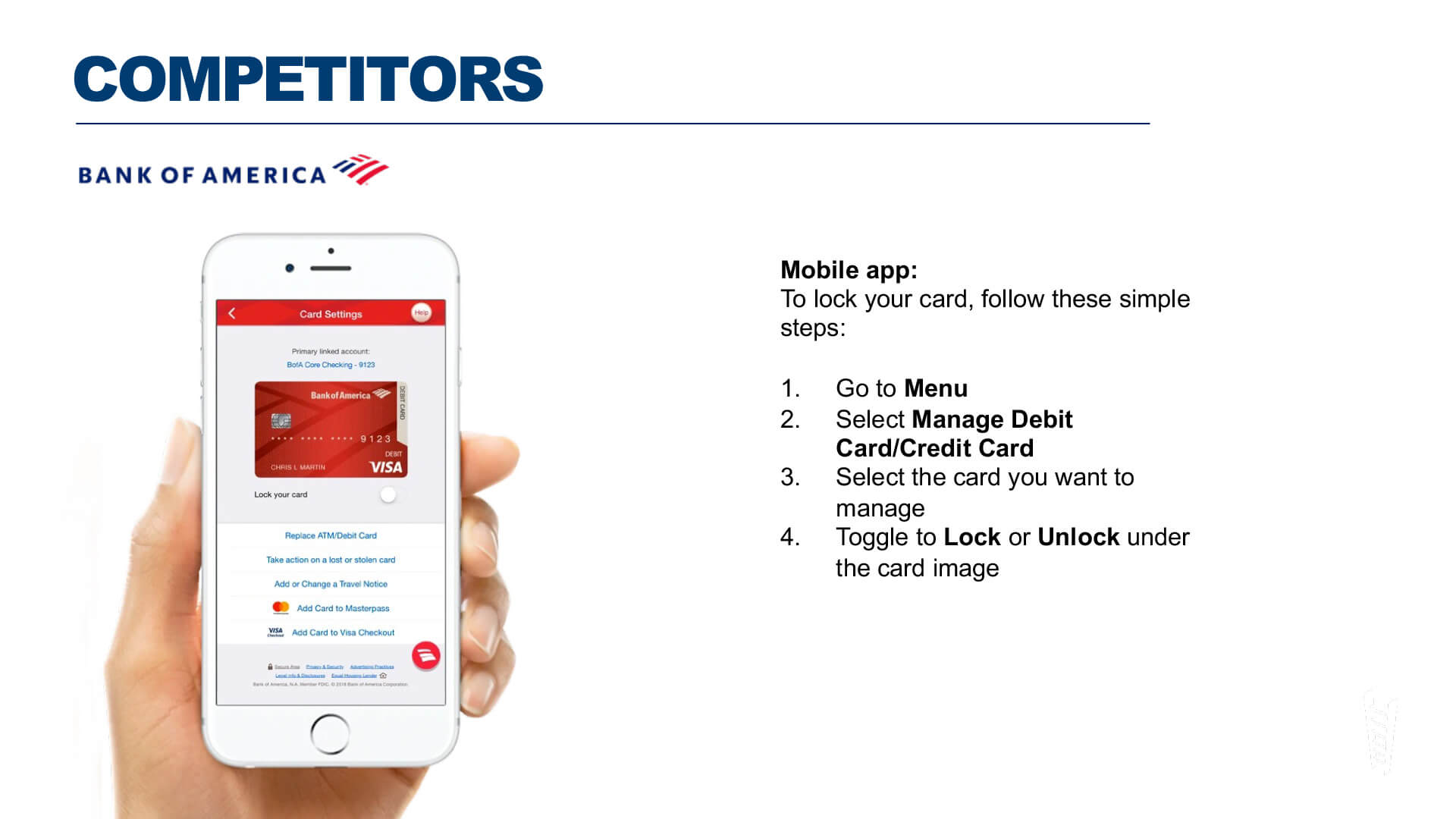
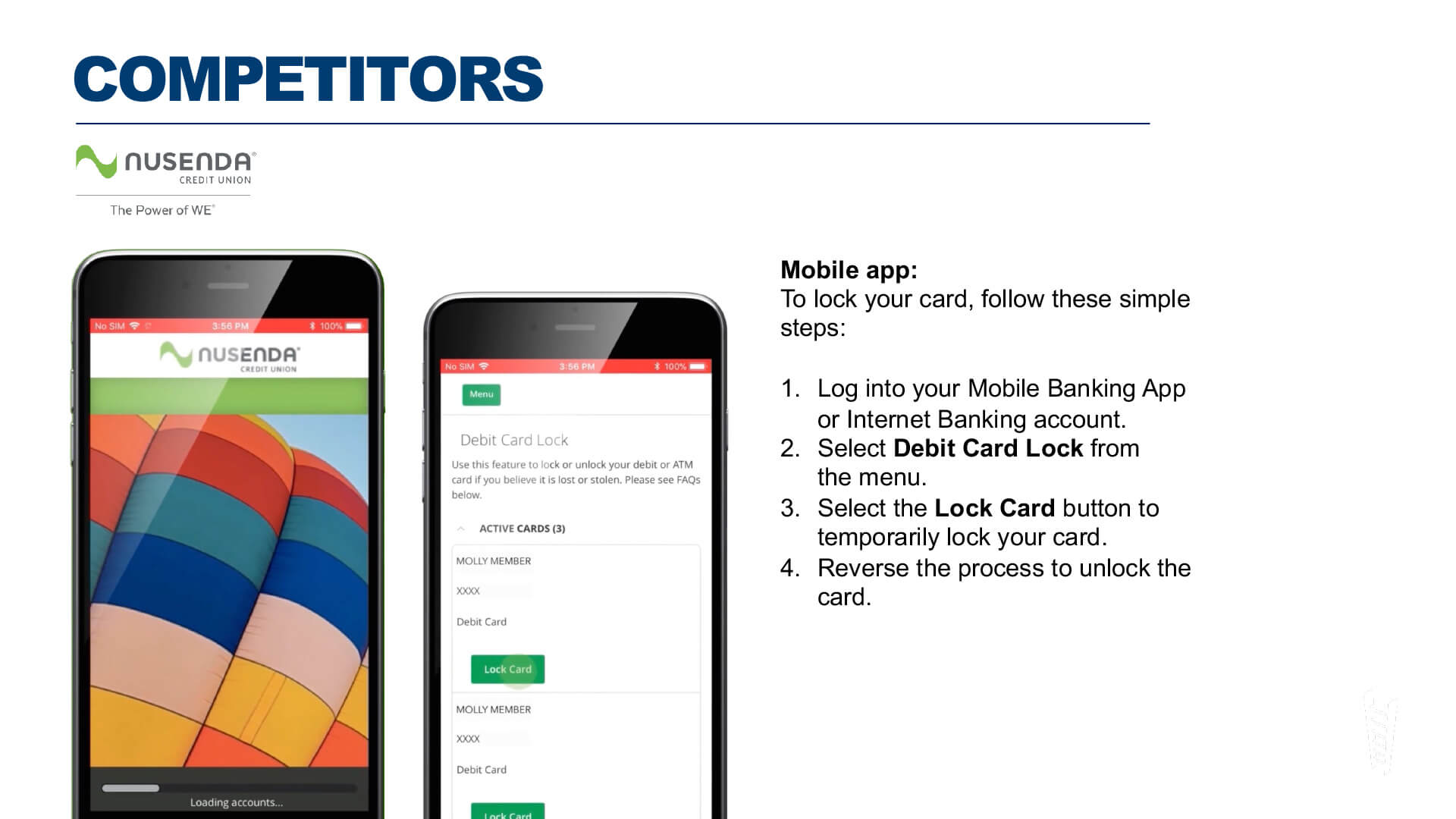
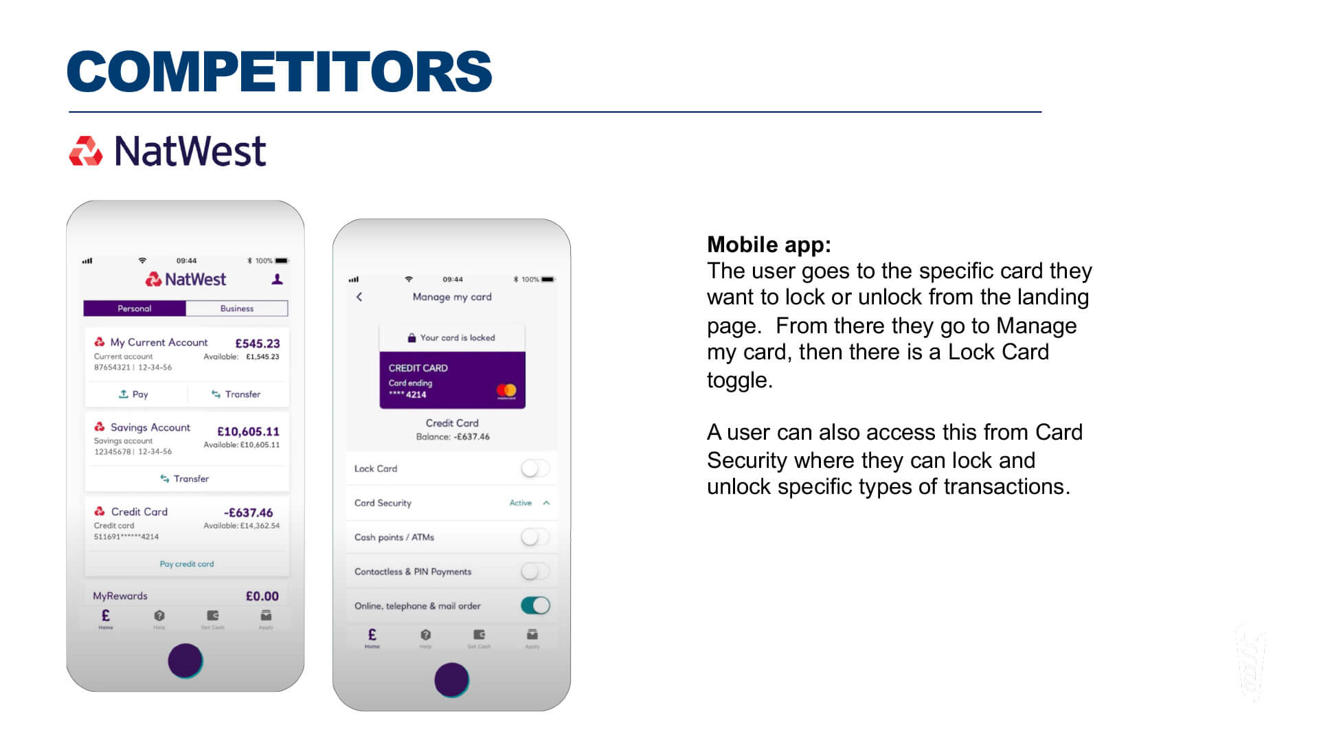
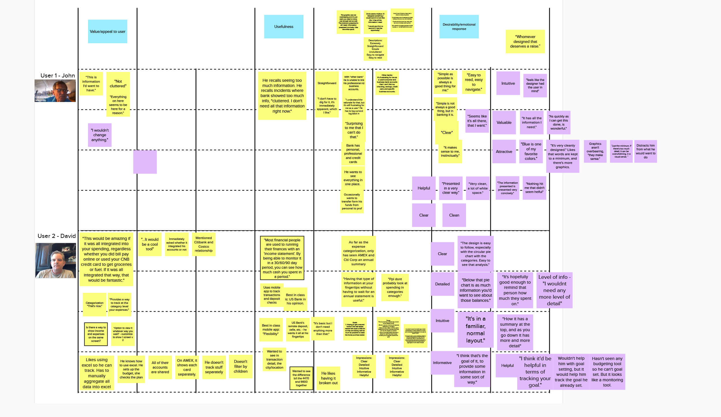
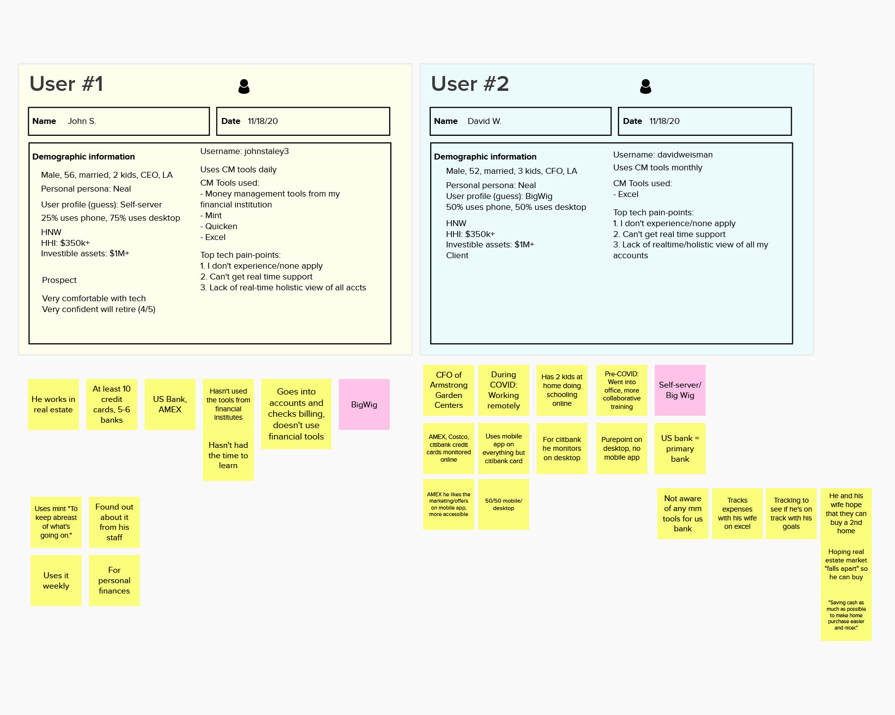
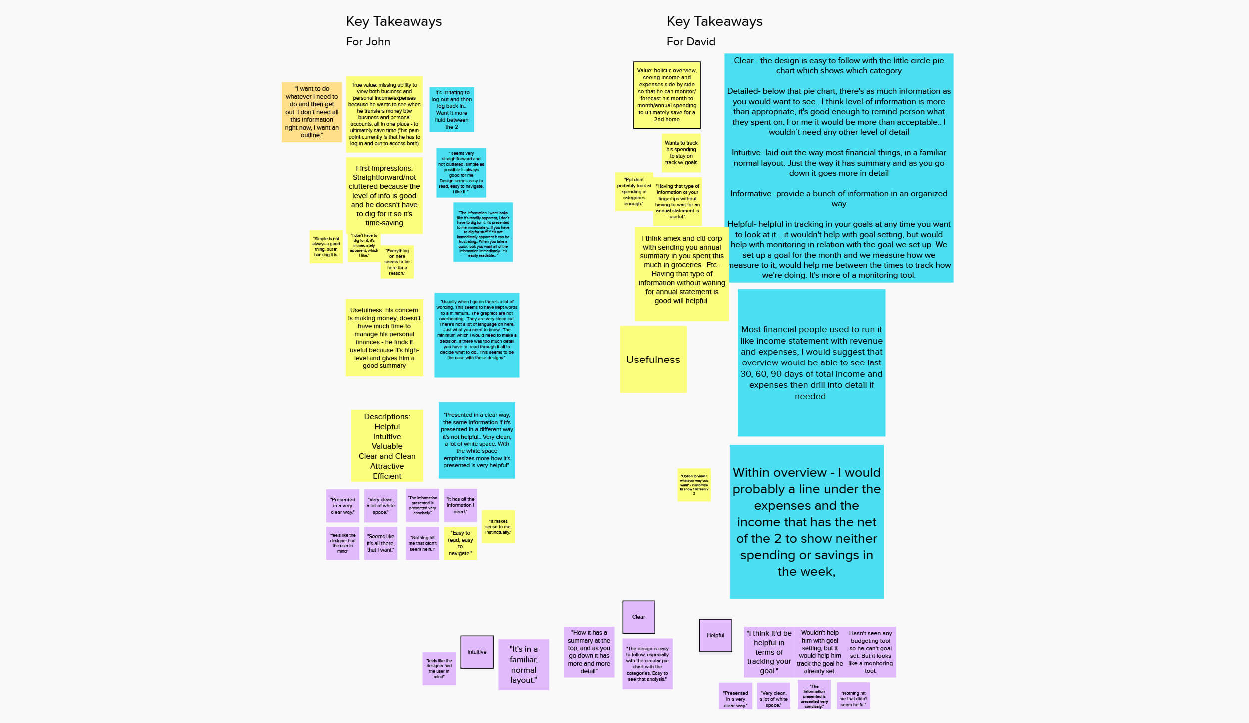
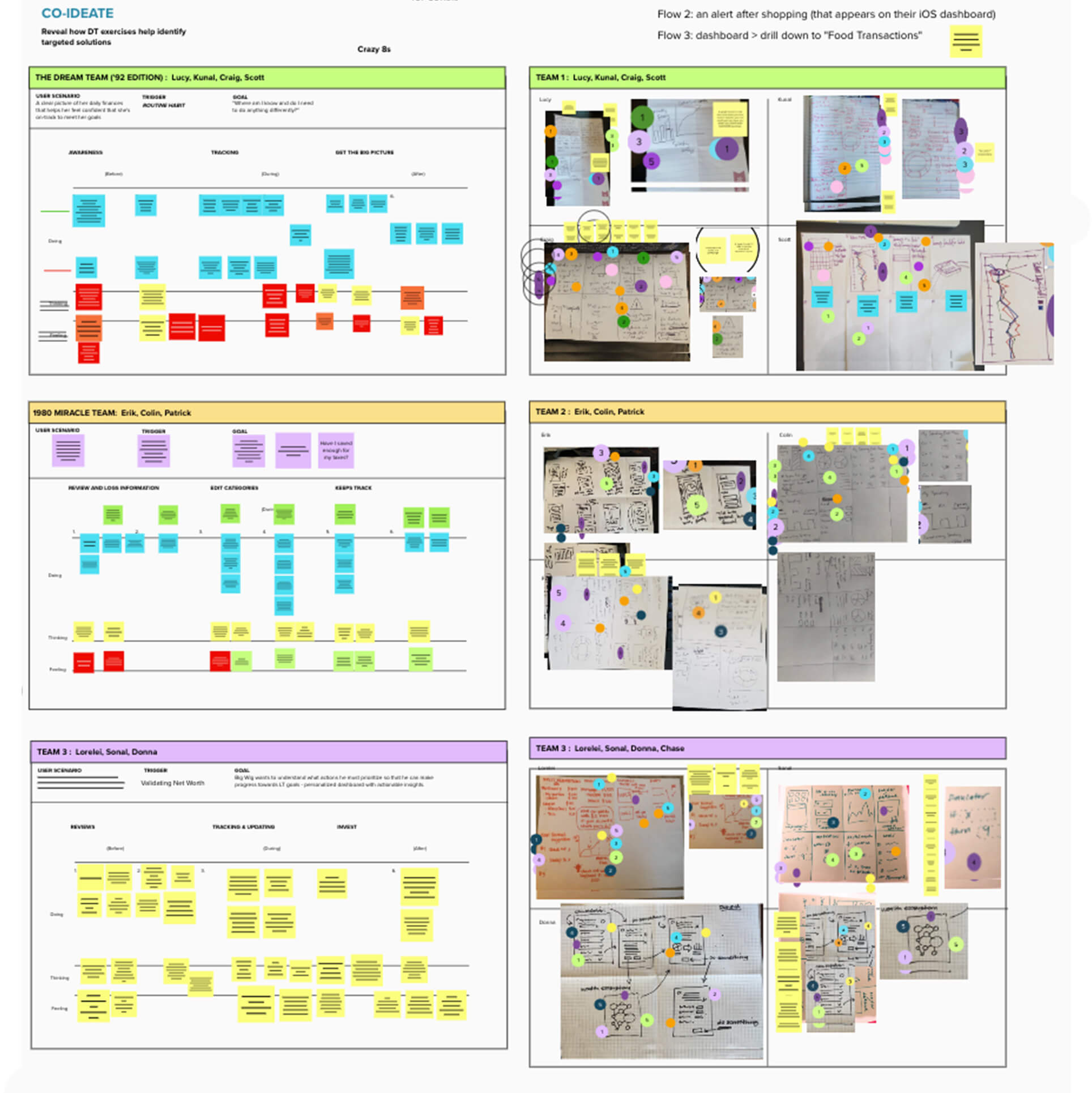
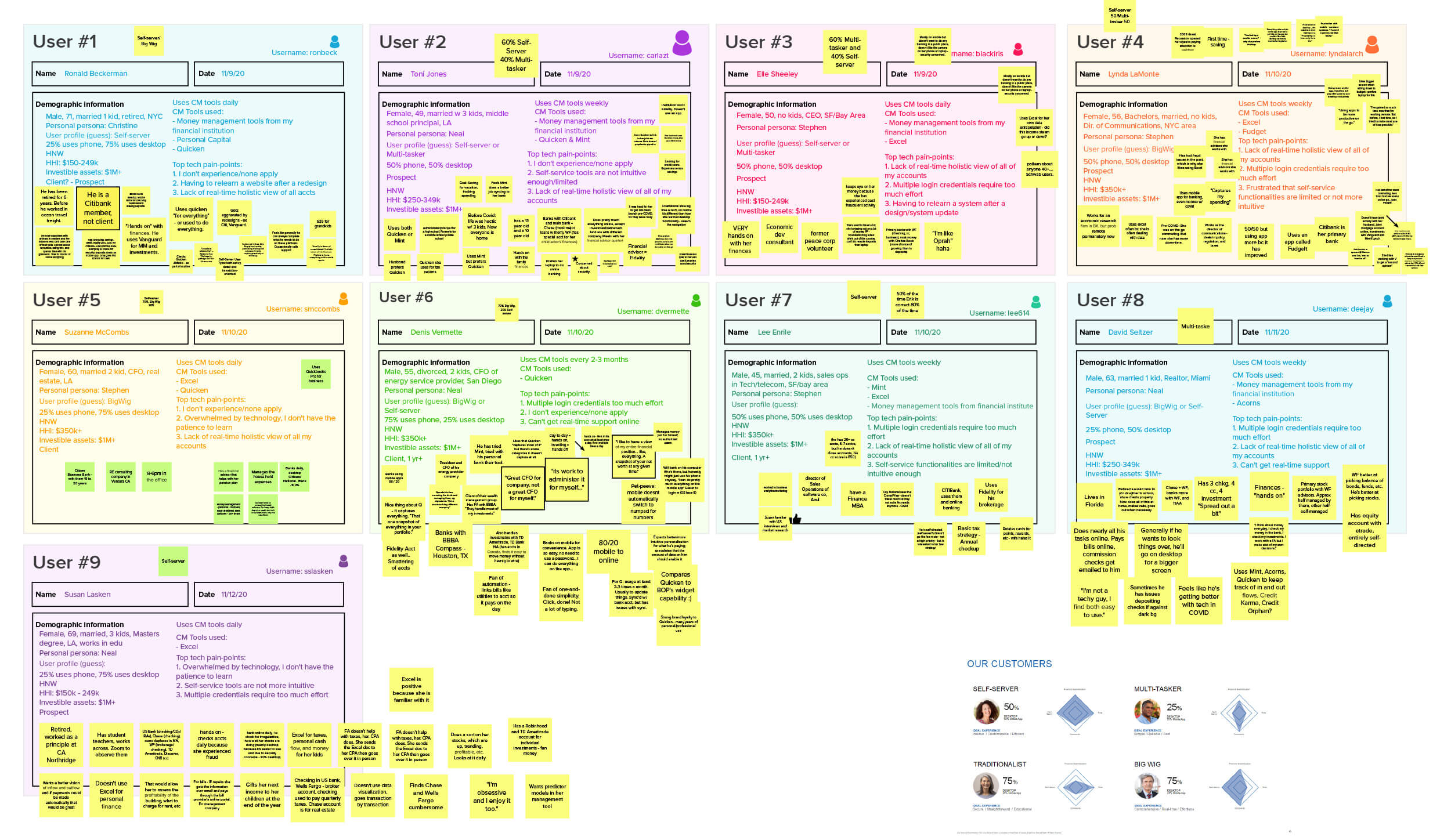
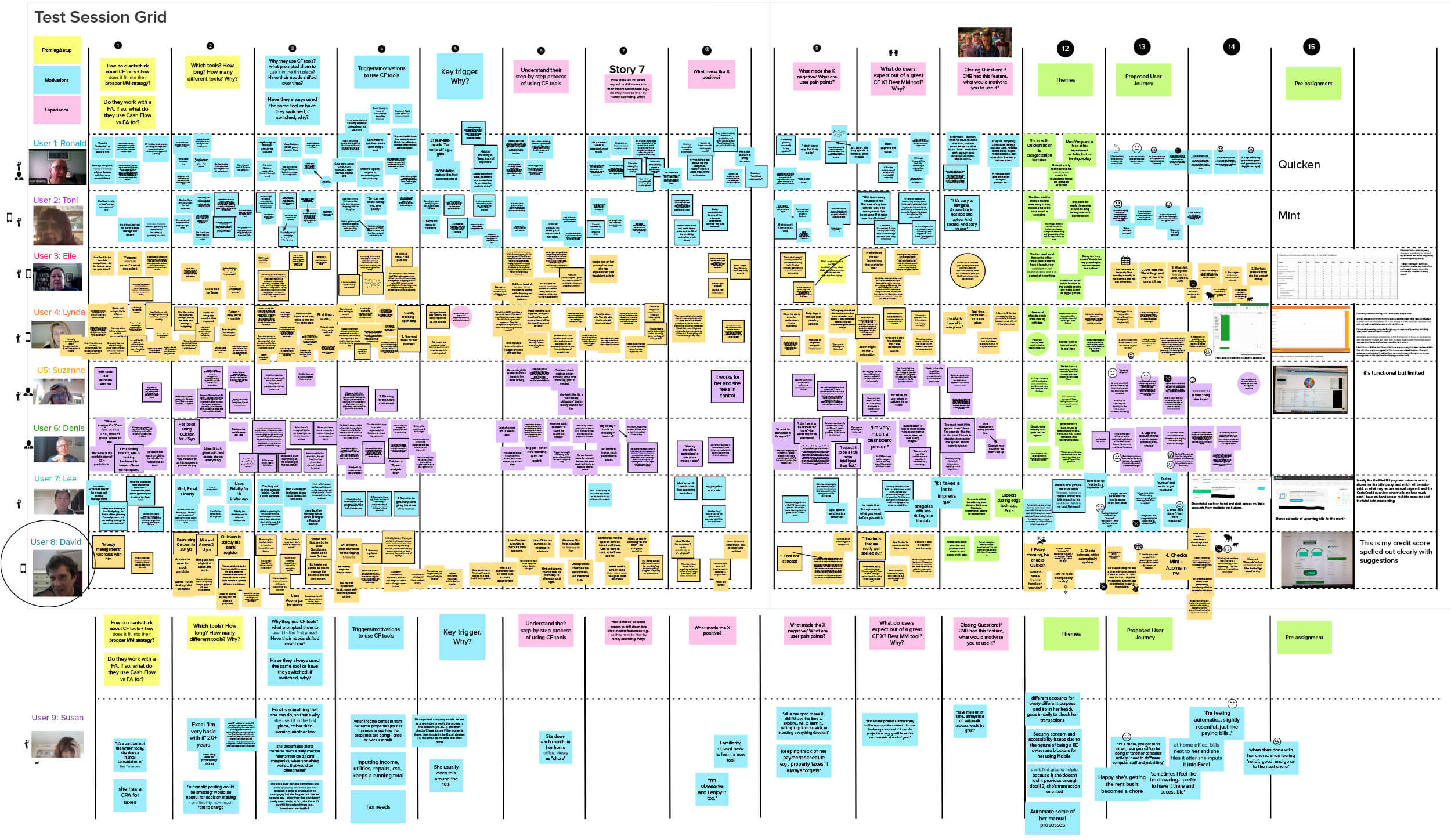
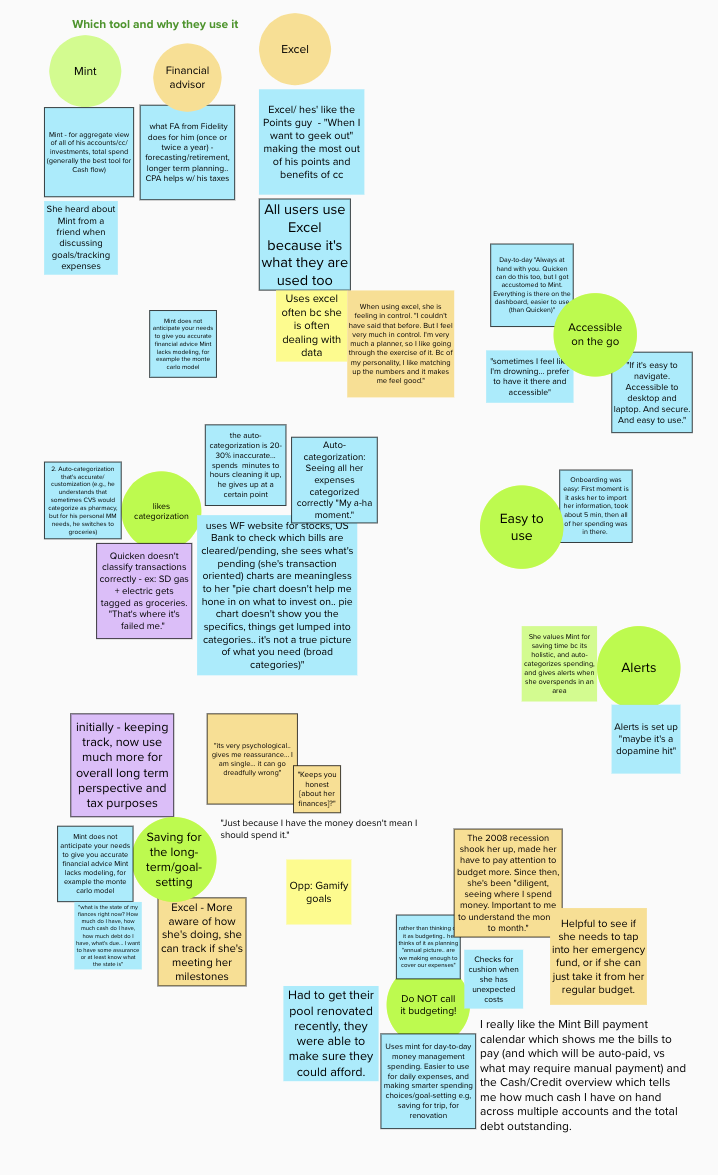
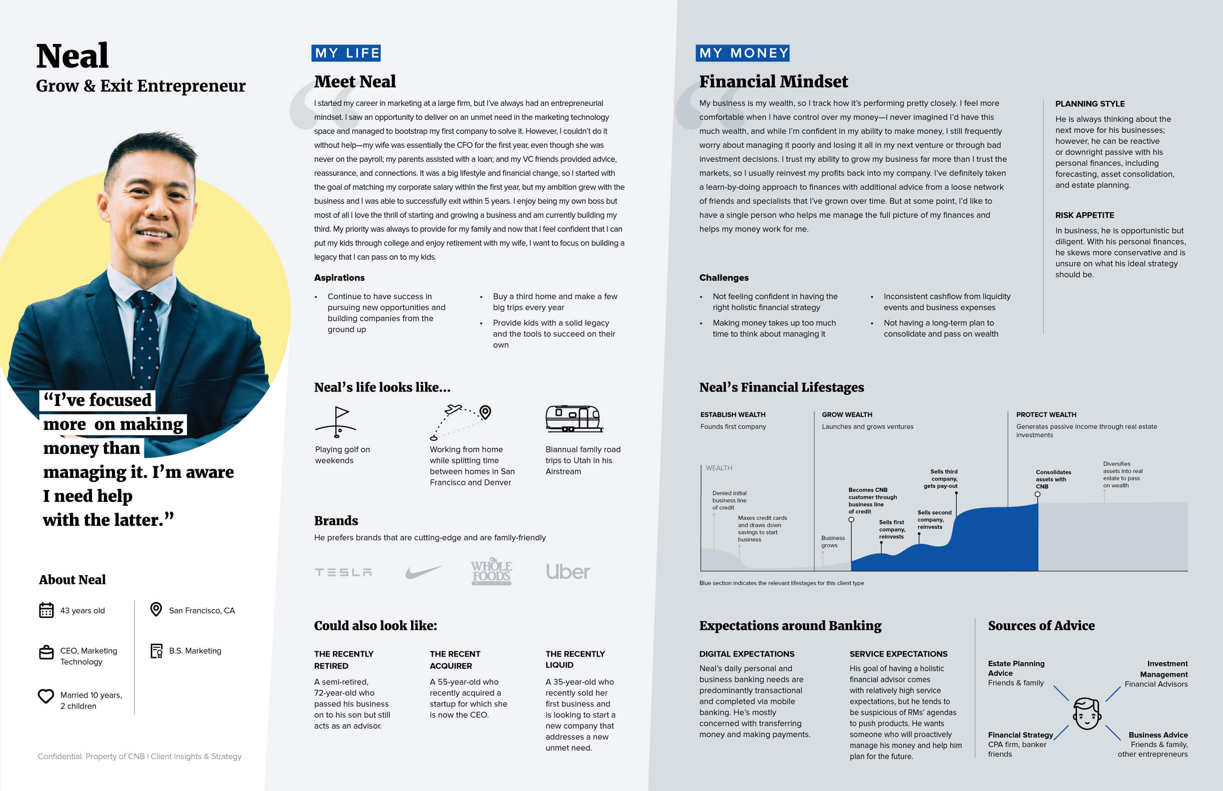
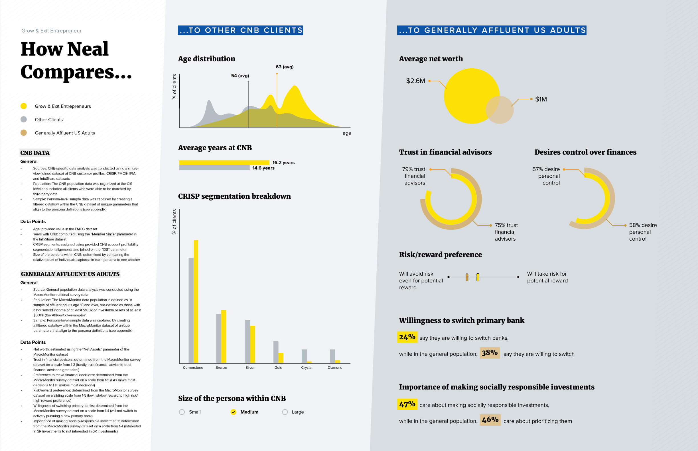
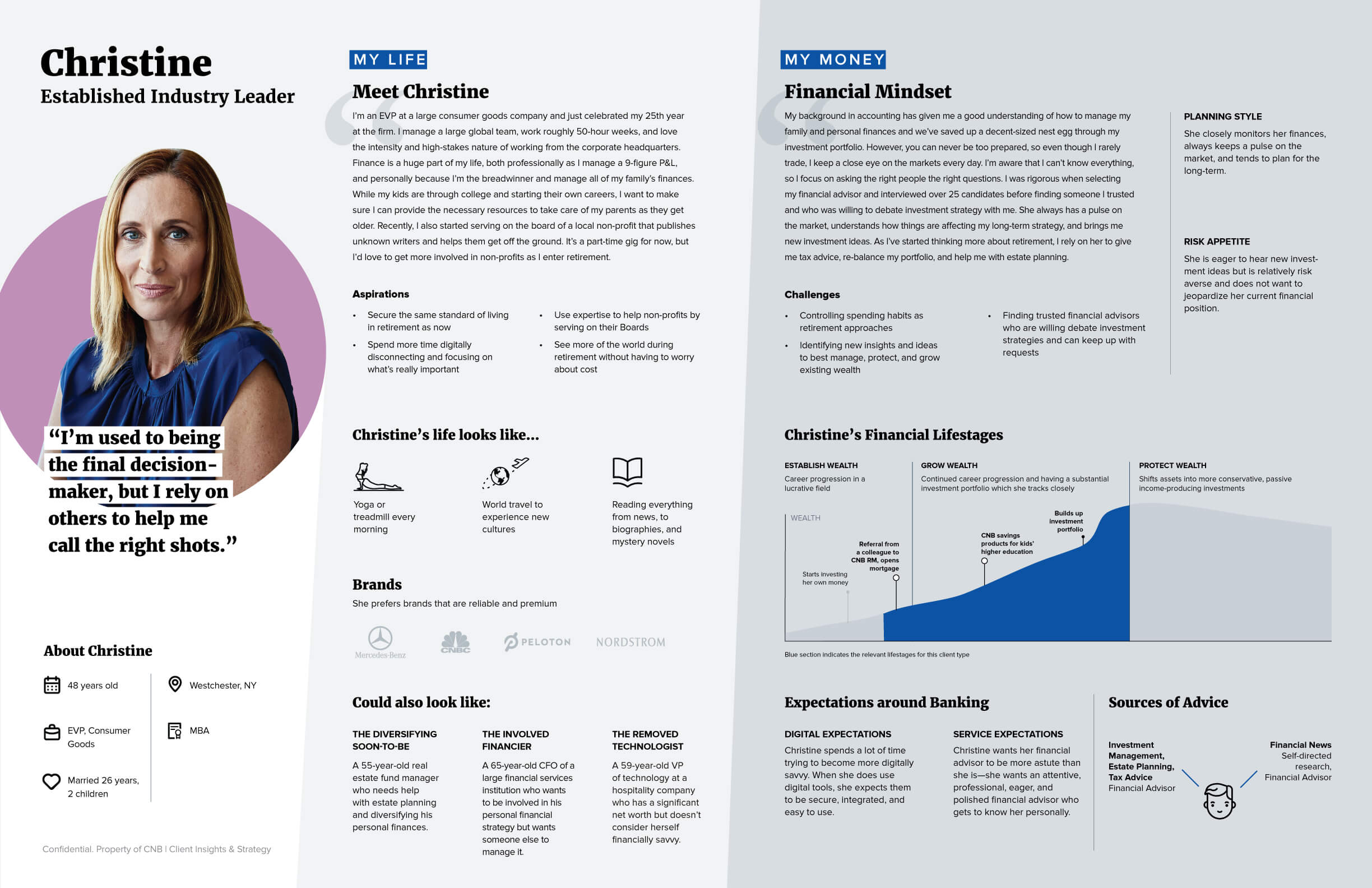
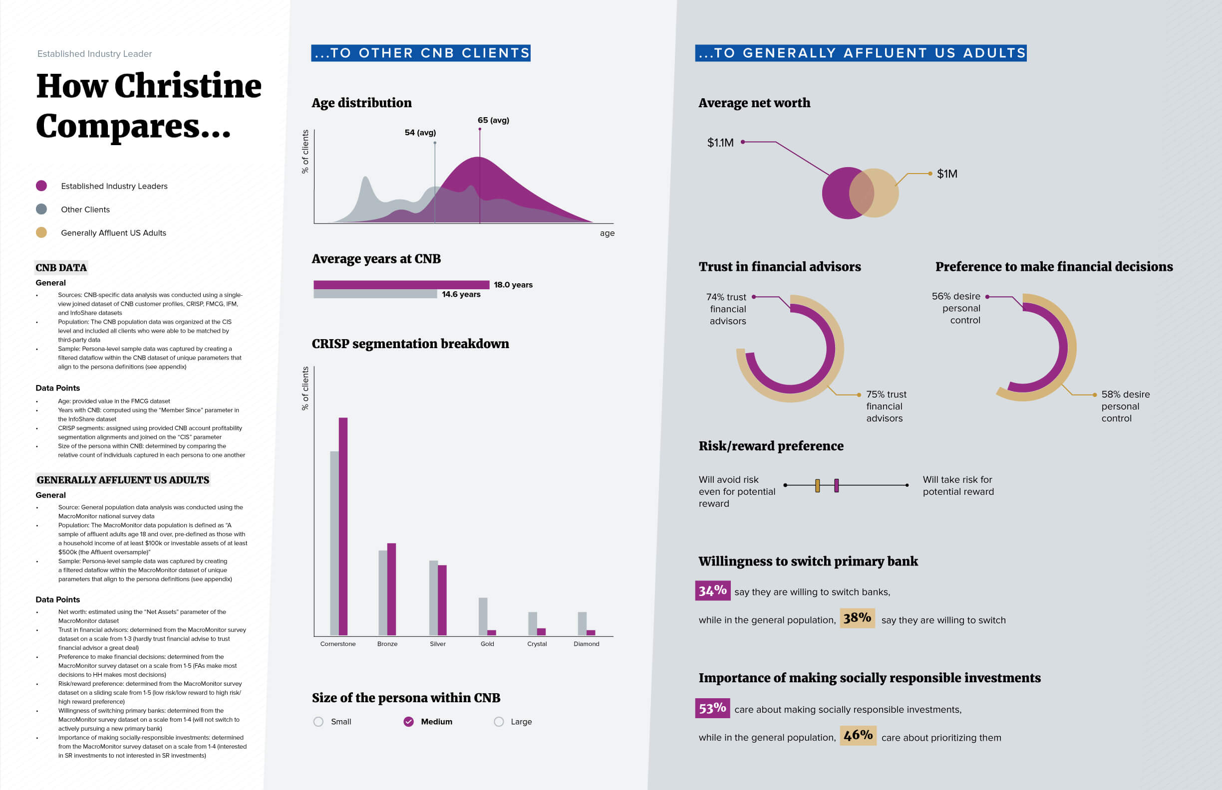
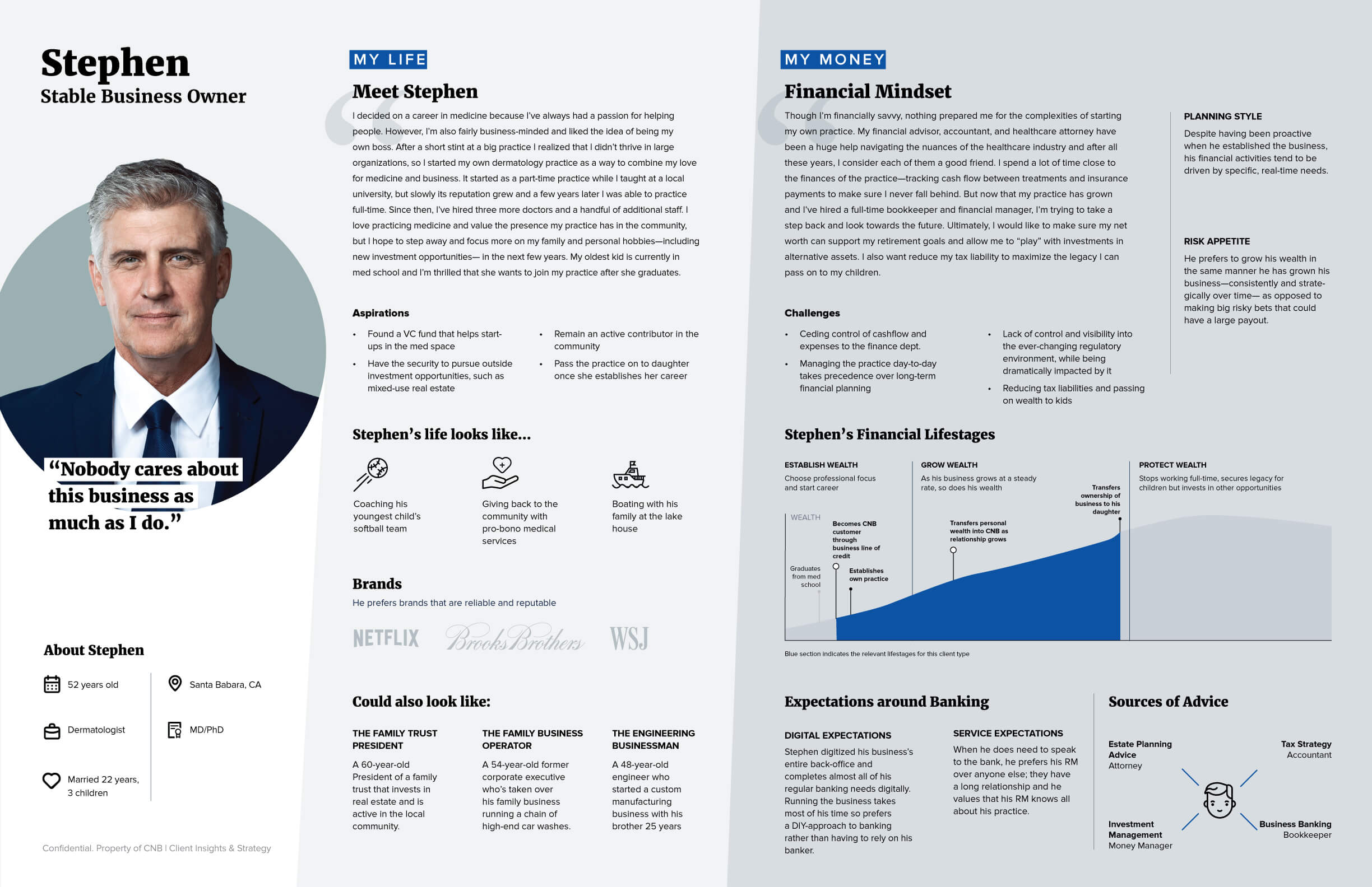
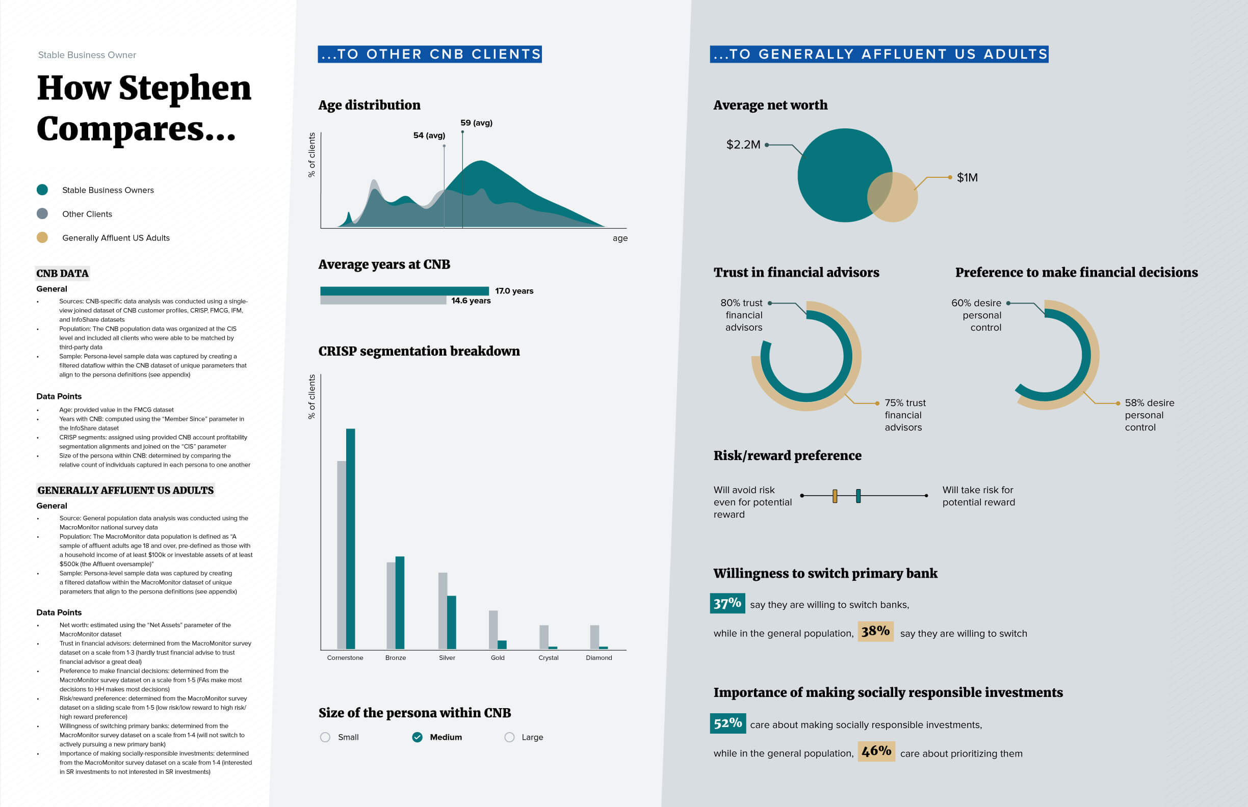
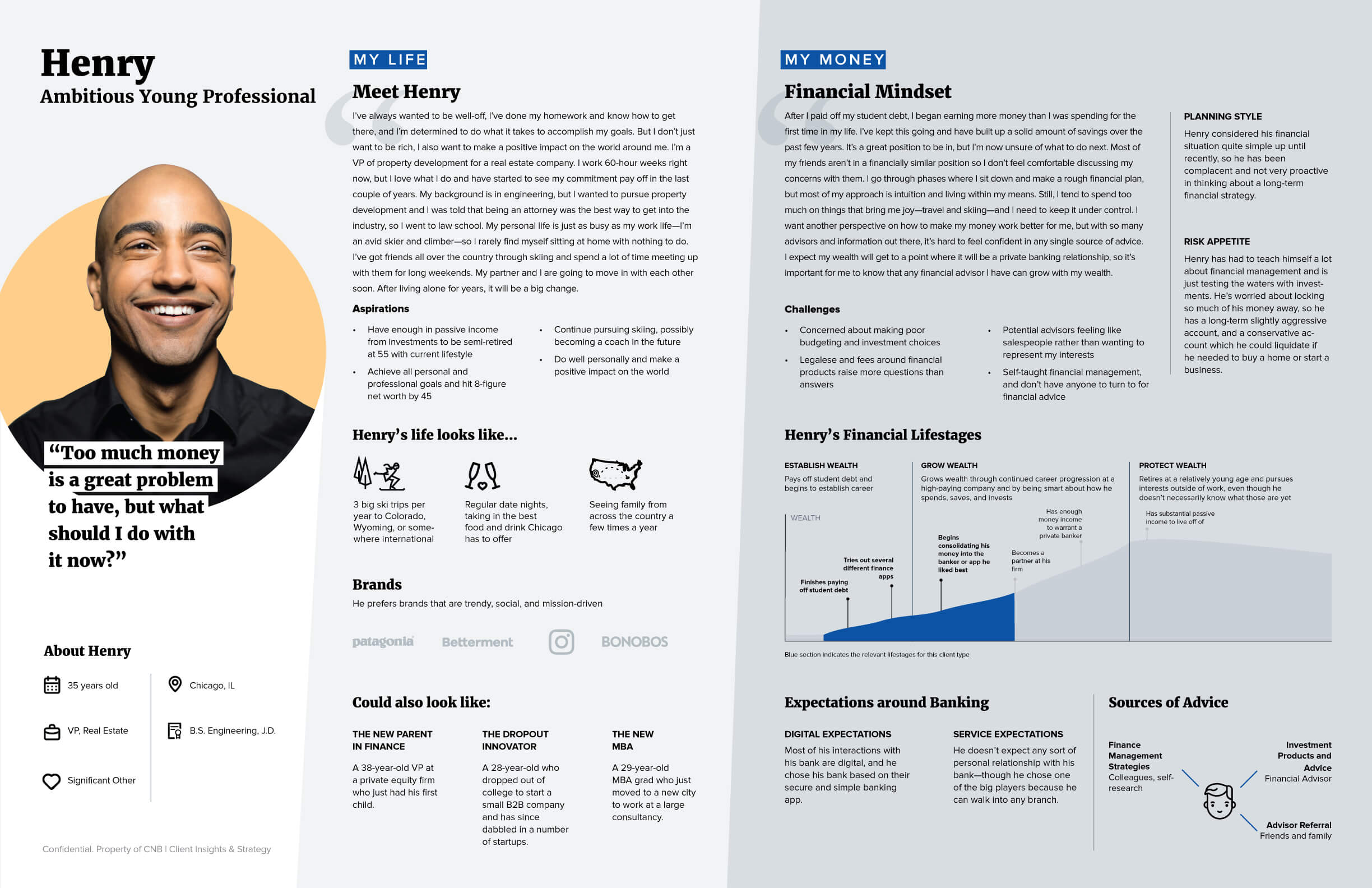
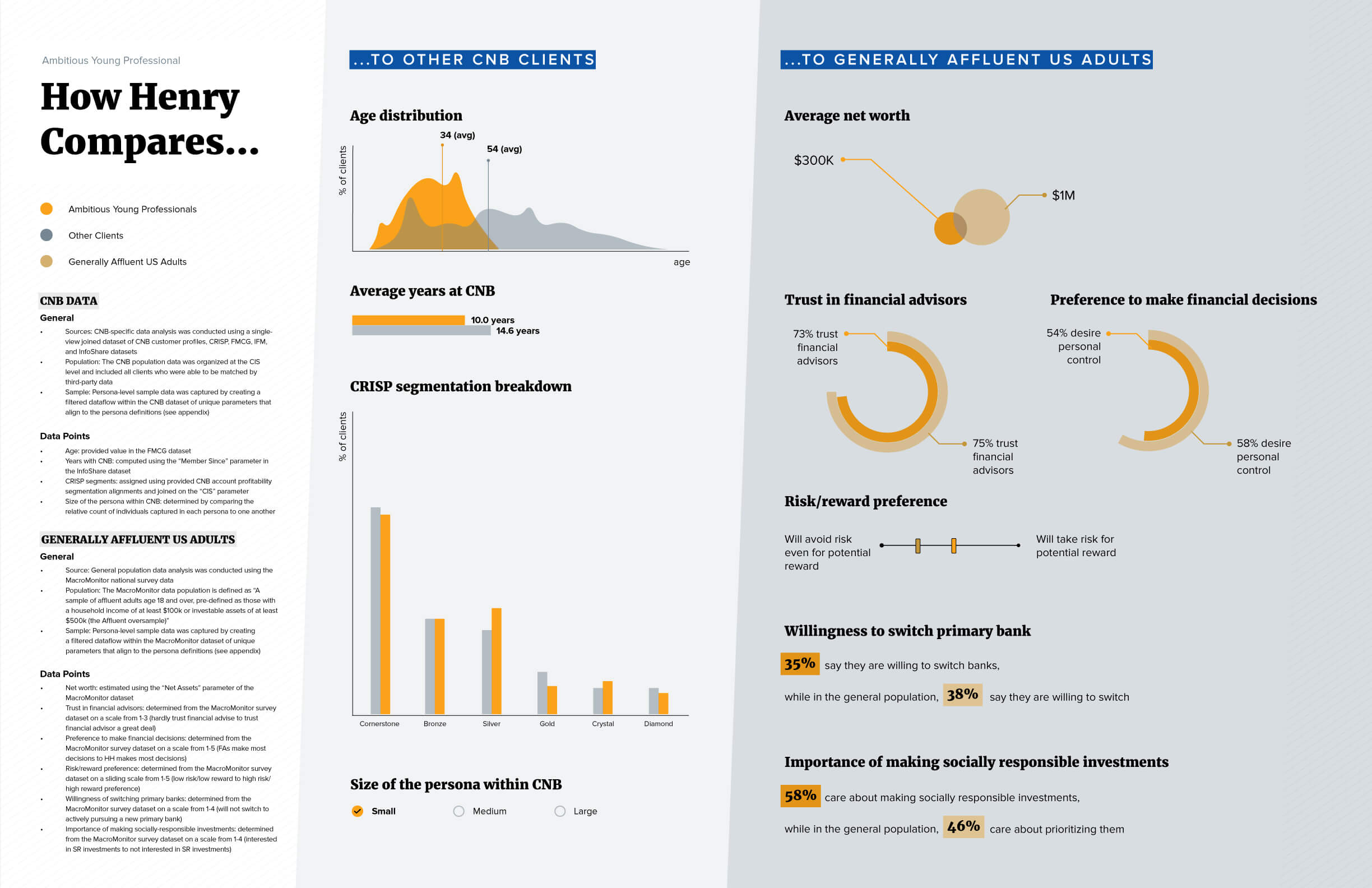
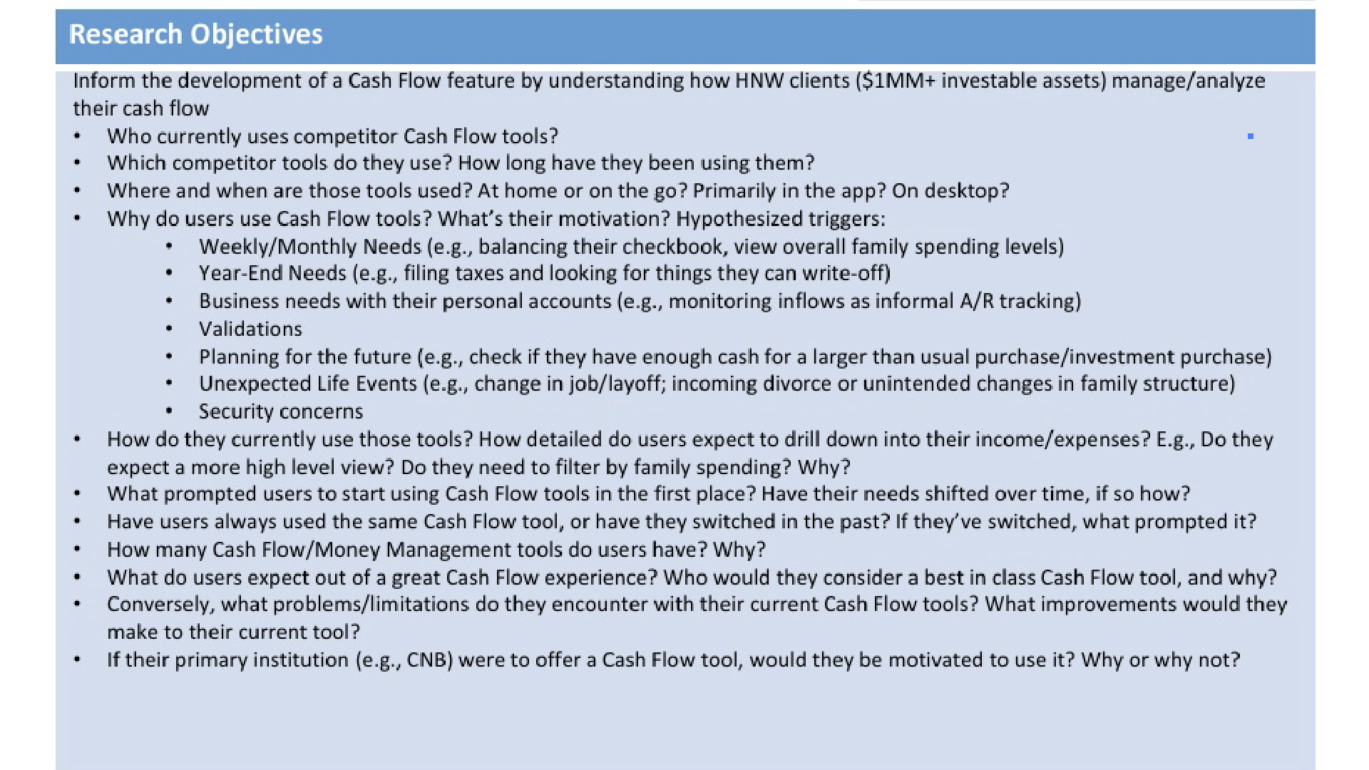
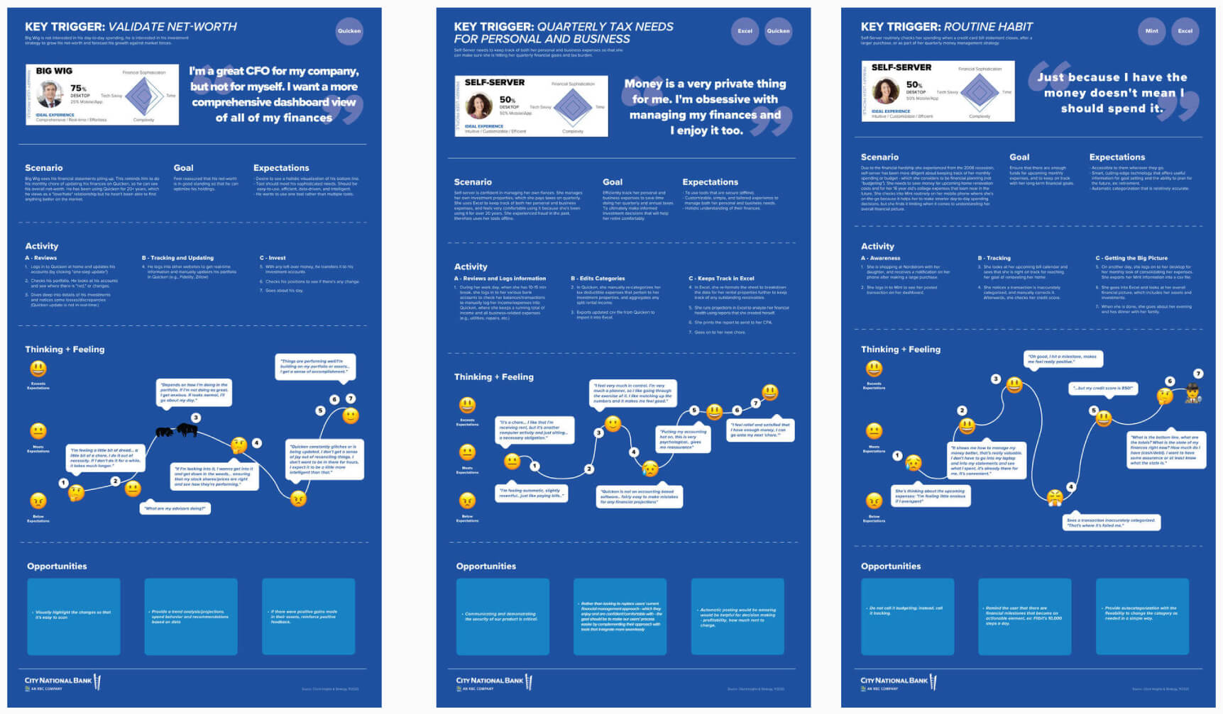
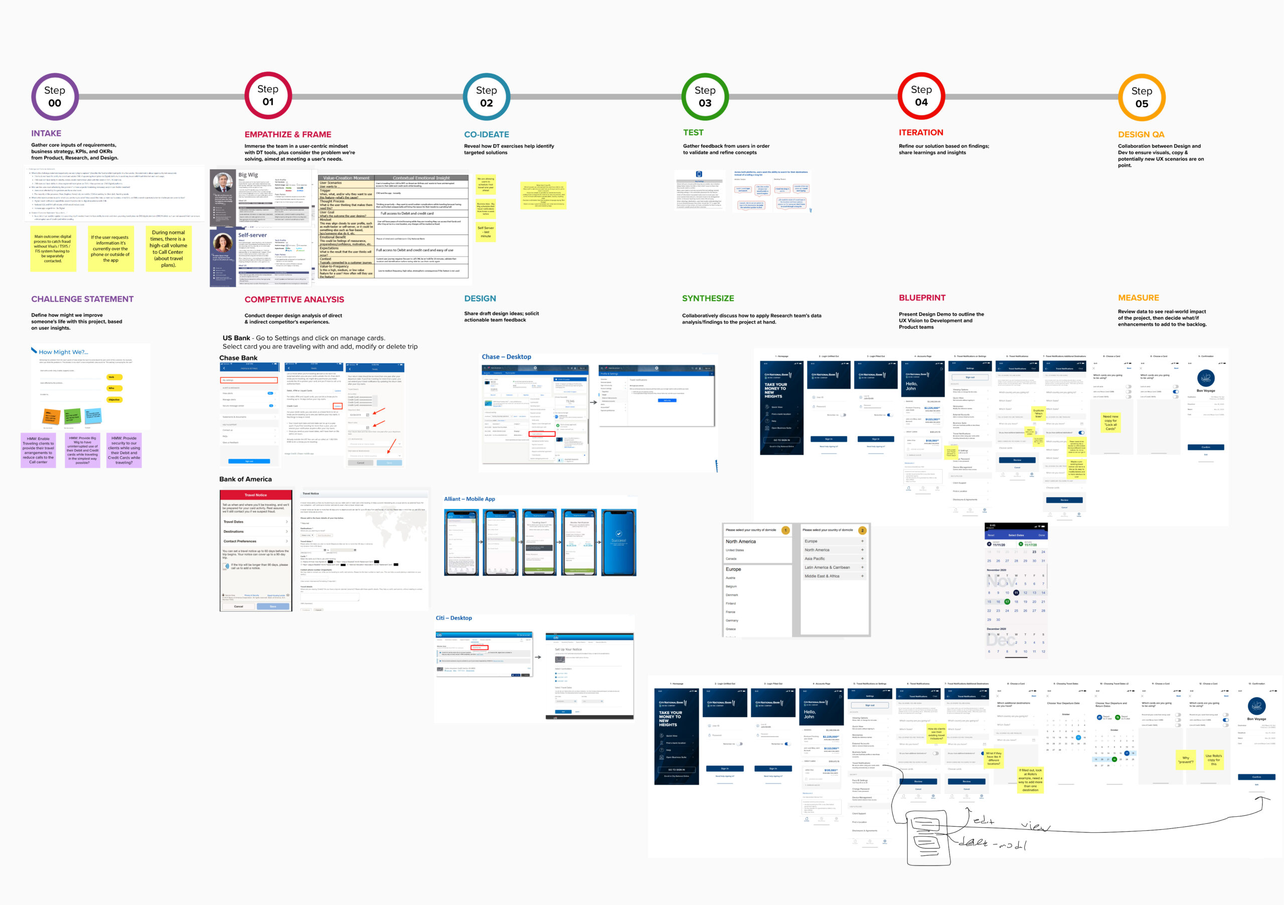
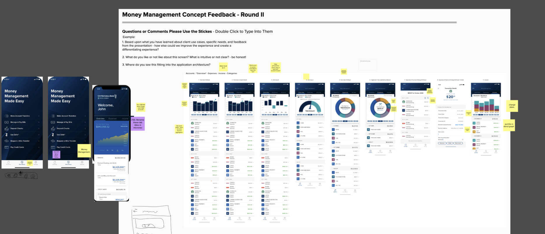
This project became a cast study in the need for in-depth user interviews, feedback mechanisms, and project scope estimation. The Wealth Management project originally started as three separate projects: credit card locking, account alerts, and travel notifications. These three needs converged to a single, large, multi-epic project due to the data we gathered from multiple City National Bank user interviews.
Once the past initial Discovery Stage credit card locking and travel notifications project expanded due to seeing what our business banking clients and regular banking clients wanted. A cost analysis was done and my team and I convinced the stakeholders to allow us to deep dive on analysis, more interviews and expand the timeline for the feature deliverables.
Moral of the story, never estimate past the point where you may get new information based on a build and testing cycle.
THE PROBLEM
- Considering this project were three seperate projects becoming one, we examined the problem from the lens of different stakeholders to help us frame what we were trying to solve.
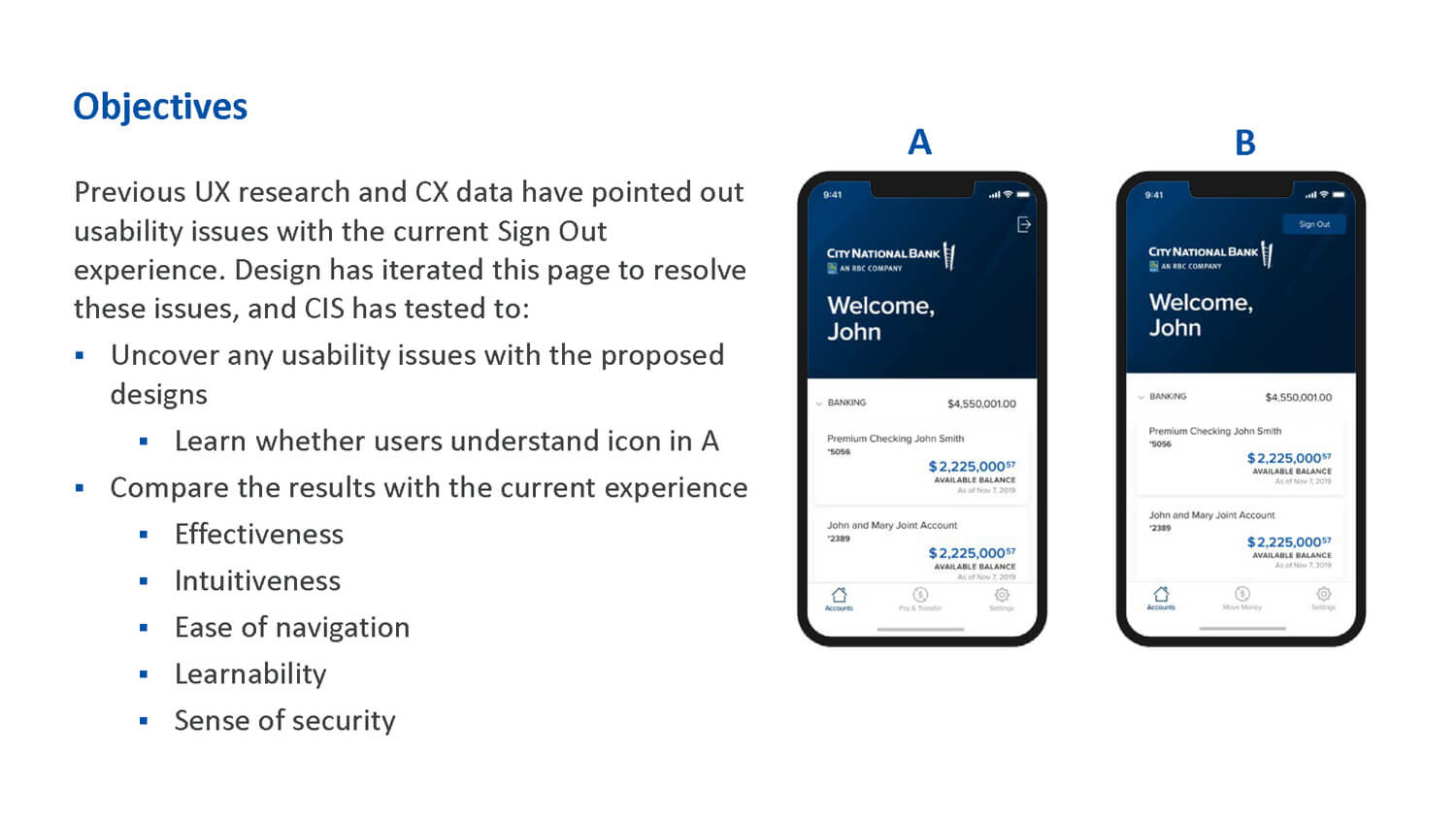
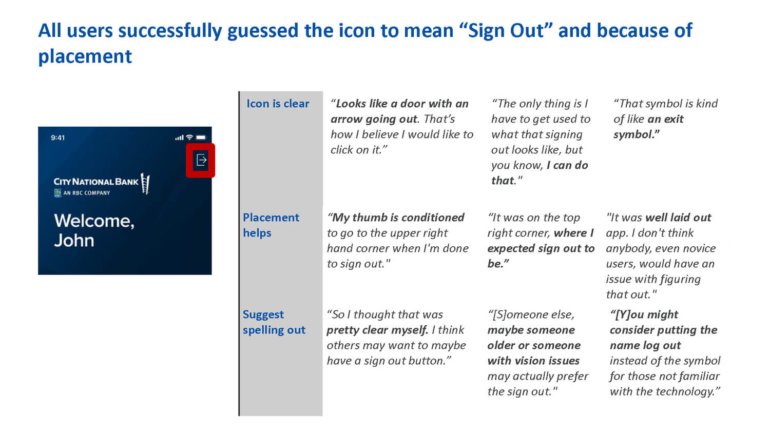
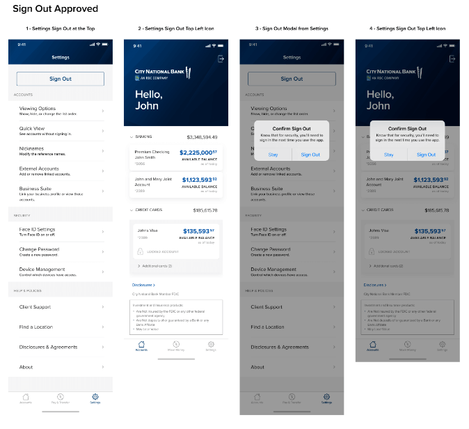
- For the initial credit card problem we found that users didn’t feel secure when they closed the app because the sign out button was buried in settings. It didn’t matter that the app automatically signs you out when closed. A feedback mechanism was missing.
- The travel notices problem was multifold. First, clients on the go needed to provide their travel arrangements to reduce requests to the Call center so CNB wouldn’t think of an international transaction as fraud. Secondly, how do we provide security and uninterrupted use of debit and credit cards while traveling, for CNB clients?
- The Account Takeover Prevention project had the issue of displaying messages when fraud happens while the user is within the app. Where would warning messages be displayed? What would the action be afterwards?
GOALS
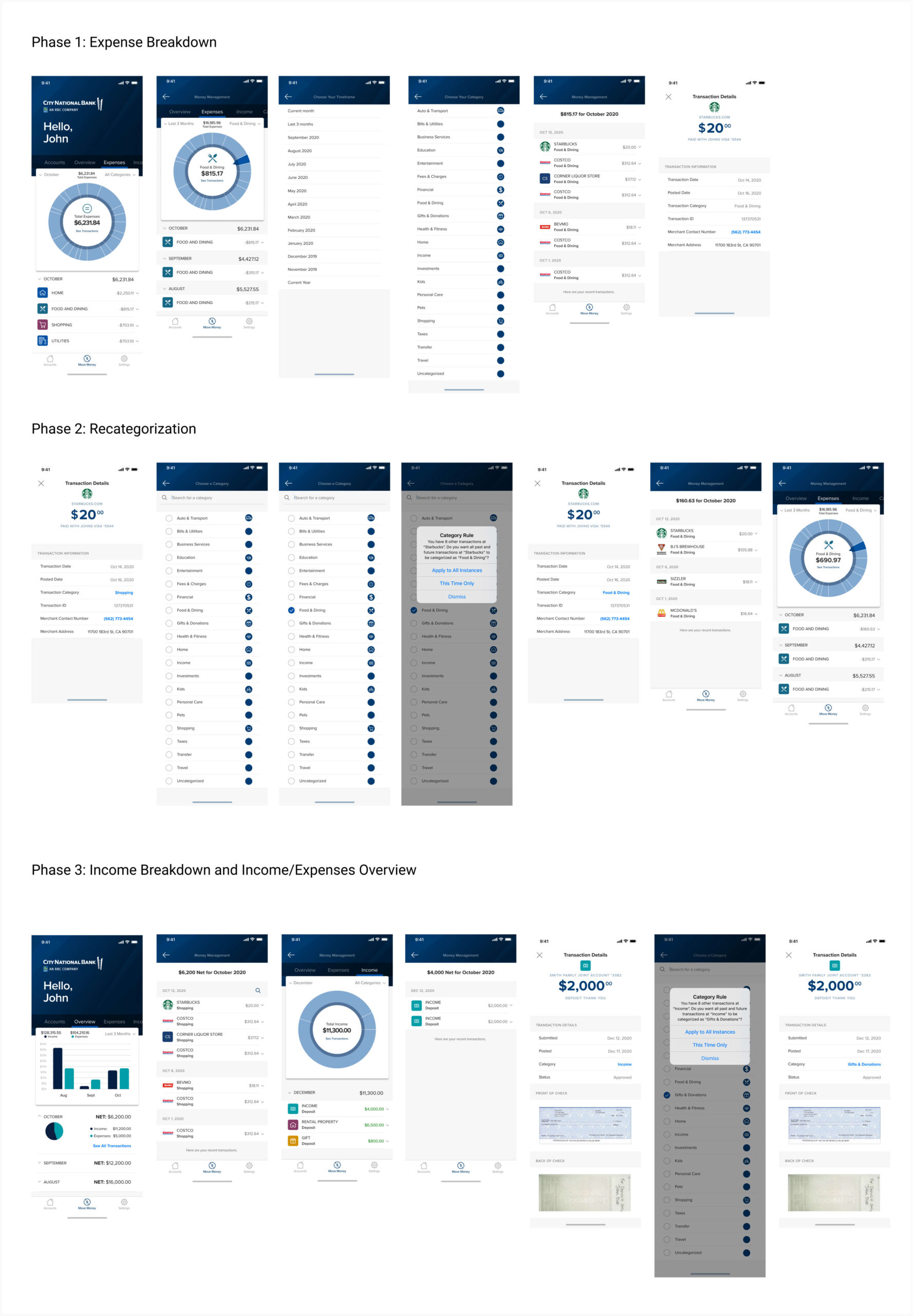
- Users want to see all their cash inflows and outflows for their accounts, they want to understand and feel in control over their finances.
- The need is for a banking app that allows users to make quick decisions on the go, users need to be able to determine if they have enough funds for an unexpected purchase or investment opportunity.
- Abnormalities in spending need to be front-and-center and alter the user as they happen. User’s don’t want to look at each account individually to get the full picture. The goal is to make accounts secure and if there is a need to lock the cards or flag the transaction – all can be within the City National Bank app.
MY ROLE
- Principle UX designer, product leader, sprint facilitator, and design thinker.
